
Project brief
YouLend, a fintech innovator, uses cutting-edge tech to provide business loans to small and medium enterprises
YouLend started in 2016 as a 7-employee company operating solely in the UK market. Over the next years, it grew exponentially, reaching over 300 employees and expanding its operations to the entire UK, Europe, and the US.
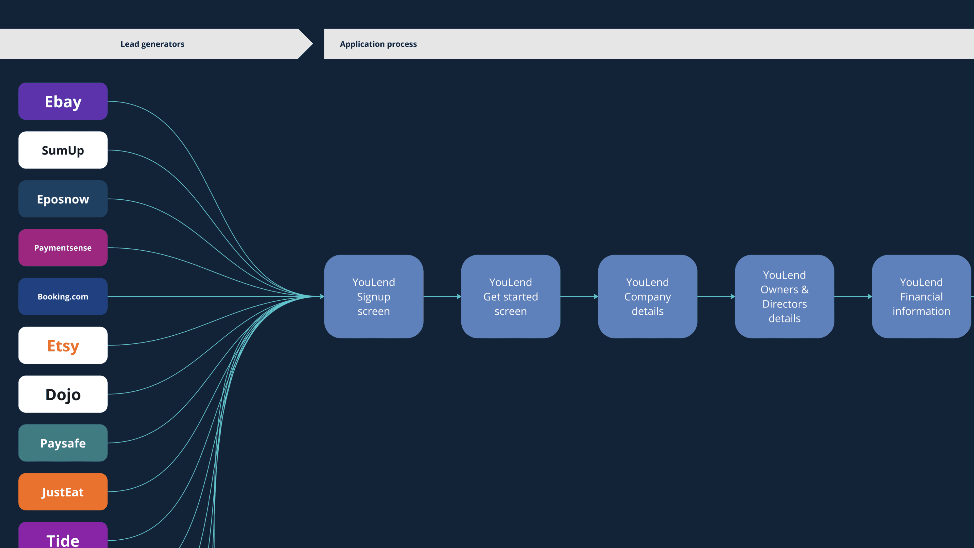
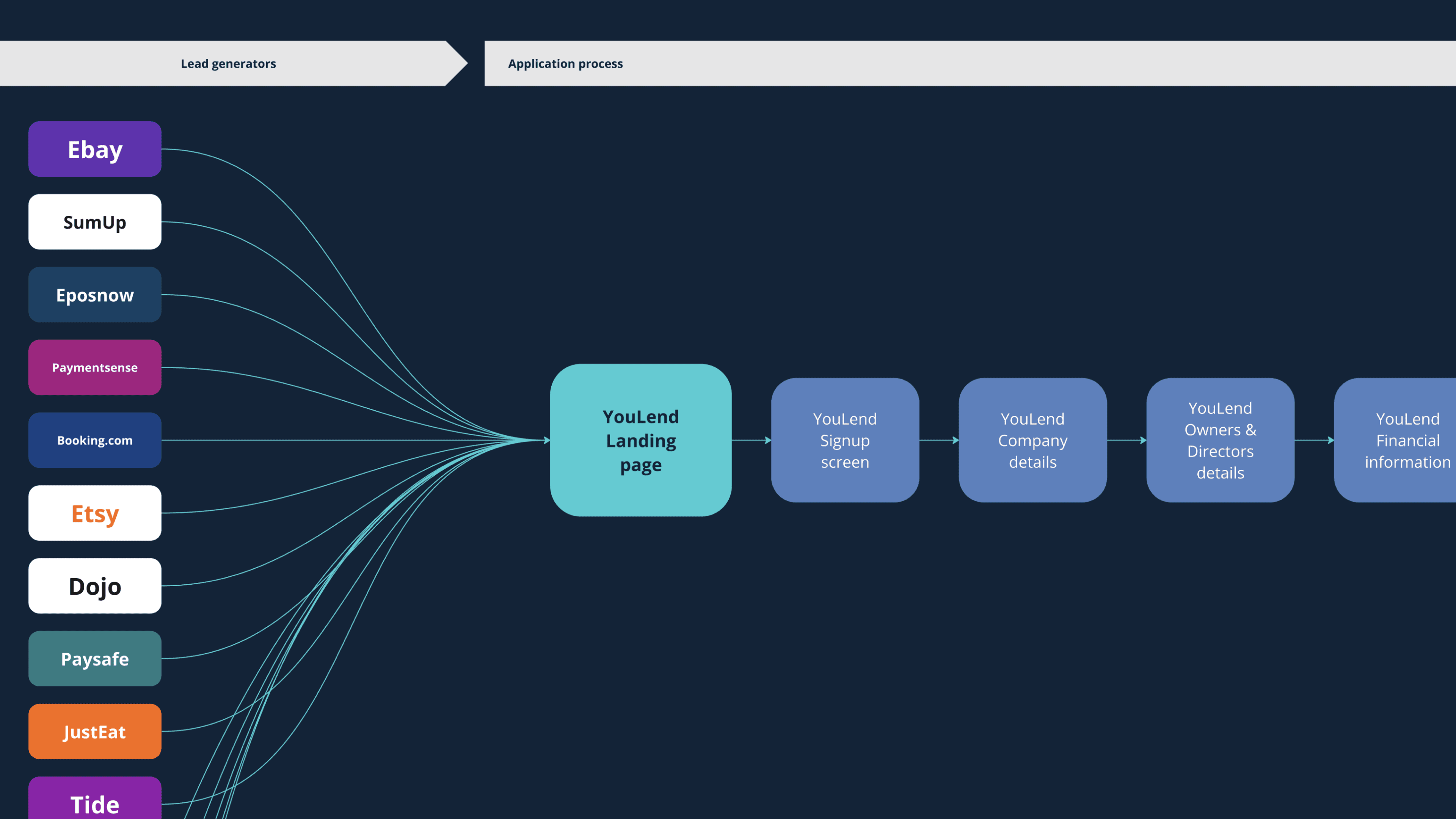
Known as a top embedded financing provider, YouLend operates through major e-commerce and payment giants like Amazon, eBay, Shopify, JustEat, Booking.com, Stripe, Dojo and more.
The challenge
When I joined Youlend, it was a thriving company, but its UX required significant improvement to stay ahead of the competition
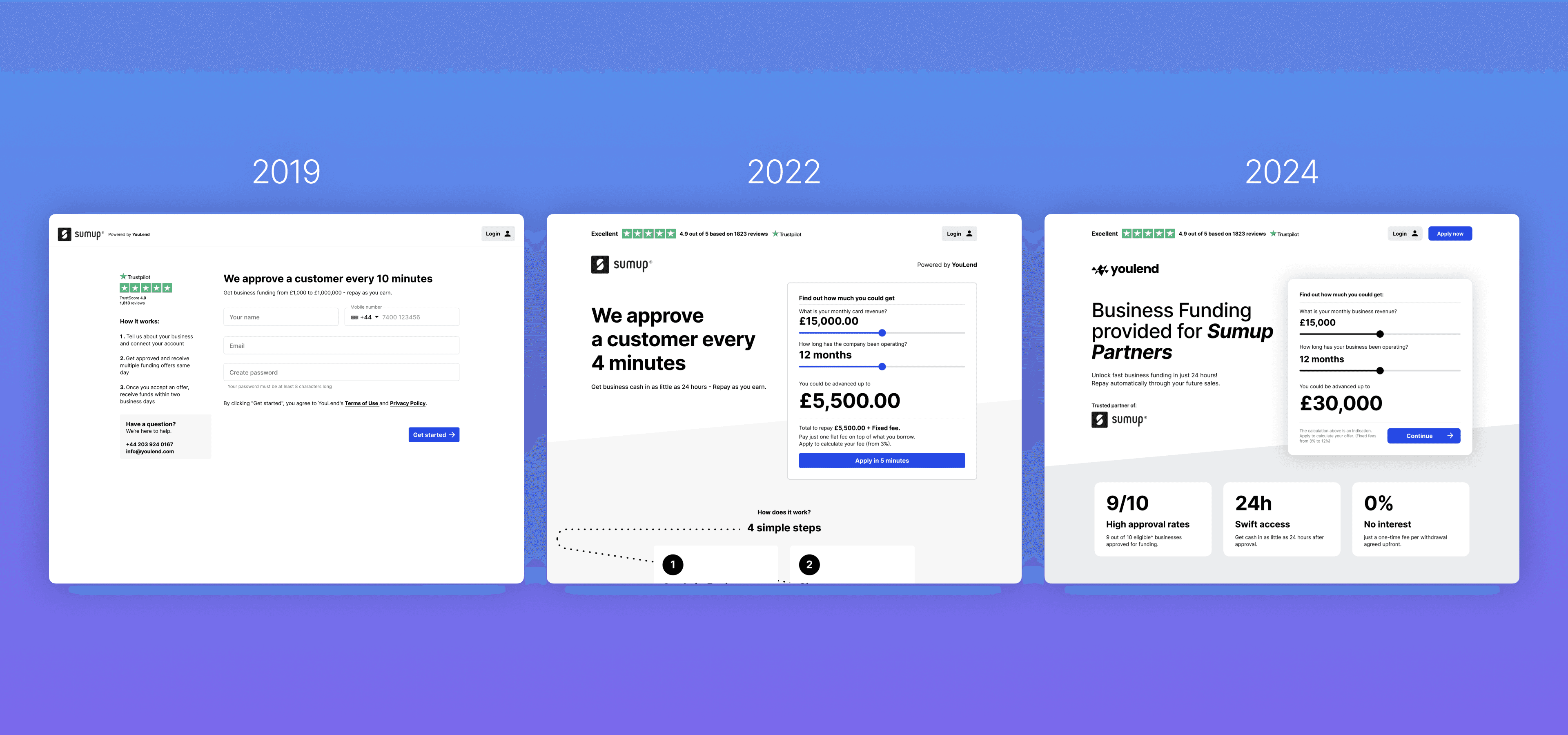
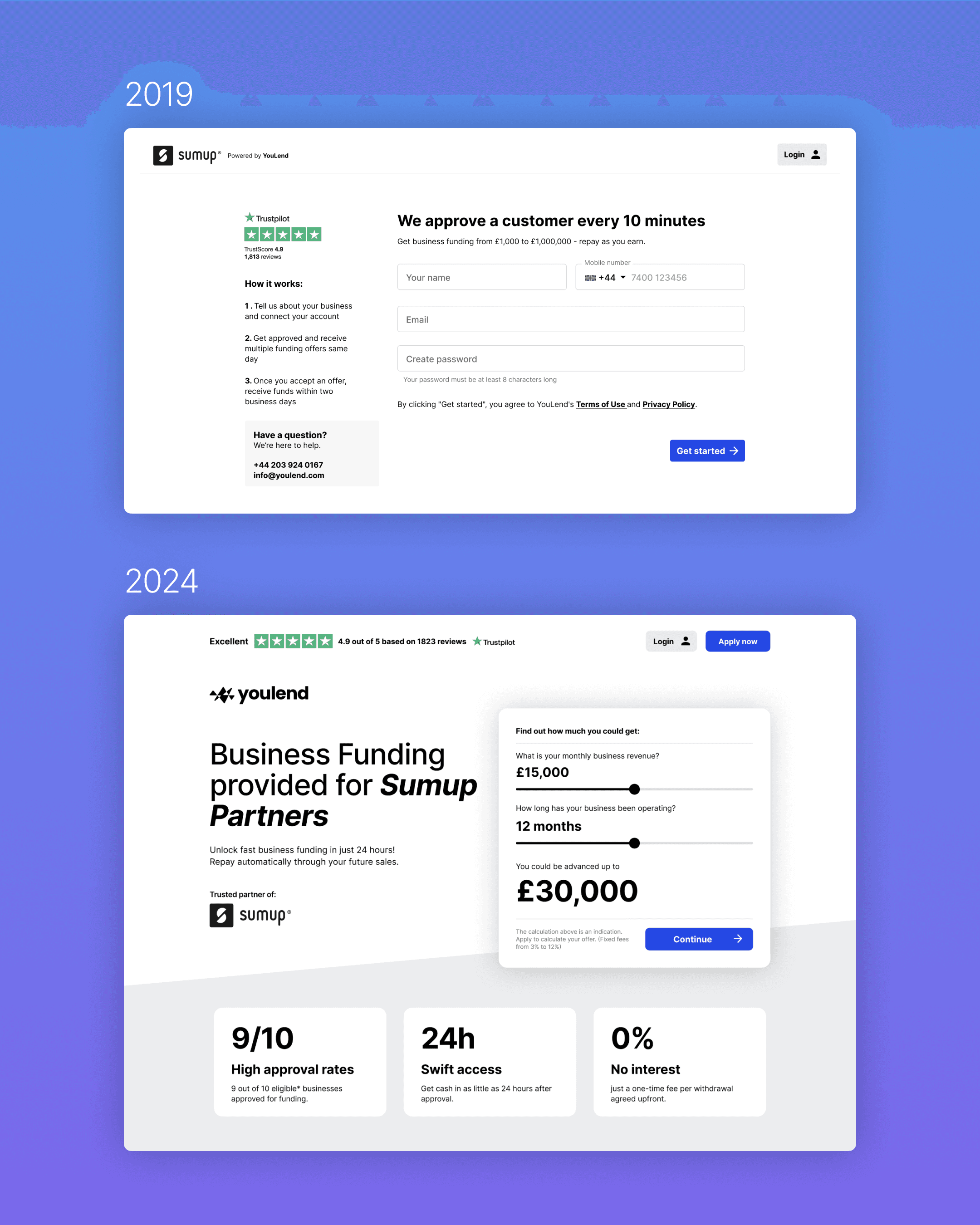
The online application struggled to keep pace with the company's rapid growth. Originally built in 2016, it served YouLend well in its early years but was becoming outdated.
To remain competitive, we needed to improve our connection with users' realities and gain a deeper understanding of our customers' needs by directly reaching out and connecting with them.
High-level goals
My role
I led the design and research for a variety of initiatives directly related to increasing acquisition and reducing operational costs between February 2022 and October 2023. This encompassed all steps in the application process, from signups and submitting the online application to signing the contract.
Alongside handling diverse design projects, I had to persuade peers and stakeholders to adopt new methodologies and autonomously expand and manage the design team.
Impact
After 18 months of rolling out different interventions, we increased nearly 1 point in customer satisfaction within the activation funnel. The Mobile NPS saw a nearly 2-point improvement, credited to design and accessibility enhancements in the mobile application form.
Comparing data from Q2-22 to Q3-23, we observed an overall uplift in final conversions. Our analysis suggests that part of this uplift resulted from filtering out disinterested customers directly at the landing page, with an additional uplift attributed to various improvements, including UX enhancements.
These achievements were the fruit of collaborative efforts across various functions, leading to our recognition as winners of the Best Customer Facing Experience at the Pay360 Awards.
I secured a budget for user research, defined initial customer segments, introduced a mobile-first approach, accessibility practices, and implemented design workflow processes and a robust design system in Figma. I also oversaw the growth and management of the design team.
Problem
Many customers were dropping off immediately after landing
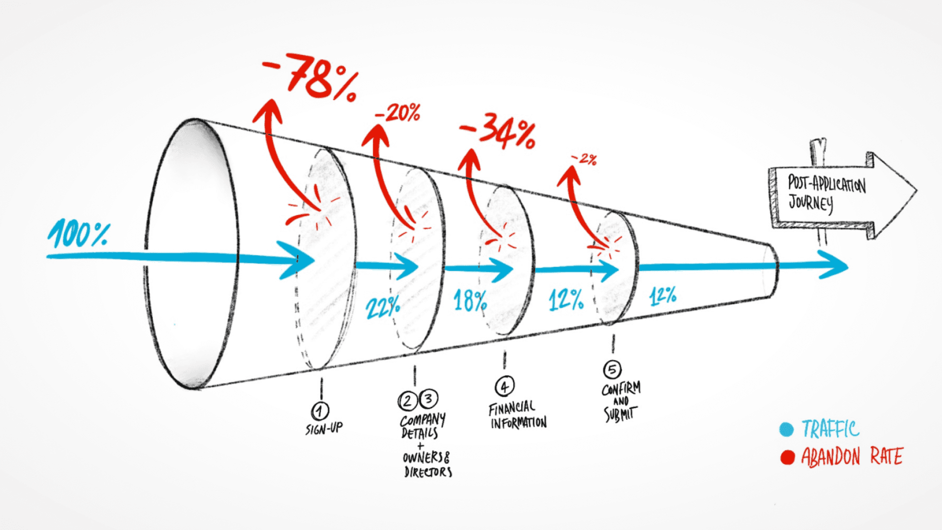
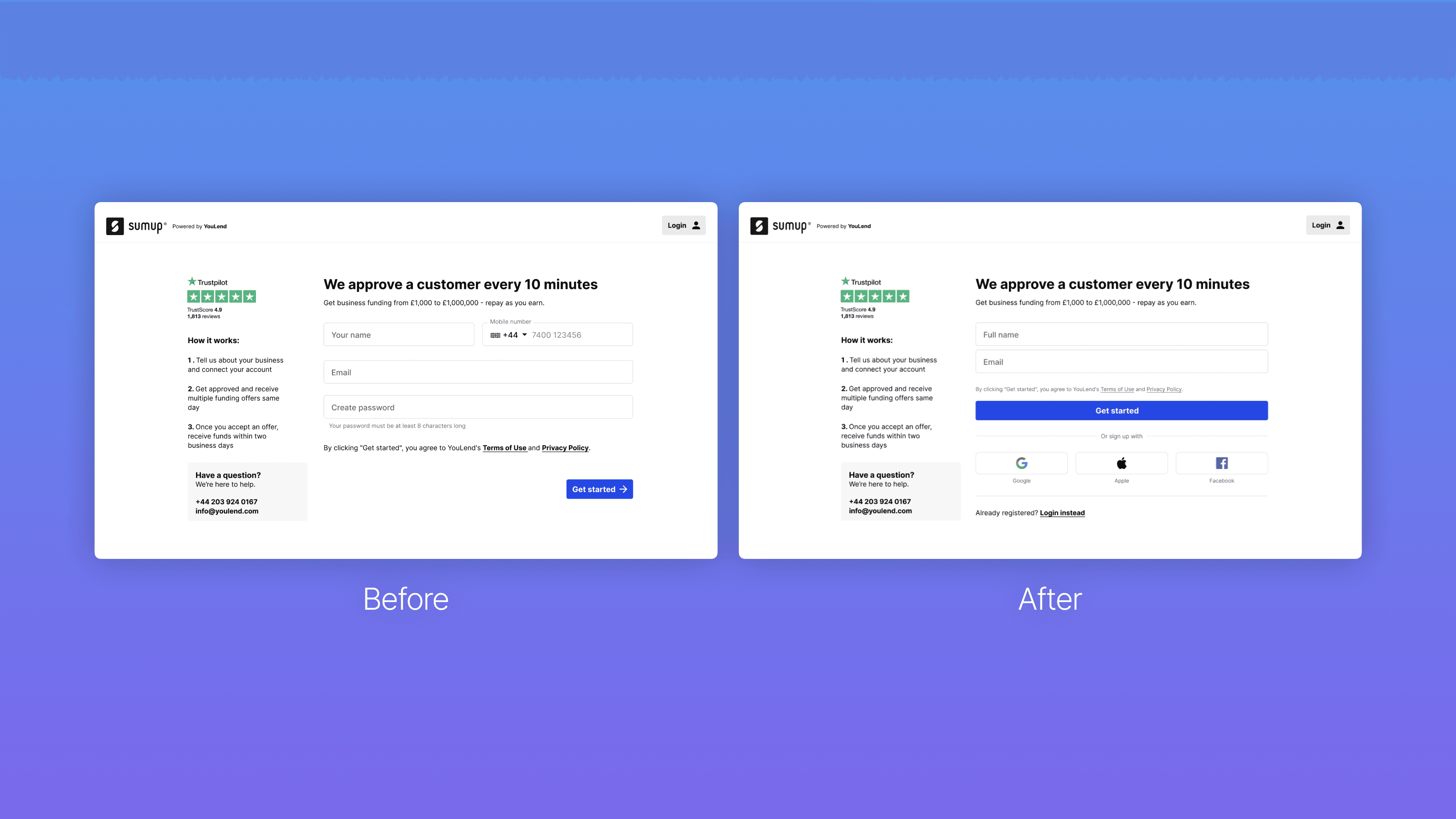
Our customers were required to complete an online application for funding, but a significant number were dropping off after reaching the signup page, resulting in very low conversion rates compared to industrial standards.
This data negatively impacted our partners' expectations, as they aimed to maximise the results of their marketing efforts into more final conversions.
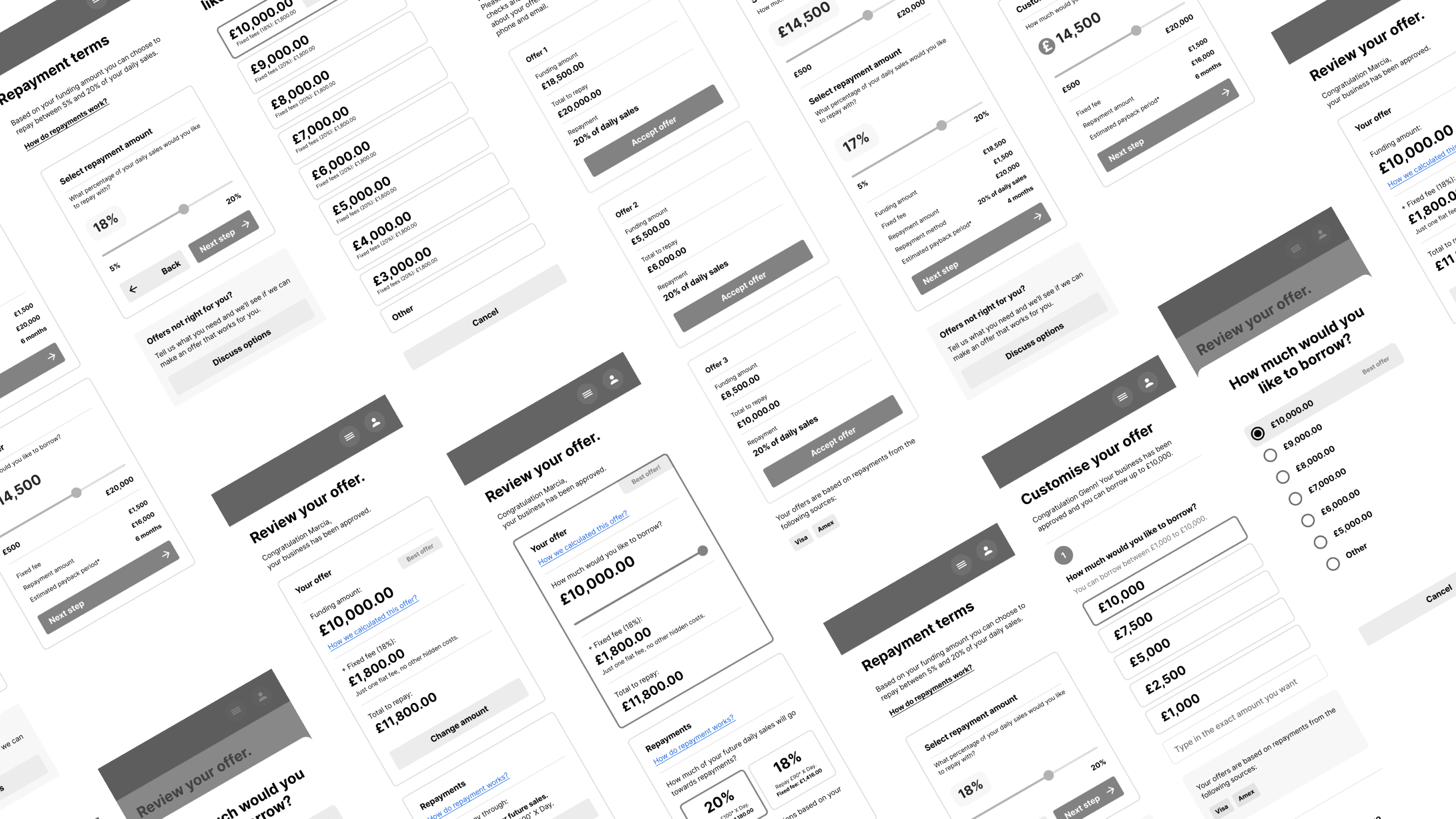
First iteration
Implementing OAuth and reducing requirements
Improving signup conversion rate became my top priority. However, lacking a user research budget made understanding why users were leaving challenging.
To begin addressing this, we studied best signup practices. We identified two potential quick changes to improve signup rates: implementing third-party OAuth and reducing signup efforts by removing two required fields, such as the phone number and password. However, we didn’t observe any significant uplift.

Why were many users still leaving?
Our customers arrived at the application process after clicking our partners' marketing material, indicating interest rather than casual browsing. My main focus was to understand why interested users were abandoning the process early.
Insights from user research
Users weren’t ready to commit yet
Securing the budget for testing, I conducted usability tests and interviews with potential customers.
We conducted usability testing on the existing landing experience with 7 participants. Our objective was to comprehend users' sentiment upon landing, their general preferences and habits, and to identify opportunities to assist them in the process.
These insights provided valuable information and uncovered a crucial oversight: users were hesitant to commit to an application without sufficient information.
The lack of information provided at the landing stage made some users sceptical
Users wanted to have an idea of the details of a potential offer. They also desired insights into how the repayment process works, information about the company, details about personal guarantees, credit checks involved, and various other factors.
Reframing the problem
We made assumptions without fully considering all aspects
Previously at YouLend, it was commonly believed that if a customer landed on the application form, they were prepared to move forward.
However, this assumption was proven inaccurate, Indeed our customers were at various decision-making stages, from actively seeking loans to merely gathering information. They came from numerous entry points managed by our partners, resulting in varying levels of initial information.
Limited access to the various initial touchpoints
Tackling this issue was challenging due to the limited access to partner-driven touchpoints.
Our numerous partners, including eBay, Dojo, and Booking.com, directly targeted their sellers with their own campaigns promoting the YouLend offering. This made it difficult to oversee the initial conversation and information provided before landing on the signup page.
"How can we ensure everyone has the essential information to decide?"
Providing more information, even if redundant, at that stage was crucial. Our proposal was simple: implement a richer landing experience to provide all essential information about our product and offering before asking to signup.
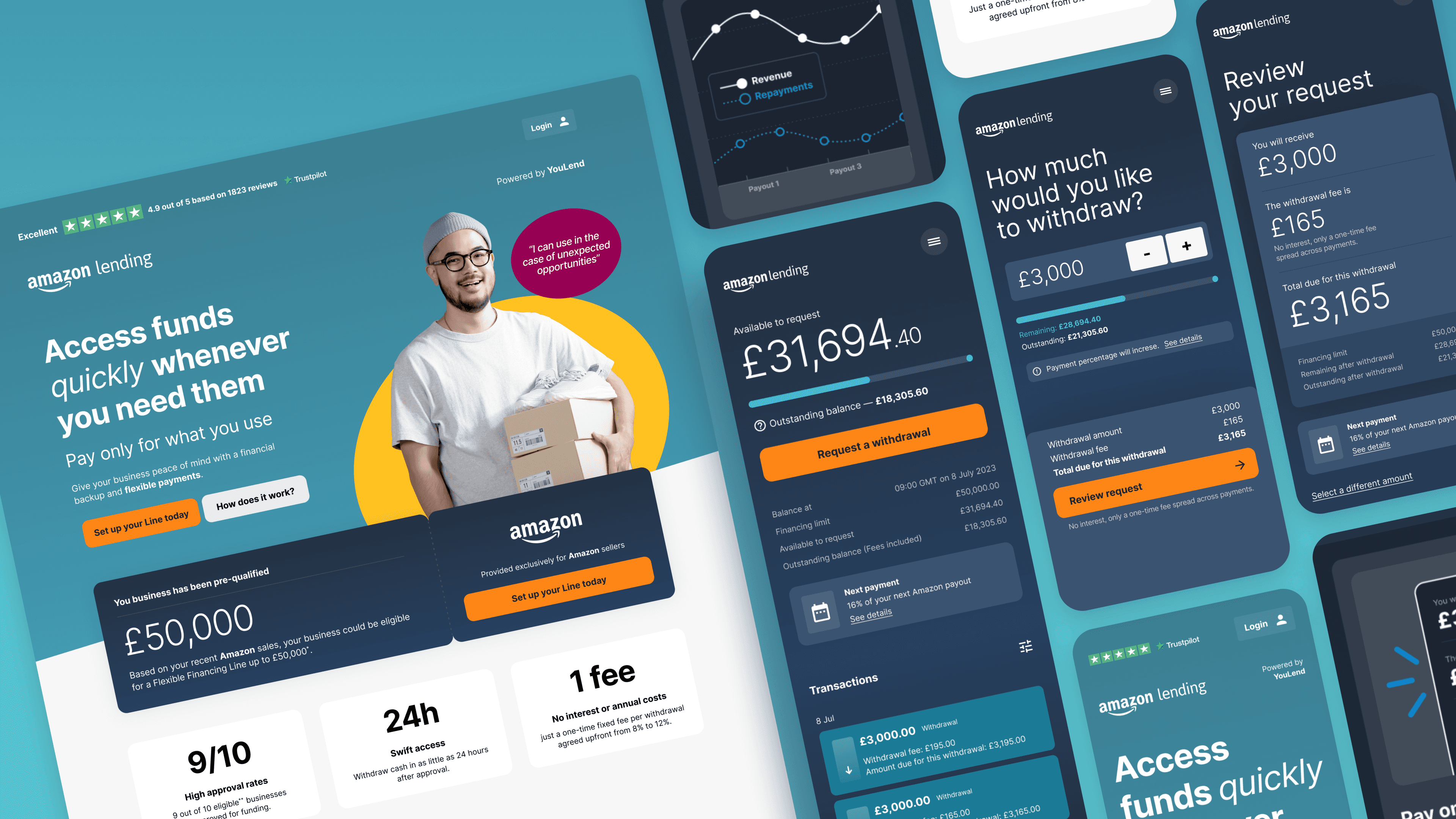
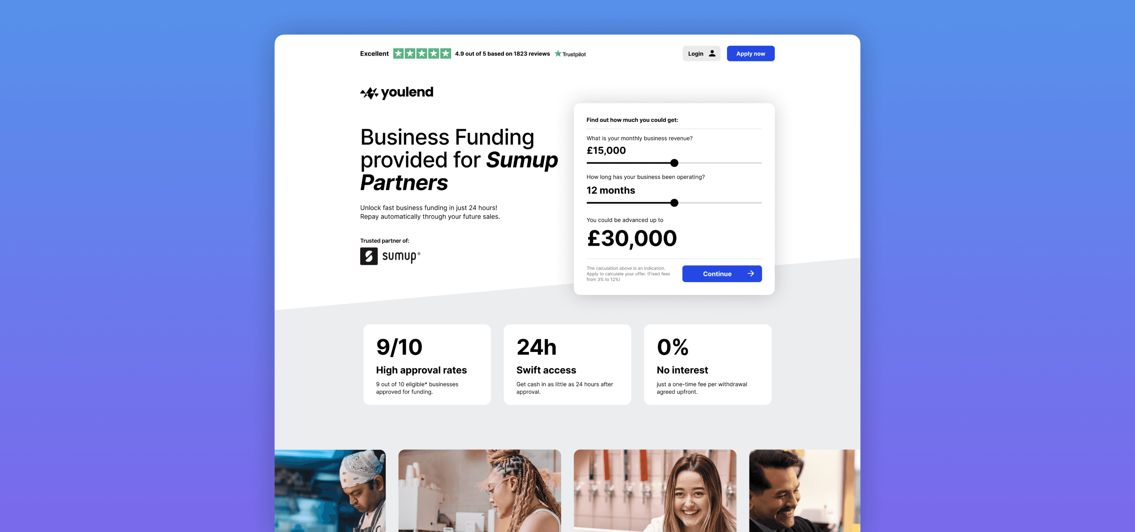
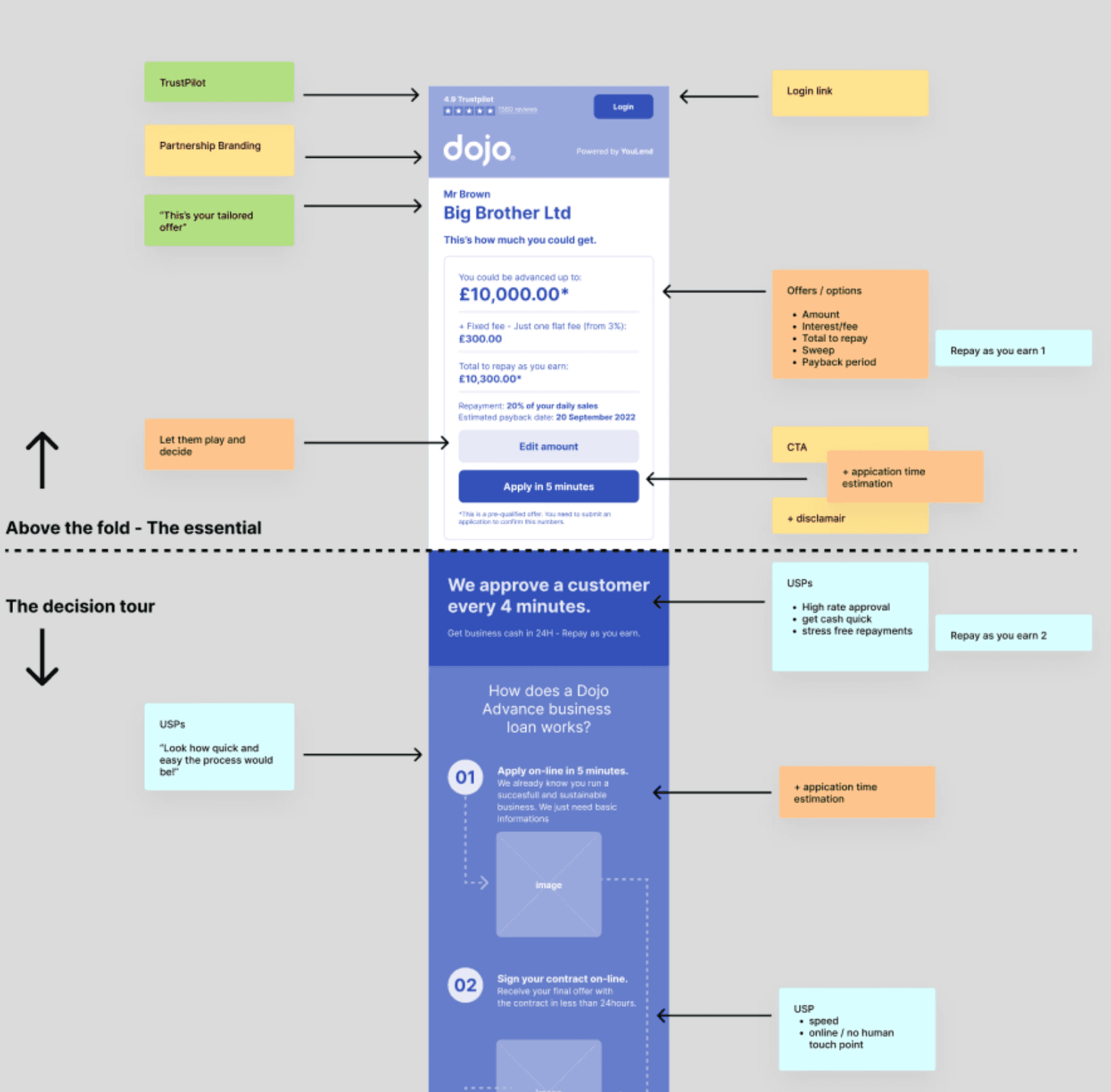
The new landing experience
A richer experience that provides essential information
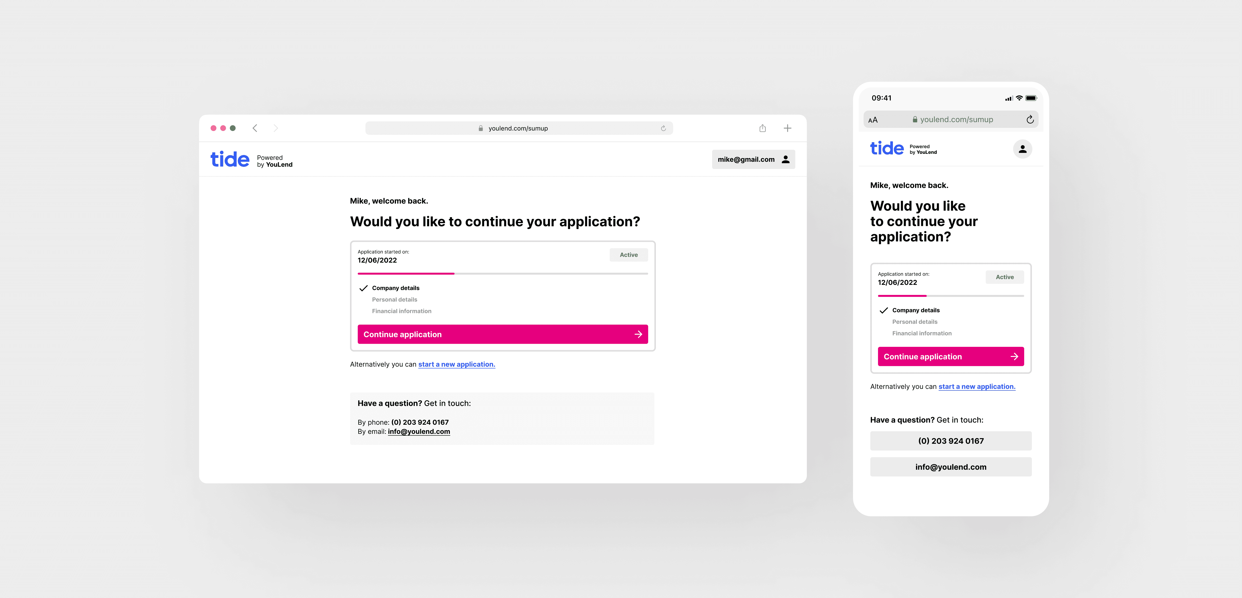
The new page functions as a traditional landing page, ensuring that customers who didn’t receive enough information before landing will find what they need here. The signup form will only become visible when they decide to proceed.
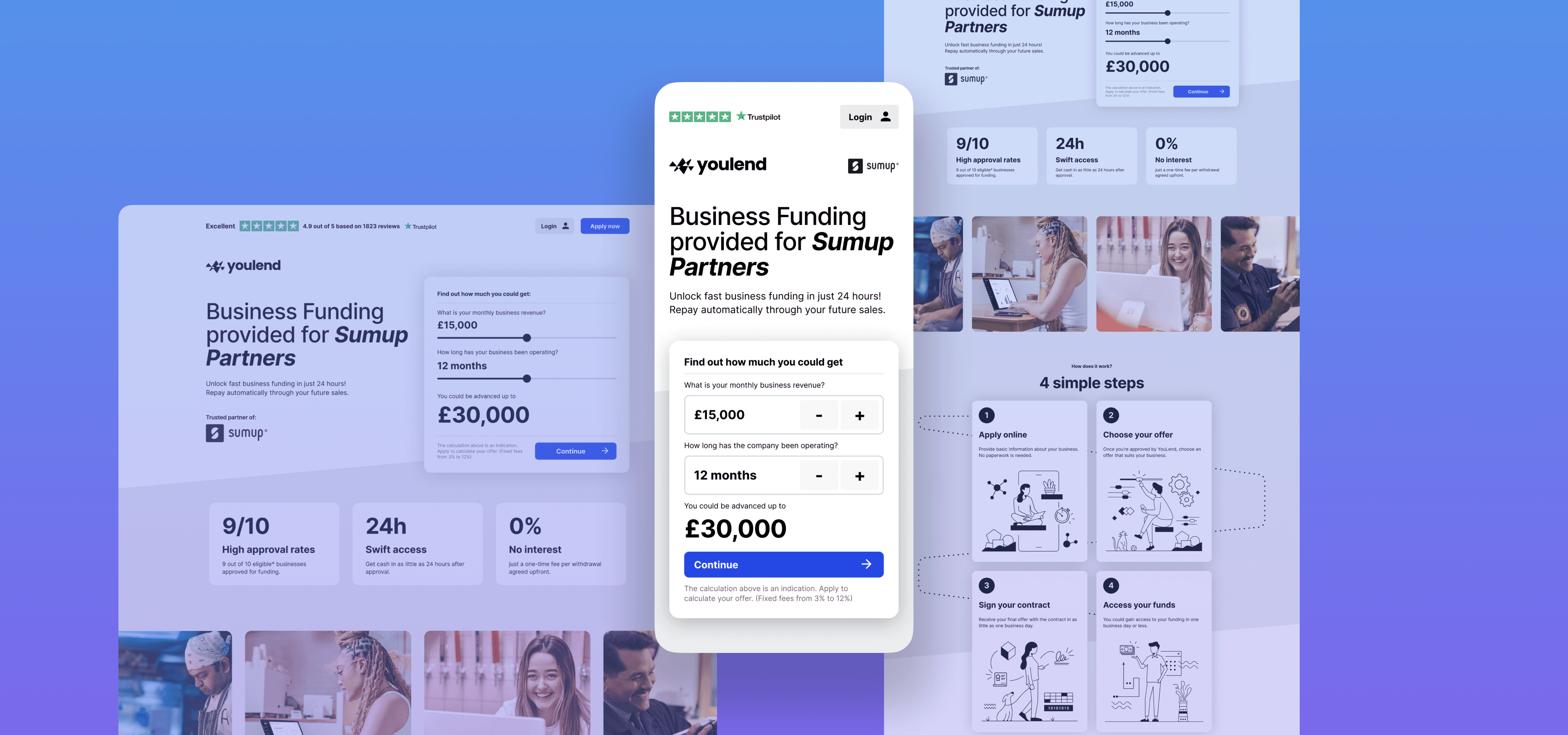
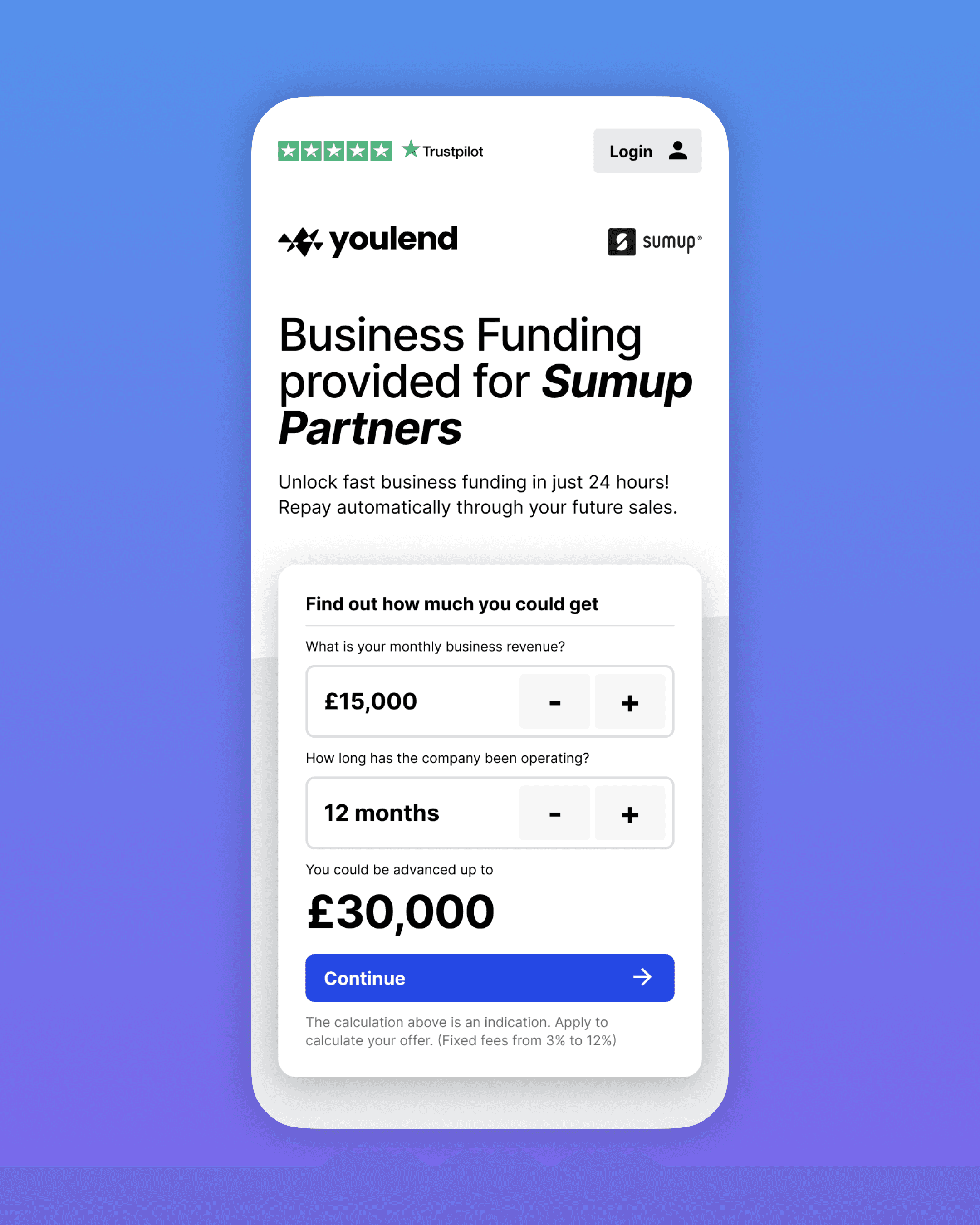
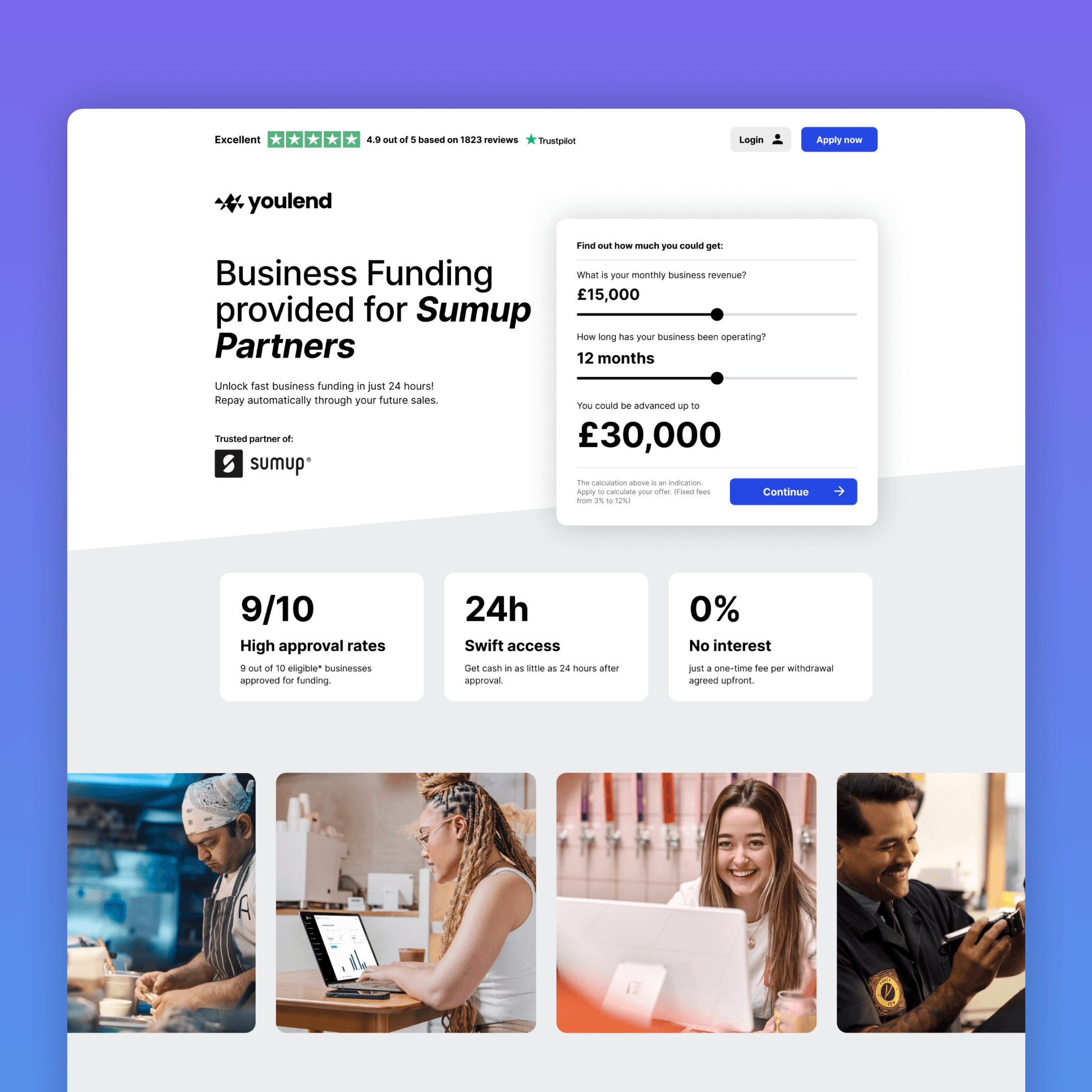
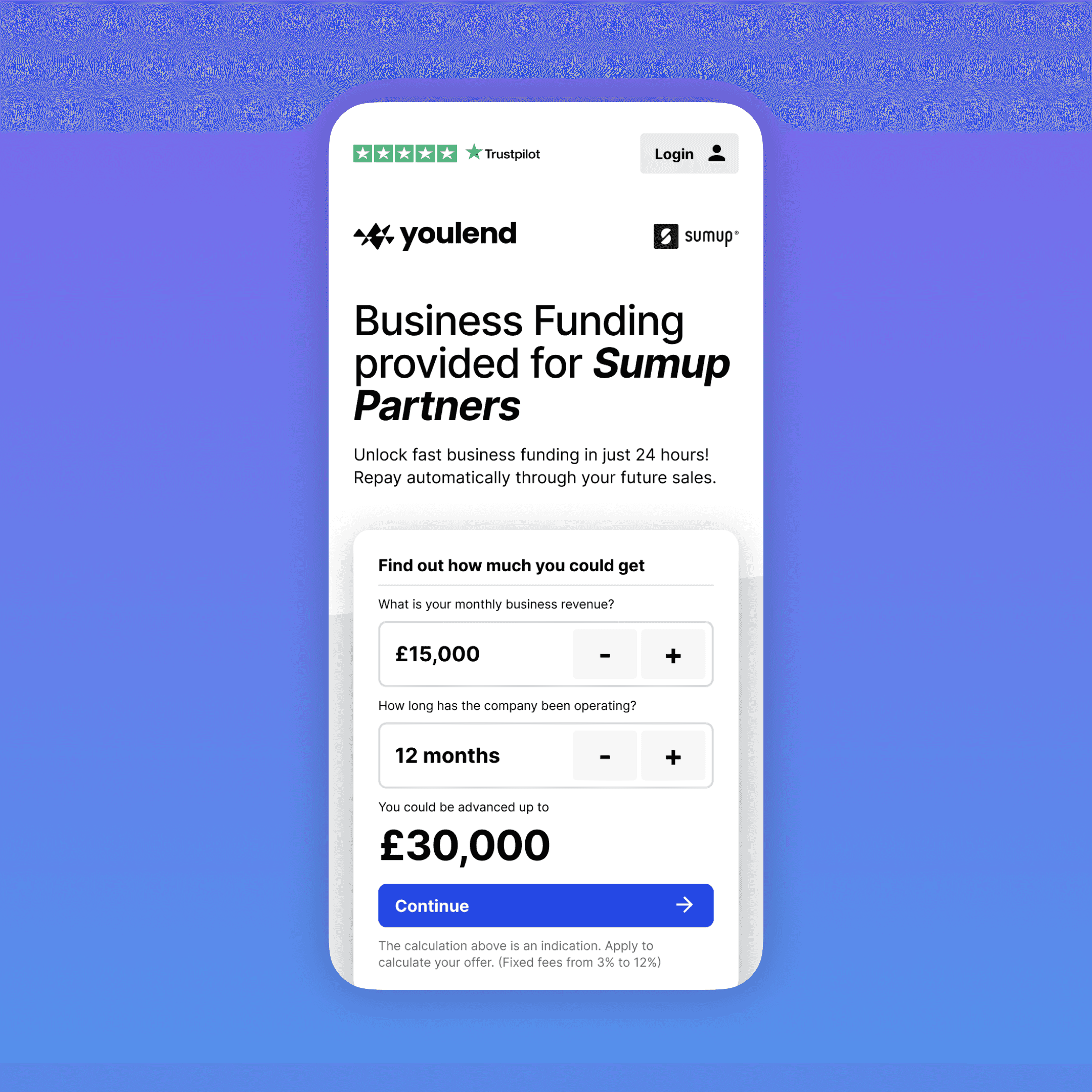
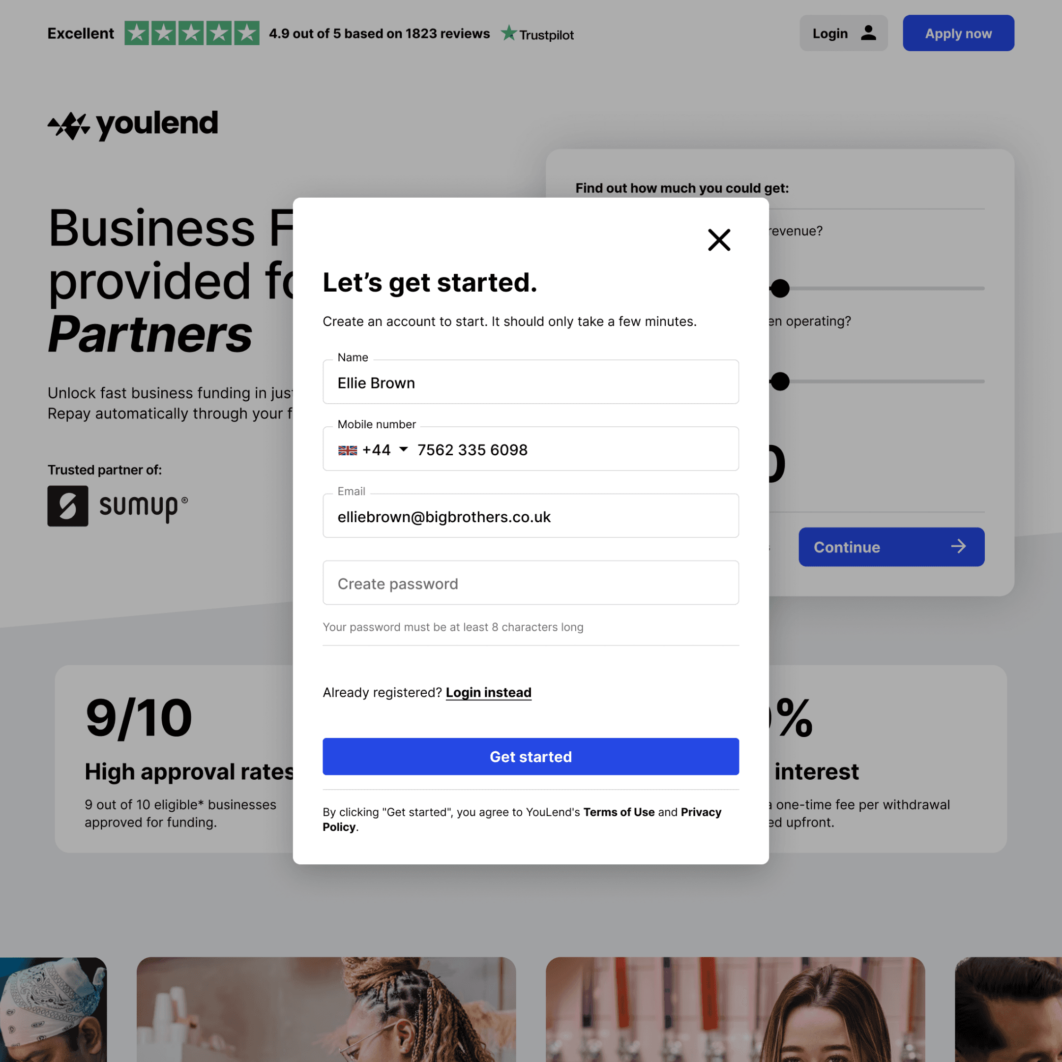
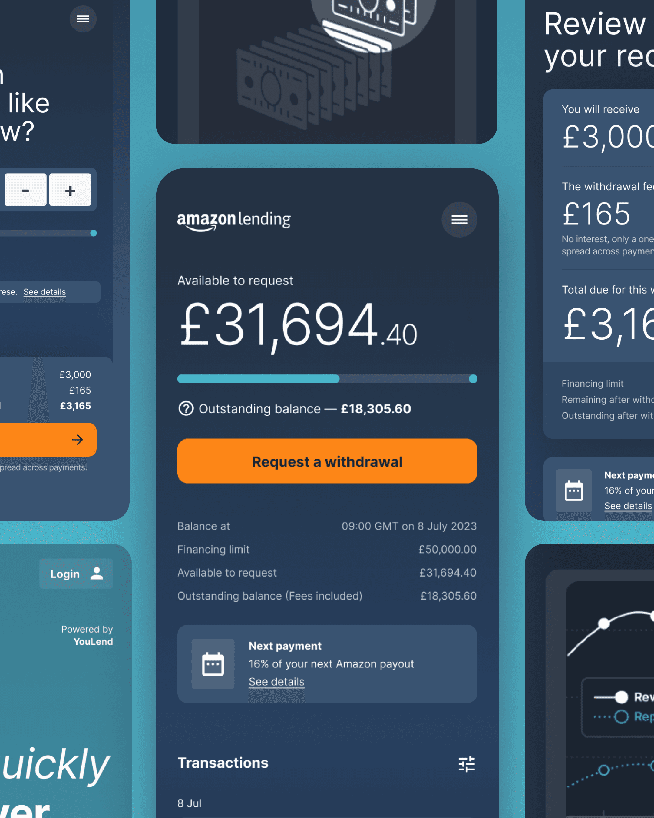
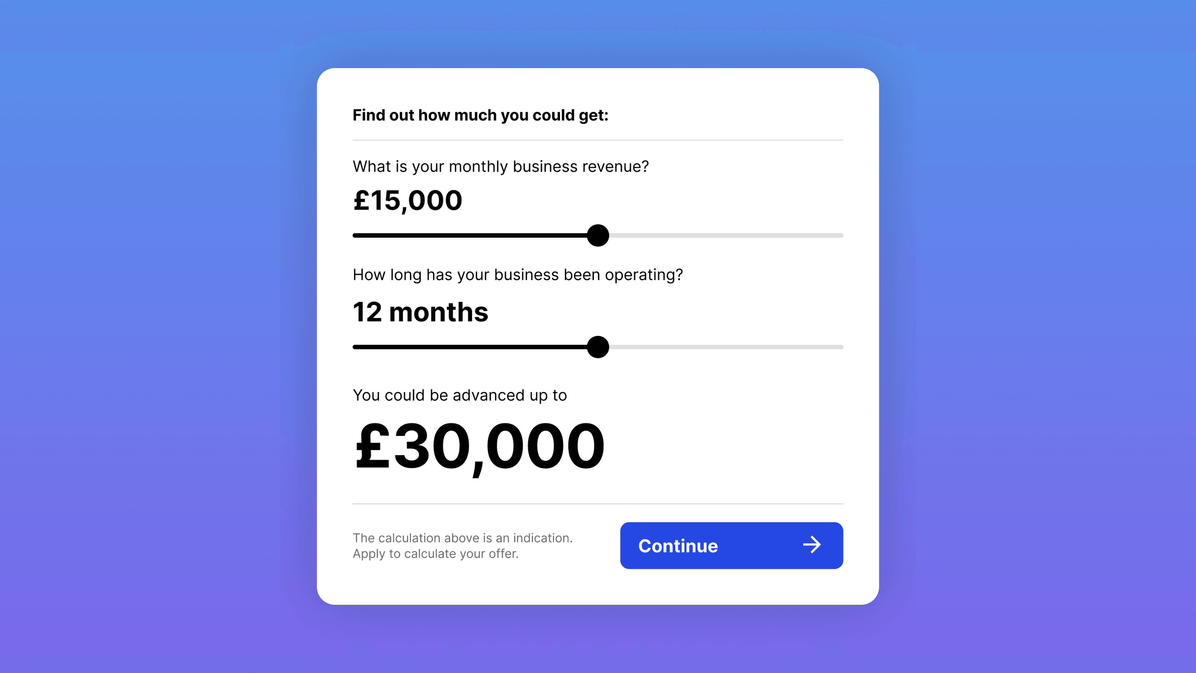
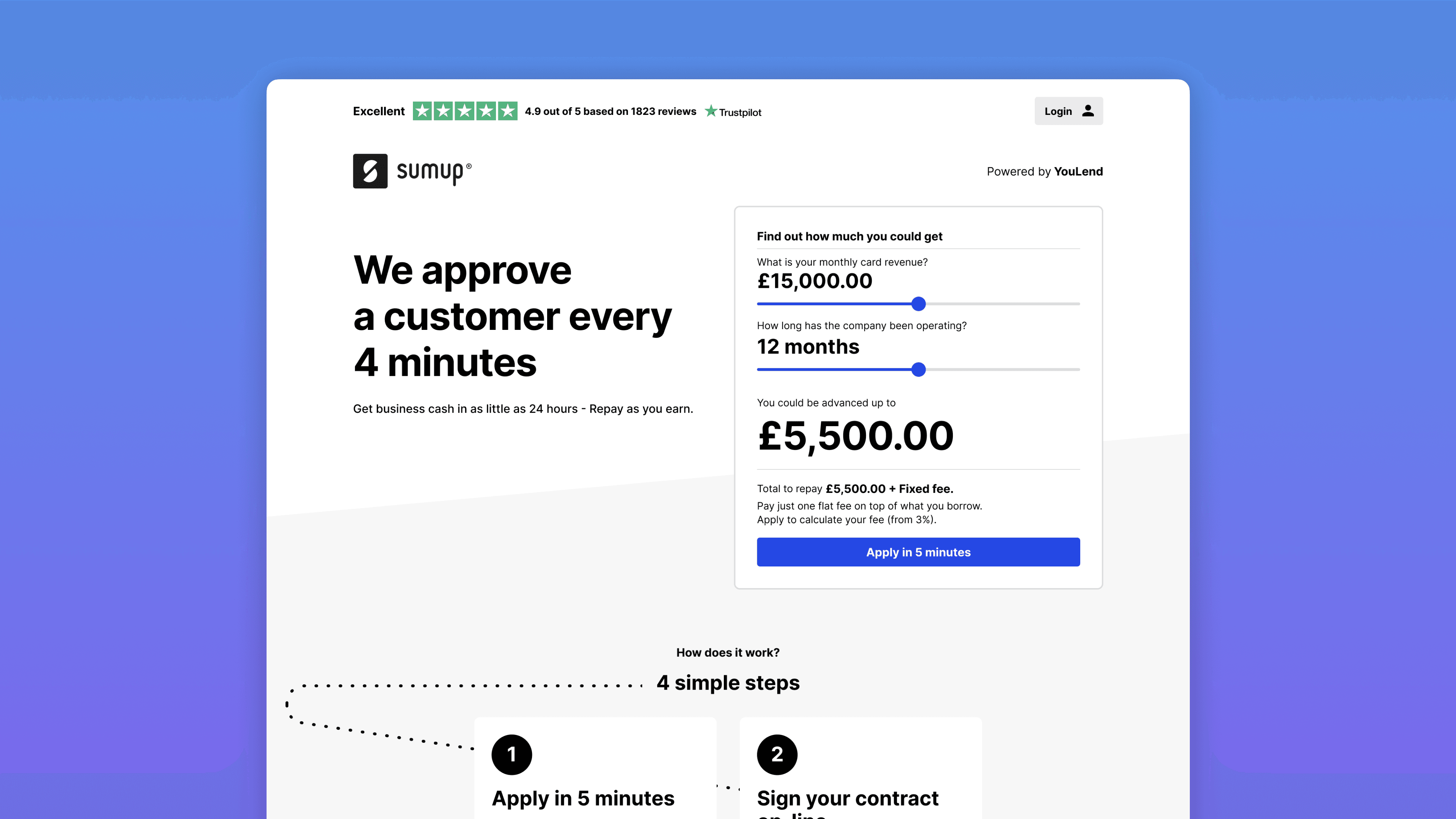
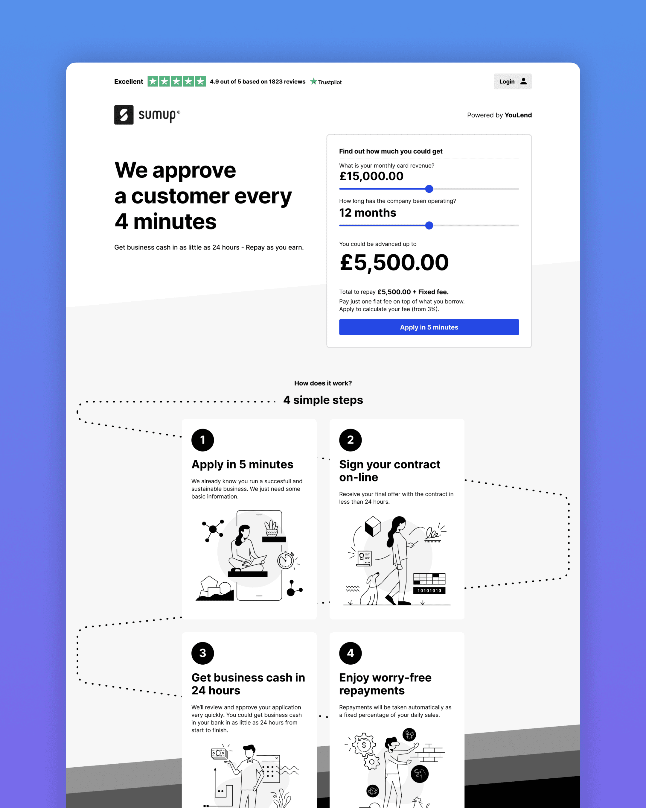
Loan offer simulator
Showing our offerings
through simulation
We upgraded the landing experience by adding a loan offer simulator prominently at the top of the page. This allowed users to interact with it immediately, giving them a better grasp of costs, total amount they could get and repayment options.
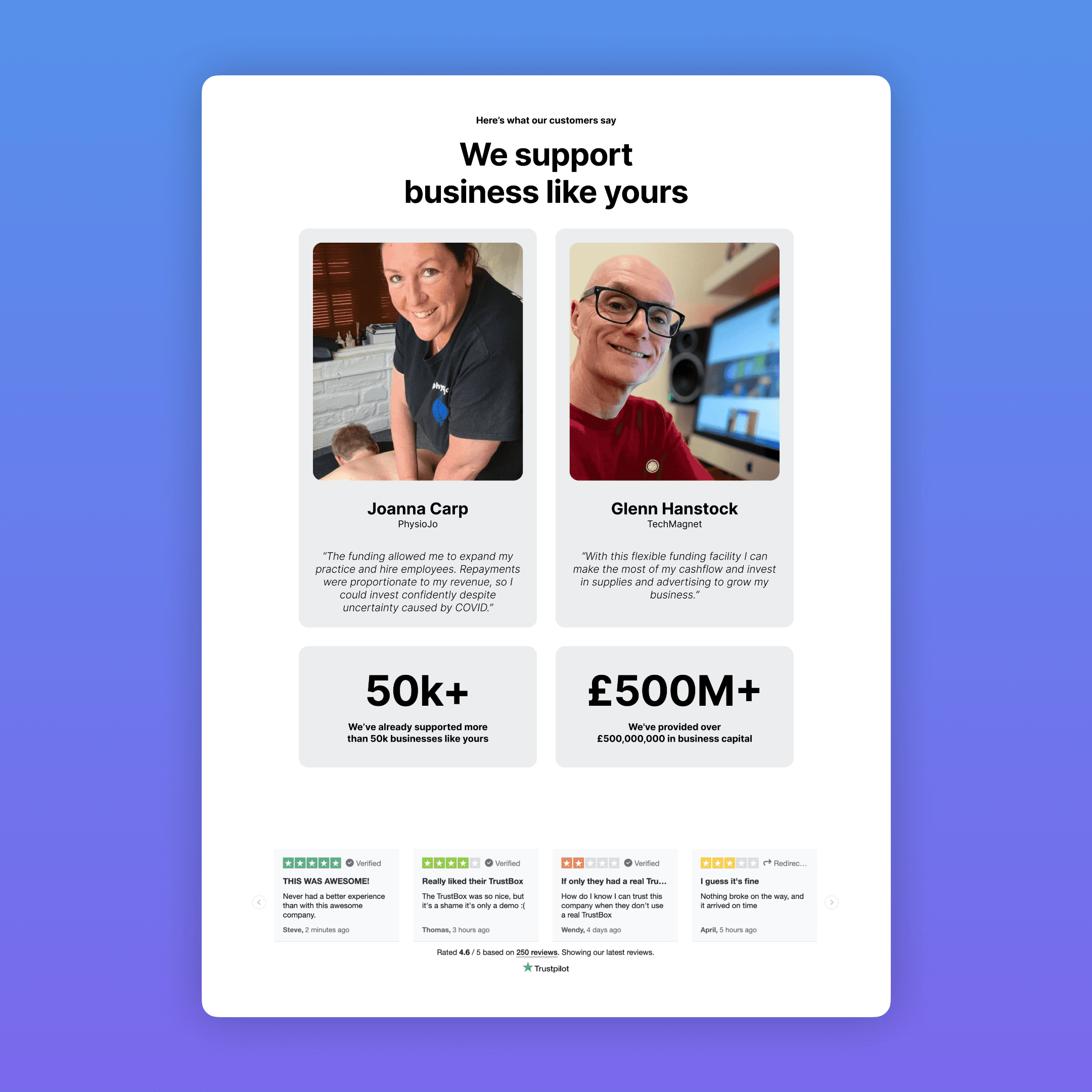
Social proof
Providing transparency by
amplifying customer feedback
Building trust with customers is always a challenge but building it when borrowing money is involved is a whole other dimension.
Our discovery test confirmed trust and security as critical concerns. Building trust was crucial. We added prominent Trustpilot widgets and a testimonials section. Usability tests and interviews showed the importance of customers accessing others' experiences and opinions.
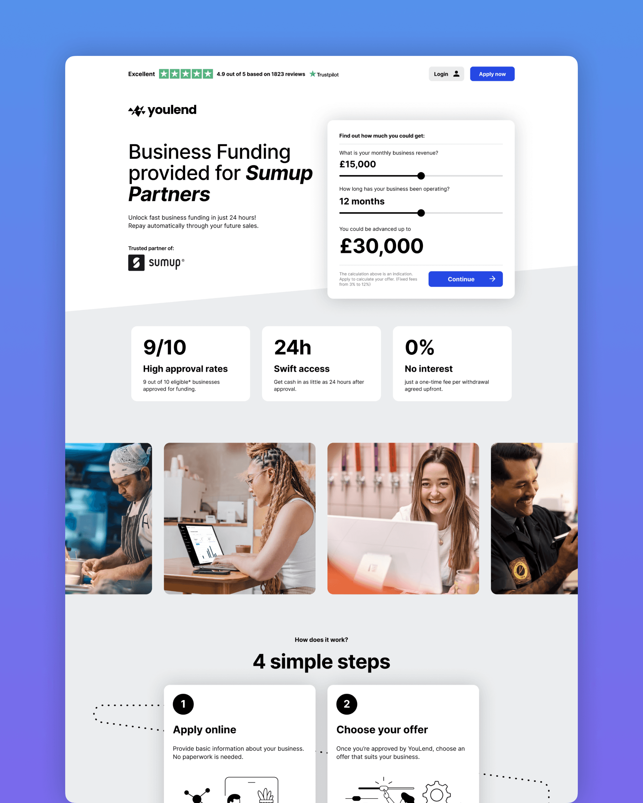
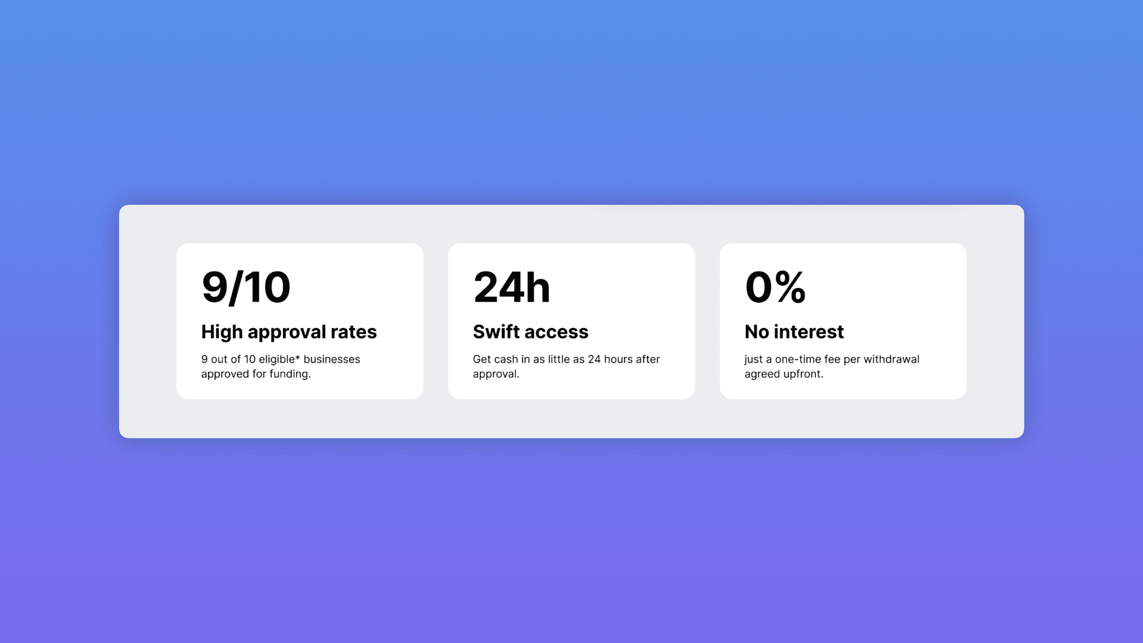
More inclusive
Enhance clarity for everyone
I utilised illustrations and infographics, alongside refined copy, to emphasise key points and prevent cognitive overload.
Visuals simplify complex concepts and convey messages clearly, enhancing user engagement and experience. For instance, illustrations were used to demonstrate the speed and simplicity of the YouLend application process.

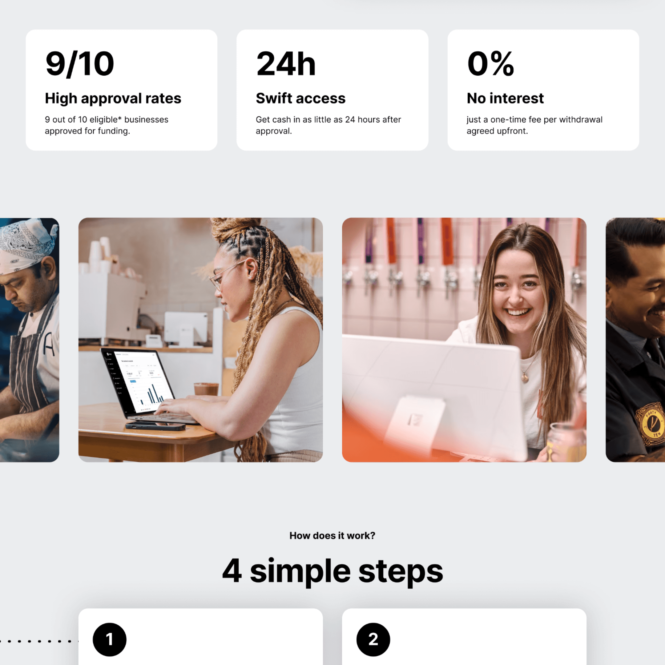
We highlighted key unique selling points: high approval rate, swift fund access, and fixed costs, which were appealing features.
A new help and support block was developed using an AngularJS accordion-ready component. This FAQ section acts as a central hub for hosting important information and allows for flexible future additions.
How we got there
Refinement, test, analyse and repeat
The initial version of the landing experience was quite different. The loan offer simulator only calculated the maximum amount, the headline and the branding strategy was different, social proof was less prominent, and there were many other distinct aspects.
We underwent several iteration cycles to reach the final version. However, even in the early stages of qualitative testing, we observed a significant improvement compared to the original "straight to signup" experience.
Deeper insights
The first AB test didn’t show us the uplift we were hoping for
When we tested the early versions of the landing page, we were focusing on sign-up conversions as the main metric for comparison between the control version and the new variant. With the experience completely revamped, I anticipated a significant difference.
Unfortunately, the AB test was inconclusive. We didn’t have enough power to see a significant different. However, despite the variant having fewer sign-ups compared to the original, surprisingly, it performed better in generating applications submitted further down the line.
New hypothesis
Skimming leads
Analysing the trend that emerged from the experiment, we began discussing a new realisation. Providing more information upfront allows us to filter out less interested individuals early in the process. This includes customer segments who prefer traditional methods of loan repayment or those with access to better deals elsewhere.
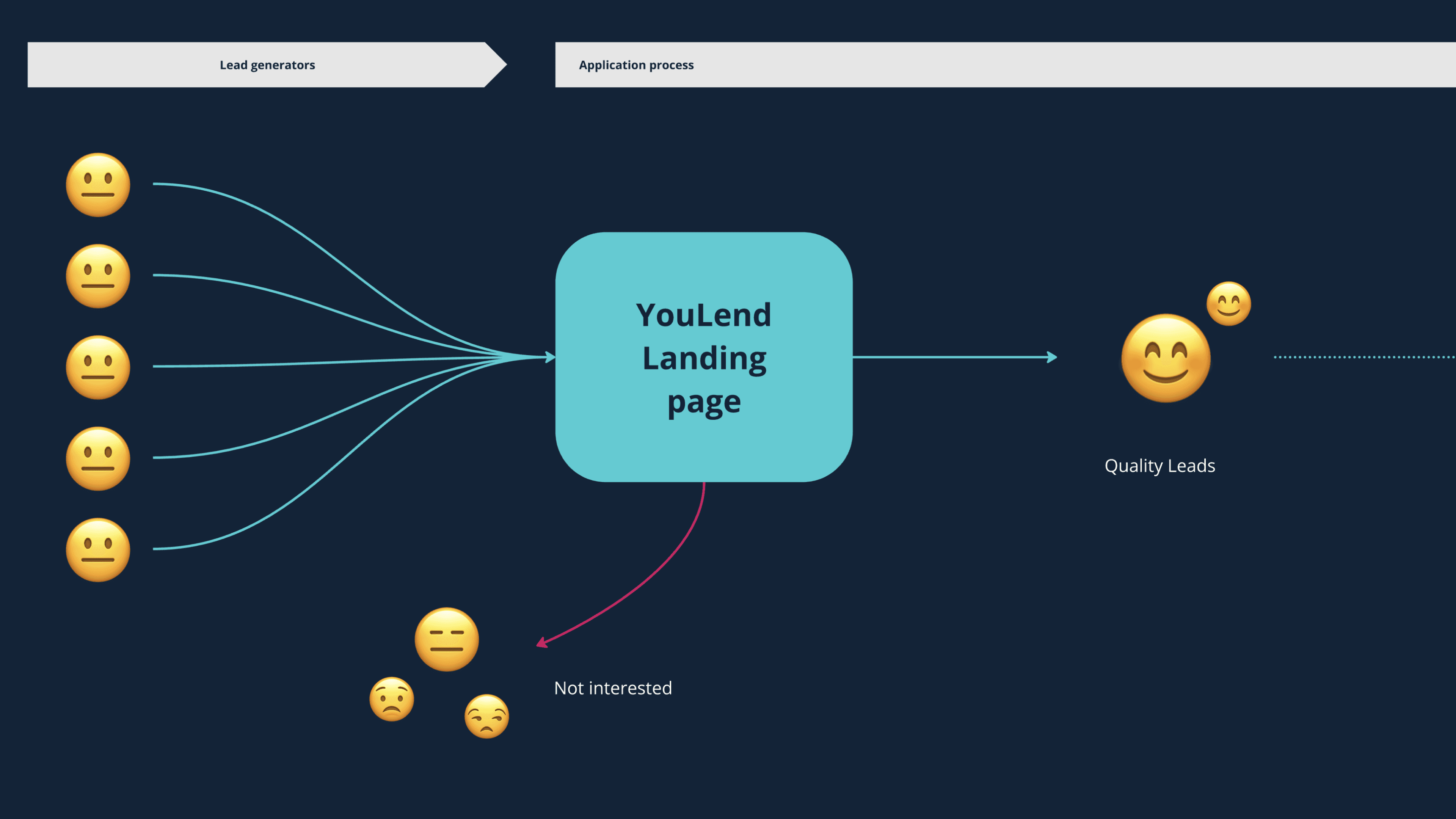
As a result, we had a higher probability of attracting serious applicants who were more likely to complete the process. This approach could also save time and effort for customers who probably wouldn't be interested anyway, while also saving time and money for YouLend.
Despite the experiment did not show the expected results, we were confident in implementing the new experience anyway, as it did not perform worse than the original and because it brought a variety of general improvements to the experience.
Narrowing user needs
Users were starting applications just to view interest rates and repayment options
We also gained insights from an internal survey to our customer support team, which wasn't directly related to this project.
One of the questions focused on why customers were dropping out of the application process. The results revealed an interesting trend: many users weren't actually interested in applying. It appeared they were initiating applications primarily to gather more information, particularly to view the costs involved and the repayment options, rather than with the intent to complete them.
Interest rates and how repayment works were primarily what customers sought at this stage
Refining the challenge
New findings led to crucial design questions:
“How can we display interest rates before they apply?”
YouLend's fees, calculated based on risk, were only determined after reviewing an application. Stakeholders were concerned about disclosing medium to high-interest rates upfront, while basing simulations on the lowest rates risked upsetting customers.
It was a trade-off between higher signup volume with lower end-funnel satisfaction or higher satisfaction with lower signups.
Transparency over performance
After a back-and-forth session with the Legal team, we agreed to advertise the best rates while clearly stating that the final offer would only be provided after applying and prominently displaying the interest rate range. We also committed to monitoring customer satisfaction when presenting offers.

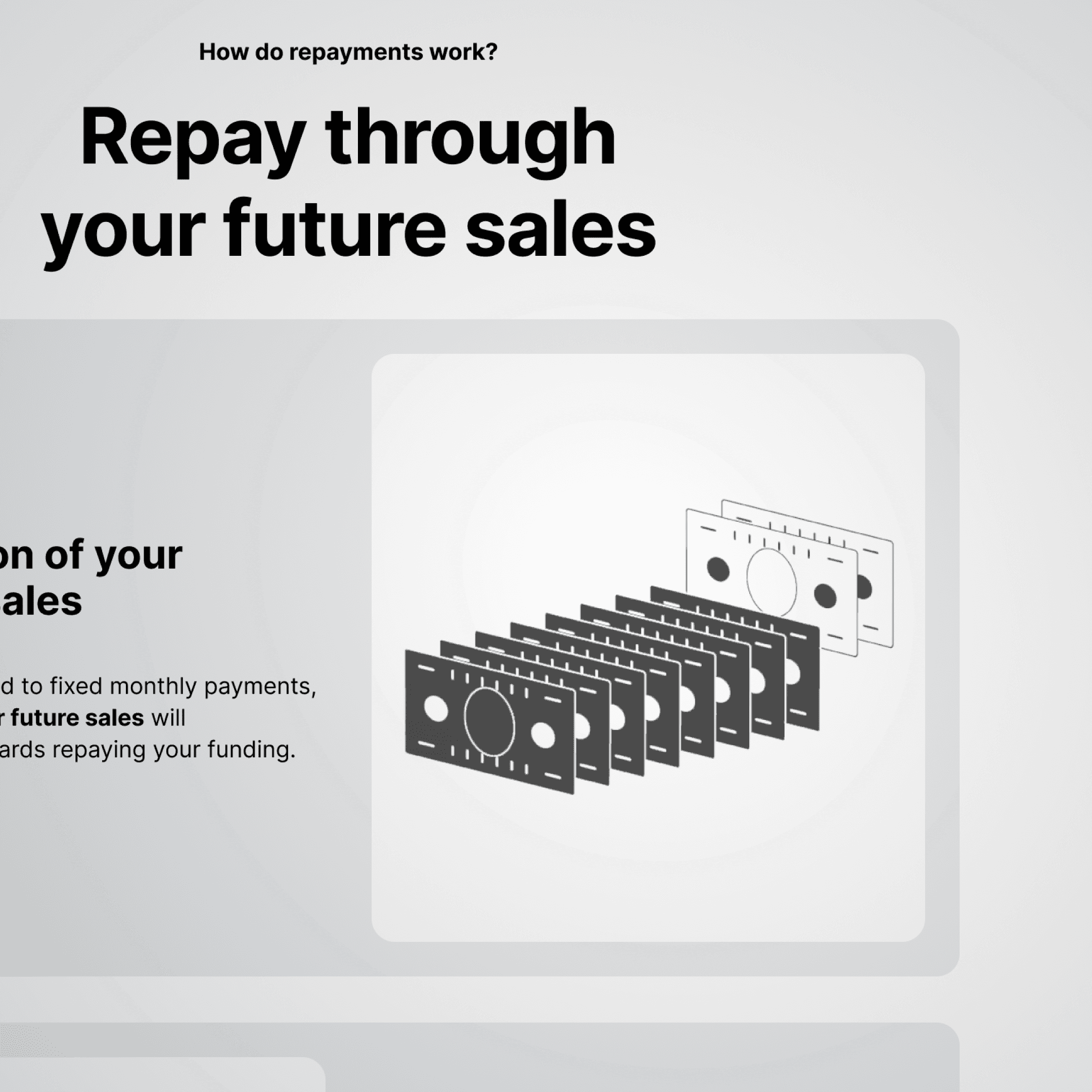
"How can we simplify repayments to make them easily understandable for everyone?"
A segment of our customers struggled to understand how our repayment system worked on their own. Insights from our customer service revealed significant "AHA!" moments when operators explained the concept and benefits of our revenue-based solution over the phone.
If we could find a way to make this concept self-explanatory for more users and generate additional "AHA!" moments at landing, we believed it could improve conversions and reducing the time and cost associated with customer support.
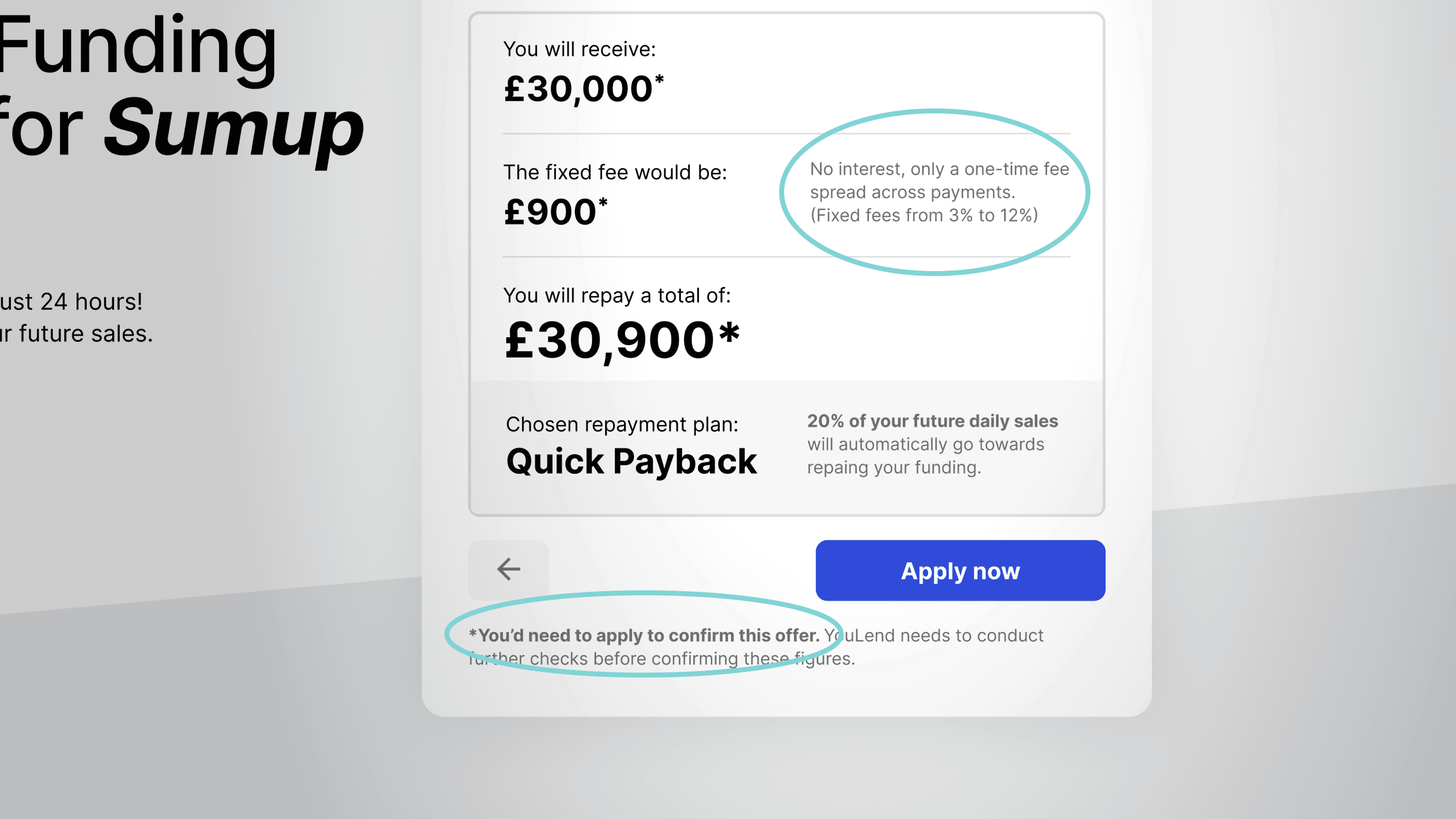
We upgraded the
loan offer simulation
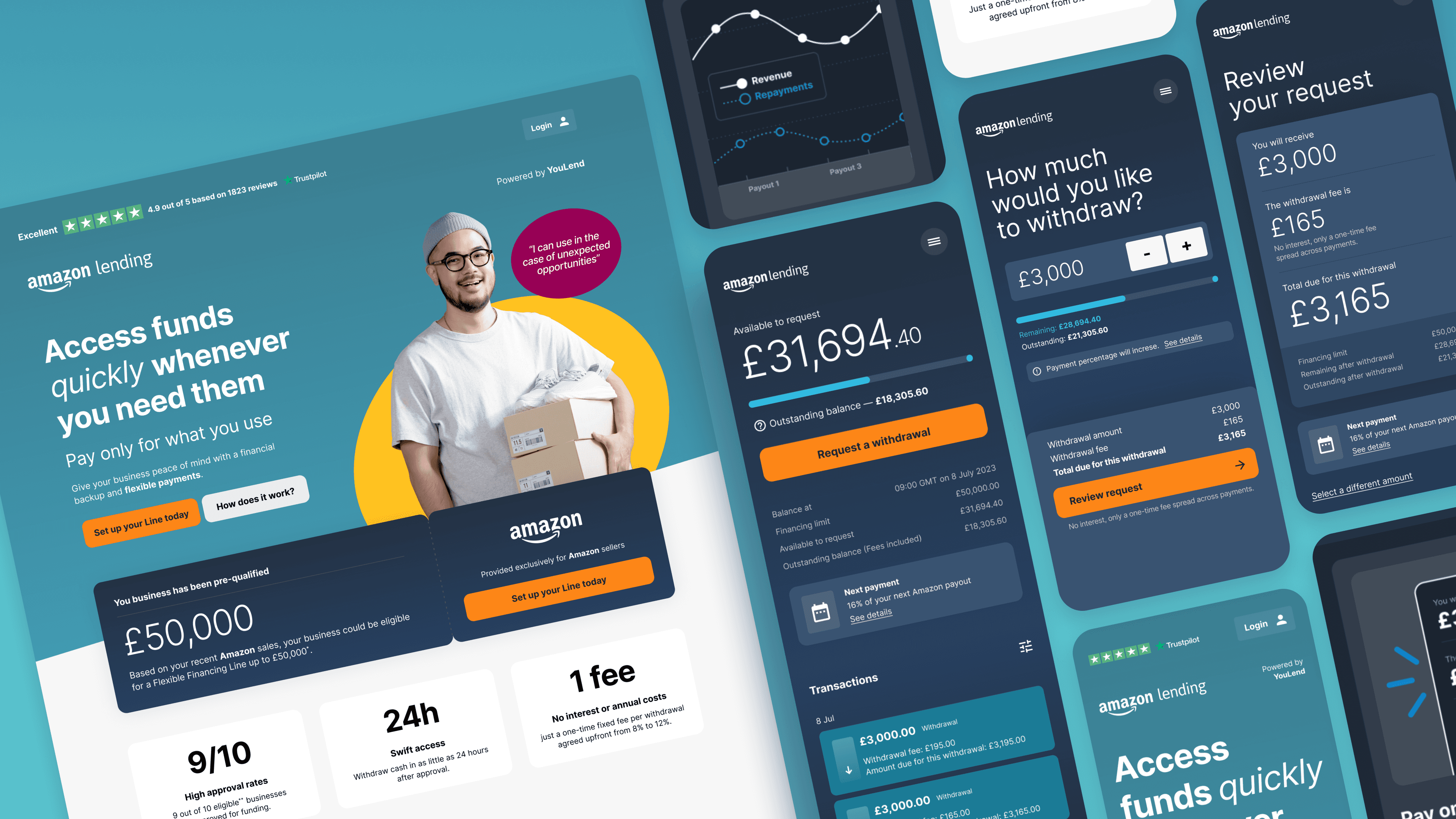
Instead of simply calculating the maximum loan amount, the new and improved loan offer simulator provided users with a comprehensive understanding of costs, the total loan amount they could obtain, and repayment options. It allowed them to experience the full journey directly on the landing page.
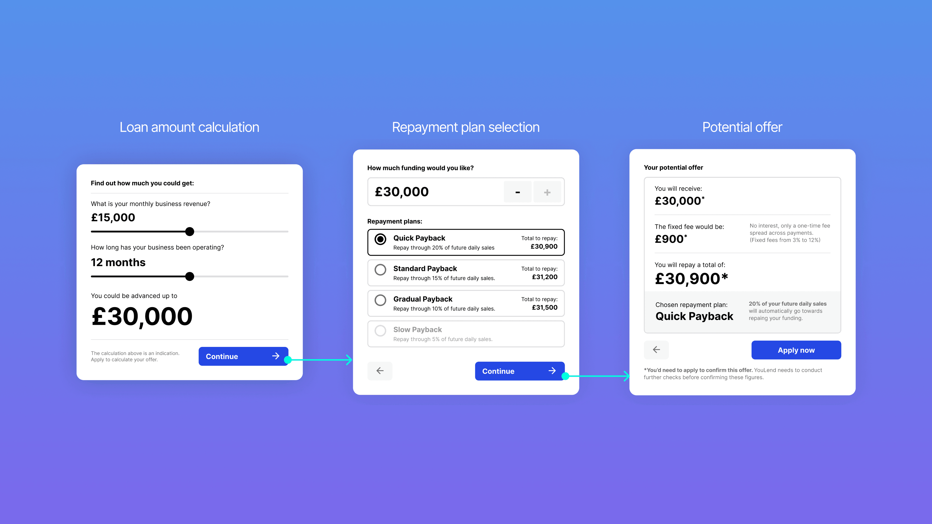
During our tests, we often observed participants interacting with the UI and tools to gather information. For instance, if asked about the fees for a larger advance, they would use the calculator instead of doing the math themselves.
The simulation proved most effective, allowing users to interact with the "offer selection" experience directly from the landing page.
Segmented information into chunks and added infographics
Insights from tests, interviews, and customer support feedback helped us optimize our repayment explanations. When explaining complex concepts to users without a finance background, it was crucial to reduce cognitive overload. Therefore, we broke down the explanations into smaller, more digestible chunks, presenting one concept at a time.
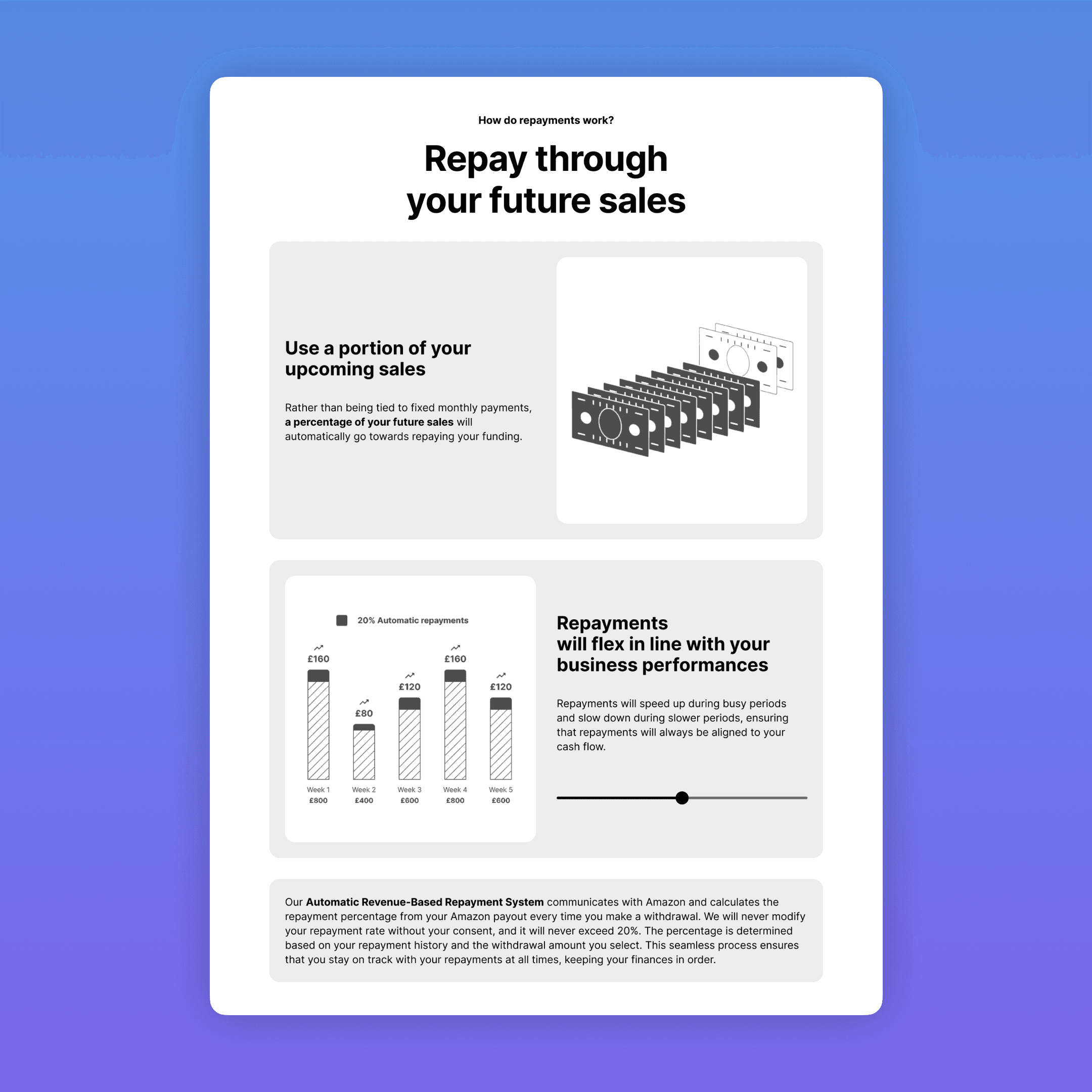
First, we explained the "sweep," which is the variable portion of income that automatically goes toward repaying the loan. Next, we demonstrated the flexibility of the repayment system spread over a longer period. We used animated and interactive infographics to clarify complex concepts and familiar terms, such as "repay through your future sales," and employed simpler language overall.
Internal disagreement
Due to prioritisation of other projects, it took about three months to estimate benefits, assess feasibility, and present the initiative convincingly. With support from key partners' UX teams, the initiative was developed and launched via an AB experiment with Optimize.
Outcome and conclusions
Uplift in submissions
The new version outperformed the original in submission rates, showing a significant improvement and potentially generating an additional £6.5 million in funding per year. However, signup numbers remained below industry standards, indicating room for further enhancement in this area.
£15k saved x year
Moreover, by filtering out customers on the landing page, we saved approximately £15k in technical and operational costs for applications.
Elevated YouLend's professionalism
The enhanced experience and designs elevated YouLend's professionalism, increasing our attractiveness as a strategic partner in the eyes of key lead generators. This ultimately led to the successful closing of significant partnerships with major companies such as Amazon, Booking.com, Etsy, Stripe, Glovo and many more.
Improved collaboration
This project also provided us with the chance to delve into the core foundations of the product, bringing design and front-end teams closer together. In addition to kickstarting ongoing discussions about a shared view of Angular components, this project allowed us to implement a more robust layout system that is easy to modify, replicate. The new landing experience seamlessly integrates with every partner's brand colour variables, both for new and current partners. We meticulously studied the colour system to ensure sufficient contrast and compliance with WCAG regulations at all times
There was much more to do…
There was much more to do as we still didn’t know why signup rates were underperforming. Categorising all different entry points and diving deeper into individual partner data was fundamental.

Context
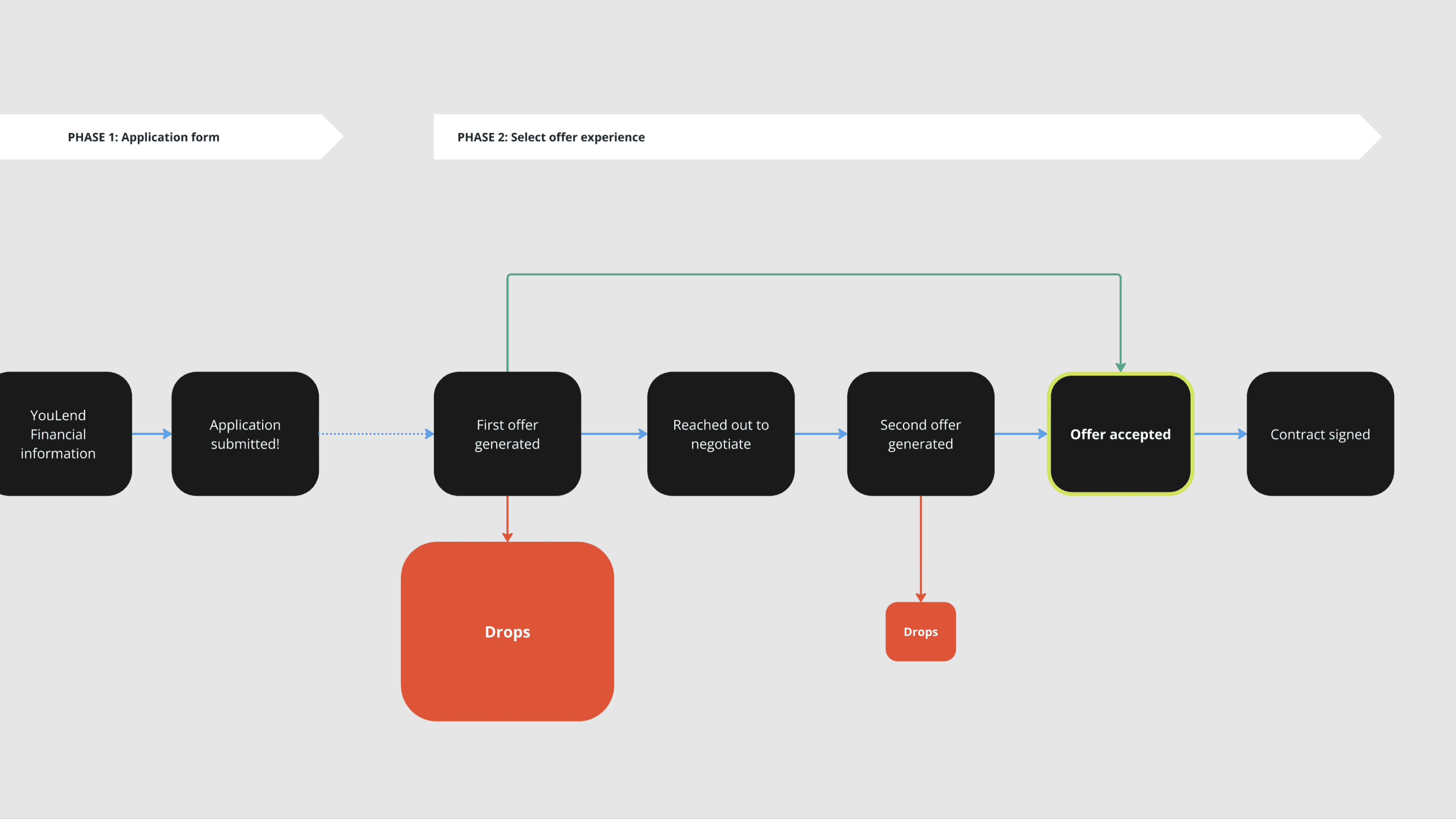
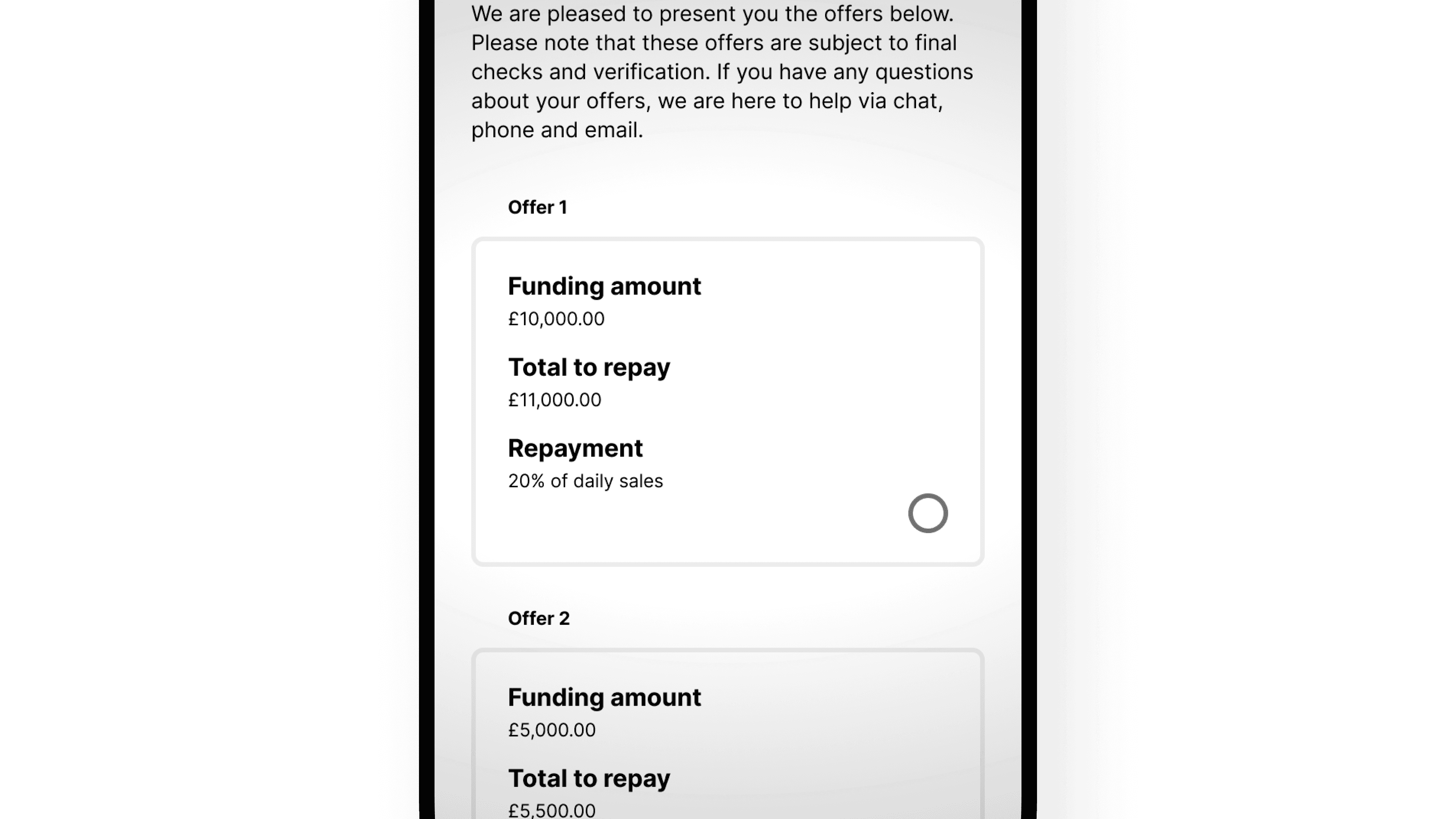
A critical area of the acquisition funnel involved the stage after users submitted their applications the “Select Offer Experience”
After submission, YouLend evaluates the application and makes a decision. If accepted, YouLend provides three offers for the user to choose from.
A final conversion occurs when a YouLend offer is accepted by the customer.

Problems
YouLend's final conversion rate in Q2 2022 was much lower than expected
Stakeholders prioritised this area because conversions were below industry standards, with many customers taking no action or declining after being approved. While the industry standard for offer acceptance was around 80%, YouLend's conversion rate in Q2 2022 was significantly lower.
Many customers who accepted offers initially pushed back the first offer provided
A segment of approved customers reached out to YouLend after receiving the initial offer to negotiate fees and terms. Often, YouLend could generate a new offer if the negotiation fell within a certain range.
Each pushback required 8-10 minutes of our sales team’s time to discuss and create modified offers through our CRM system
Along with improving conversions, saving time and reducing costs were the most important aspects we aimed to address.
Hypothesis
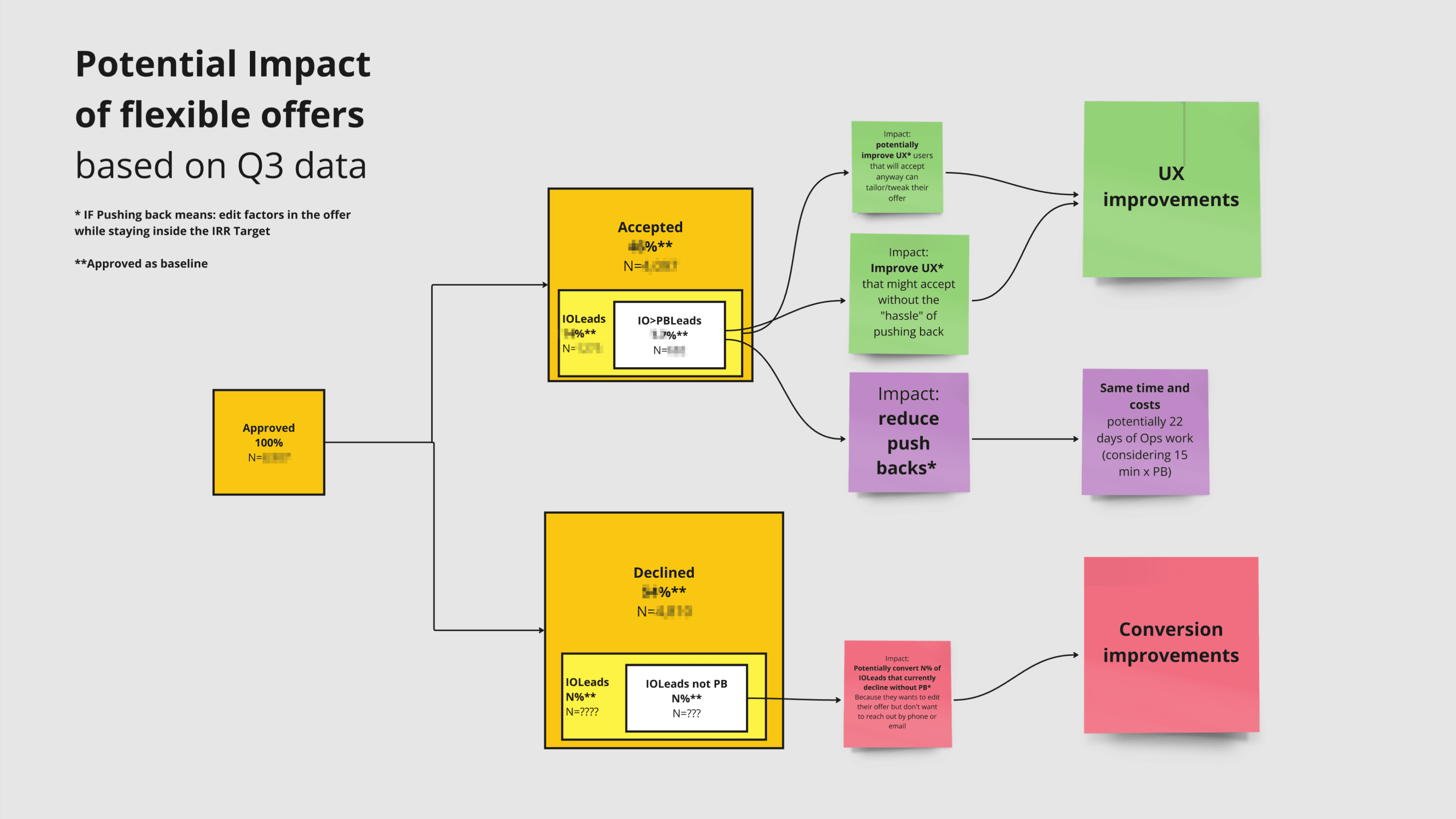
Allowing customers to modify their offers independently
We initially thought that many customers who declined the offer wanted to negotiate but didn’t bother to reach out to YouLend by phone or email, perhaps due to a lack of confidence in negotiating. Numbers showed that a significant portion of conversions came from negotiated offers rather than the originally generated ones.
Allowing customers to interact with a flexible offer and providing options at this stage was a certain upgrade to reduce manual intervention in pushbacks. By adding flexibility to our product and allowing customers to modify their offers independently, we also believed this would address the low conversion rate.
Deeper Analysis
When I joined the team, I wasn’t convinced this intervention alone would solve the conversion problem.
We only looked at data from leads that ended up accepting an offer
I wasn’t convinced because we only analysed data from leads that accepted an offer. Gathering similar data for leads that didn’t accept an offer was challenging at the time. However, to get a complete picture, we needed to understand how many users declined an offer in the YouLend range, which couldn't be resolved with flexible offers. I worried we were focusing entirely on one initiative without considering other hidden issues.
Eventually I was able to get everyone back to the drawing board for a review.
In-depth data analysis revealed that pushbacks might not be the key factor in users declining offers
Additionally, traffic volumes suggested that the proposed intervention alone couldn’t address the significant drop in conversions. Apparently, something else was affecting conversions.
Further investigation
We needed to investigate further to avoid wasting time and effort later by focusing on a solution without a clear understanding of the problem
We decided to employ four different methods to assess the situation, identify major issues affecting conversion rates, and gather evidence to determine if the proposed solution was effective.
01 — Live Feedback
We implemented a feature that allows customers to discuss their options without needing to call us
This was a quick intervention by using Hotjar.
When pressed, a dialog box appeared, allowing customers to select a topic they wanted to discuss: loan amount, fees, repayments, or other issues, with an optional text field for additional details.
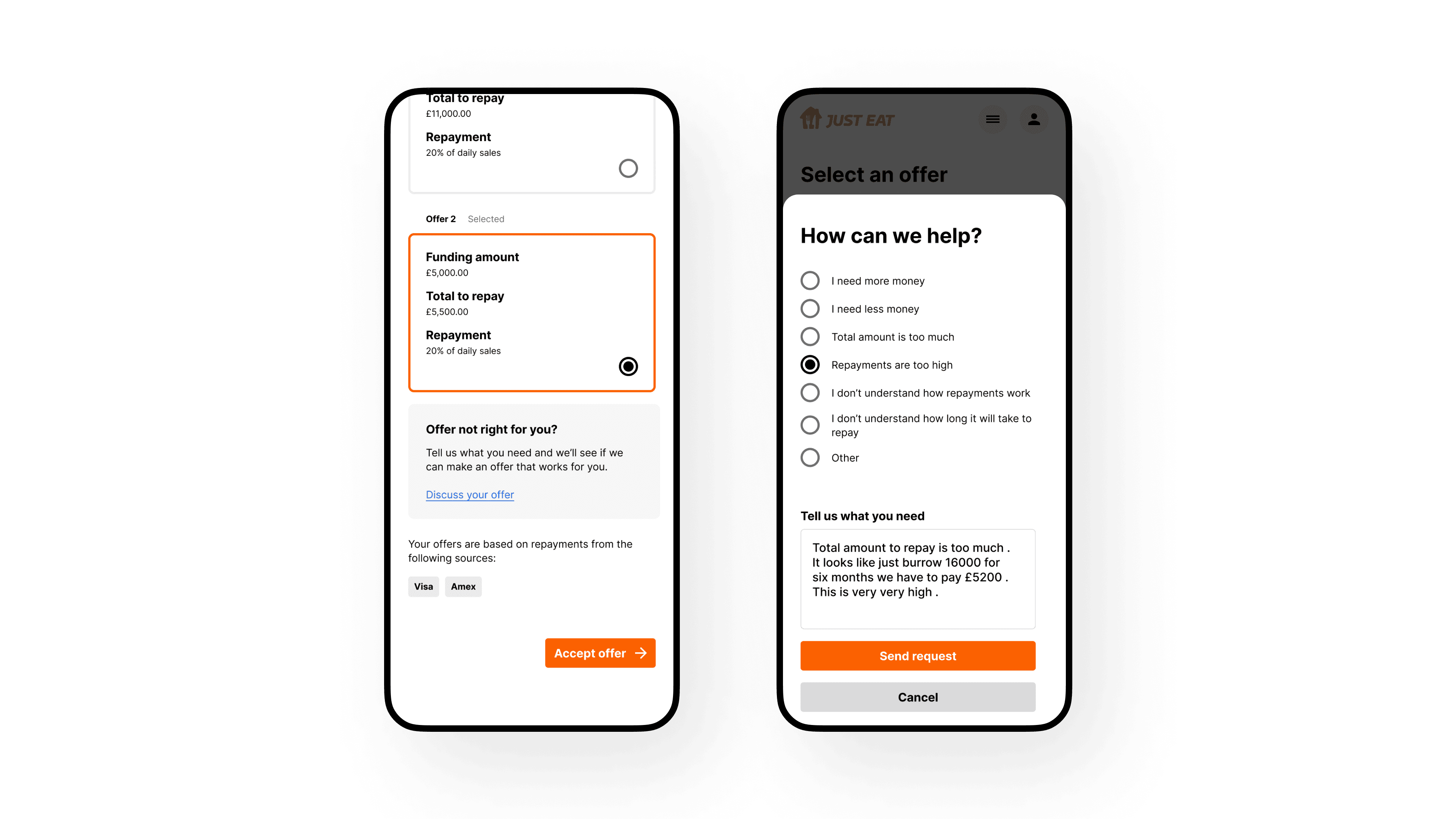
By tracking this feature, we could understand which modification users wanted within our range or beyond what we could offer. Additionally, we could start reaching out to these users by phone to potentially offer them a better deal.
The live feedback confirmed a mix of pushback reasons, with a consistent percentage being within our range, reinforcing the validity of making offers flexible anyway
Many customers used the form to inquire about repayments, indicating uncertainty about how the repayment process worked. The live feedback also enabled us to promptly call back and engage with hesitant customers who might not have reached out to YouLend on their own.
02 — Marketing email analysis
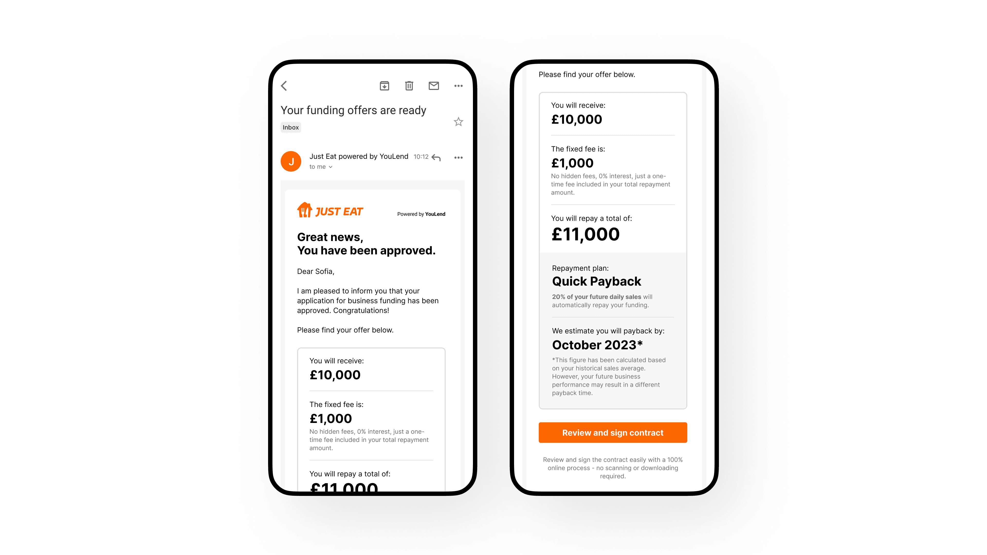
Technical issues, emails being lost in spam folders, login problems, and ineffective email subjects might be impacting the accessibility of offers
When a customer was approved to access their offer, they needed to open an automatic email generated by our system, click the “Review offers” link, and log in. We hypothesised that some traffic might be lost during this part of the process, affecting conversions.
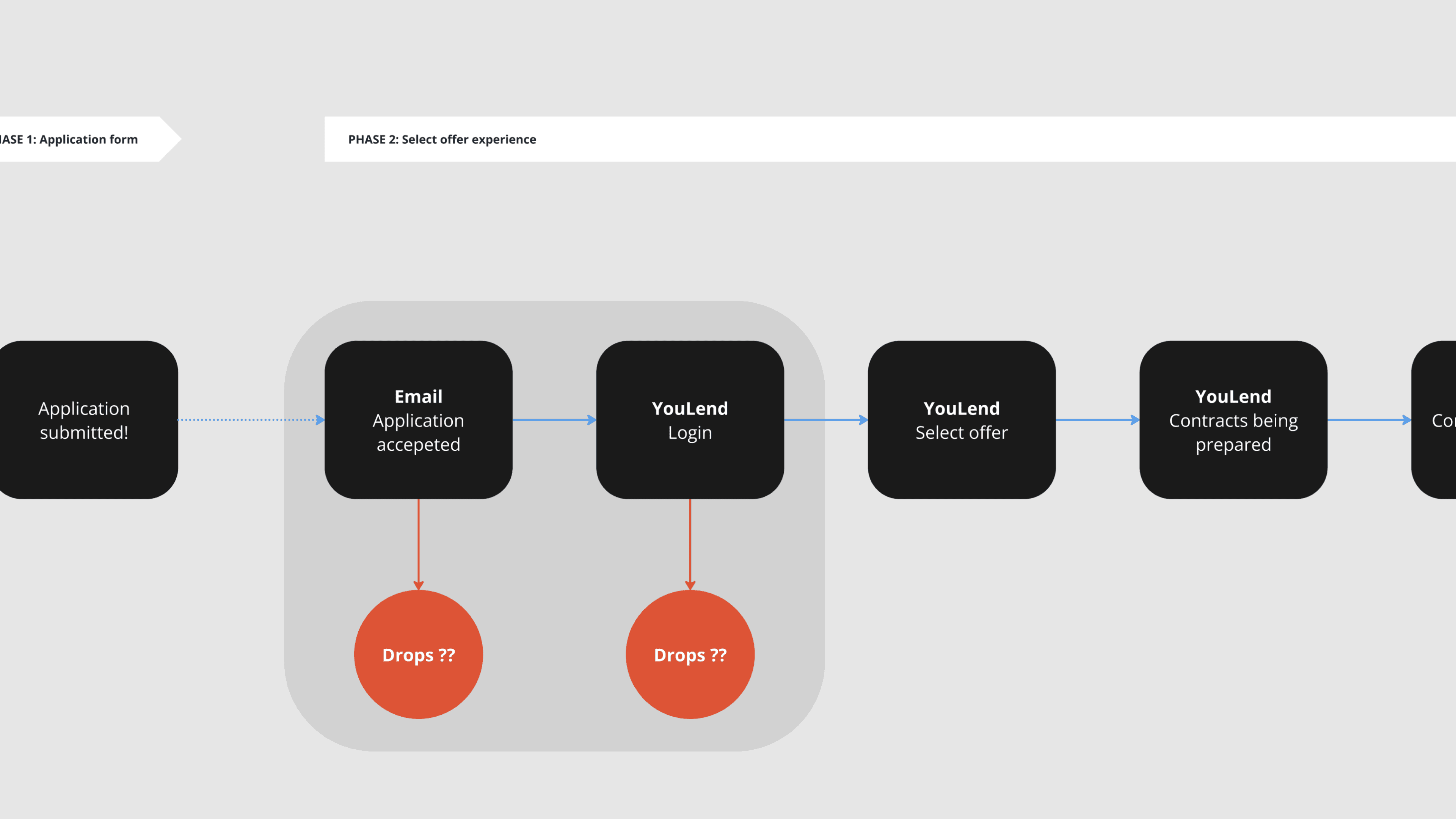
To investigate, we analysed data from our email marketing tool and found that a significant number of leads didn’t engage with the emails. We discovered that a large portion of approved emails did not generate any clicks, even though there were no major issues with open rates and logins.
We questioned why customers were opening the emails but not clicking to explore their offers. Lacking the ability to perform A/B testing on these emails, we began making weekly changes to the email content to gauge any effects.
We noticed a positive trend when we included some offer details directly in the emails
Although we are still unsure about the exact reason for this behaviour, we believe it might be related to motivation—customers who found our offering appealing were more likely to engage.
03 — Usability test
We also aimed to evaluate the current “Select Offer Experience” usability
To do this, we tested the existing experience. The unmoderated user tests focused on identifying usability issues, detecting missing crucial information, finding potential interventions to improve the customer experience, and evaluating the necessity of a flexible offer solution at this stage.
The experience had significant room for improvement in terms of usability, information clarity, and flexibility, which was also deemed useful
Number breakdown
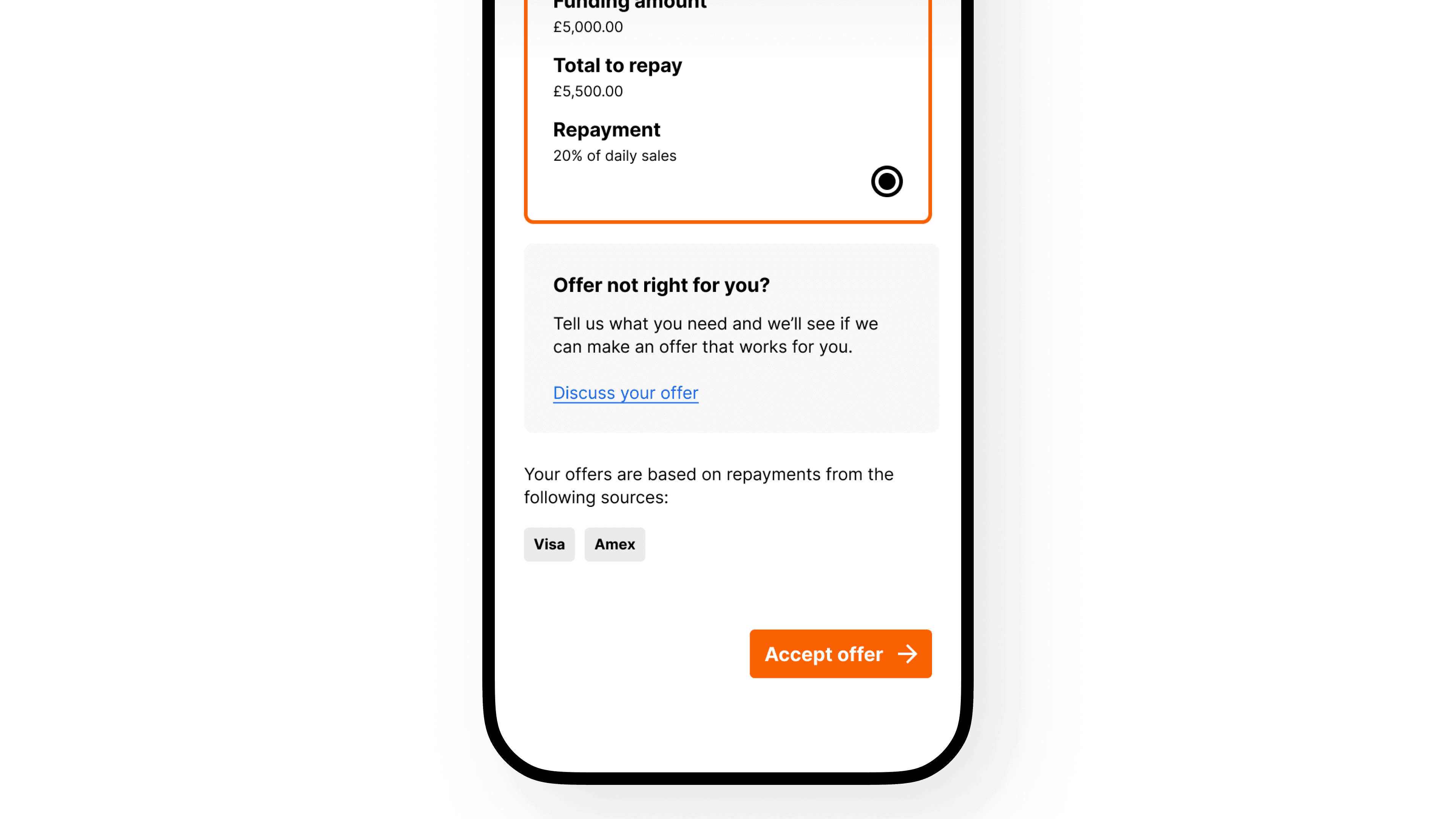
Each offer card featured the total amount and total repayment, forcing customers to do the maths to understand the fees
This unnecessary complication made the experience less transparent. It seemed beneficial to clearly display the fee breakdown with the equivalent interest rate to help users evaluate the loan offers. Additionally, it was important to ensure customers were aware that there would be no extra costs applied to the loan.
Clarity Around Repayments
Participants expressed a need for more clarity regarding revenue-based repayments, particularly concerning shortfall scenarios and fluctuations in sales.
Missing Confirmation Step
Customers expected to see a confirmation step, with more information and a potential FAQ section and terms and conditions. The experience was perceived as too rushed and unclear.
Customization of Loan Amounts
Participants showed a clear expectation of being able to customise their loan amounts to meet their specific needs. This includes adjusting the total loan amount and having different repayment options.
04 — Interviews
We interviewed old customers that declined an offer
We interviewed nine leads who had previously declined an offer to understand their reasons more deeply. It was challenging to determine the reasons for declining from the CRM, as the available categories were too generic.
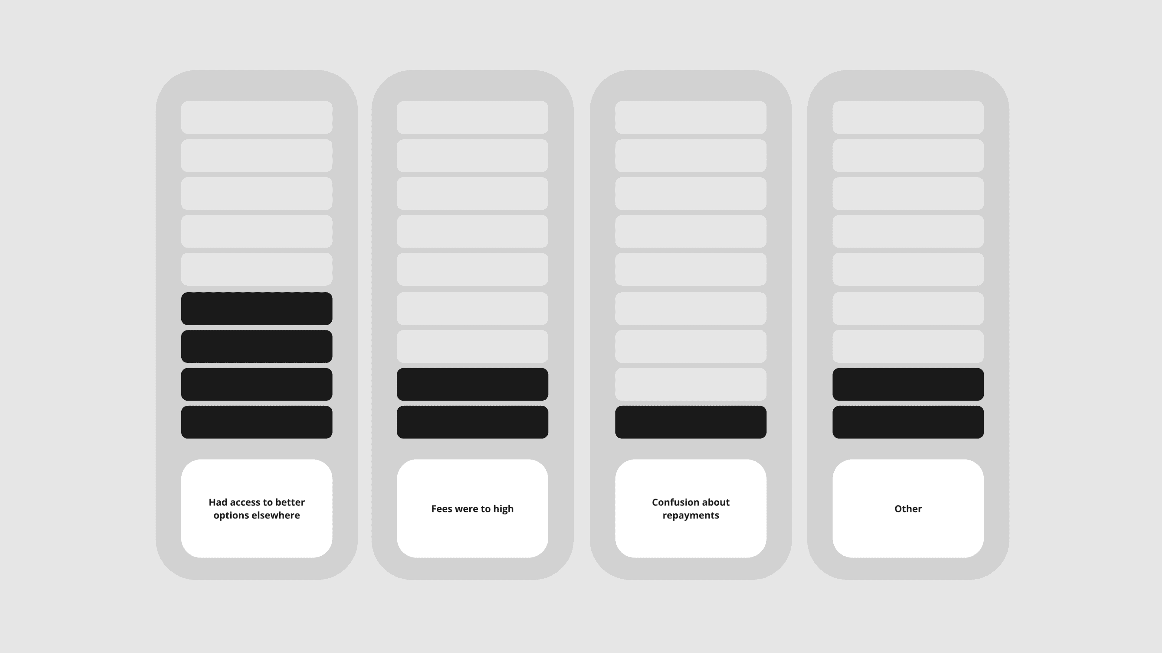
Four out of nine customers had better options elsewhere, which was the main reason they declined the offer. Two out of nine customers thought the fees were too high and abandoned the process. One customer was sceptical about the repayment process and didn’t understand how YouLend’s system worked; however, once it was explained, they found it attractive.
We identified promising patterns that helped us form a new hypothesis to explain the low conversion rates
New Hypothesis
Our conversion rate might
not be as low as it seemed
Customers needed to complete the application journey to view the final offer and understand the total amount they could receive, along with the associated fees. Unlike competitors who provided more information upfront, potentially increasing their industry-standard rates, our process required customers to engage more deeply before seeing detailed offer information
This "non-skimming" approach might have negatively impacted our conversion numbers. Essentially, we were comparing two rates without accounting for the confounding aspect of the skimming process.
This new hypothesis was developed by analysing insights from various studies. For more details on the skimming process, see Story 01 — Boosting Submissions.
The design & usability
could be improved
Issues with email presentation, granular problems with design and user experience, and confusion about our non-traditional repayment system were potentially negatively influencing our numbers.
Full redesign
The brand new
“Select Offer Experience”
Informed by these insights and aiming to align our experience with a higher standard of usability, we decided not only to implement the original initiative of allowing users to modify their flexible offers within our ranges but also to completely re-architect the whole experience.
Throughout the design sprint, we have been engaging in a continuous feedback loop between design iterations and usability testing. This process has allowed us to iterate designs multiple times and refine the user experience.
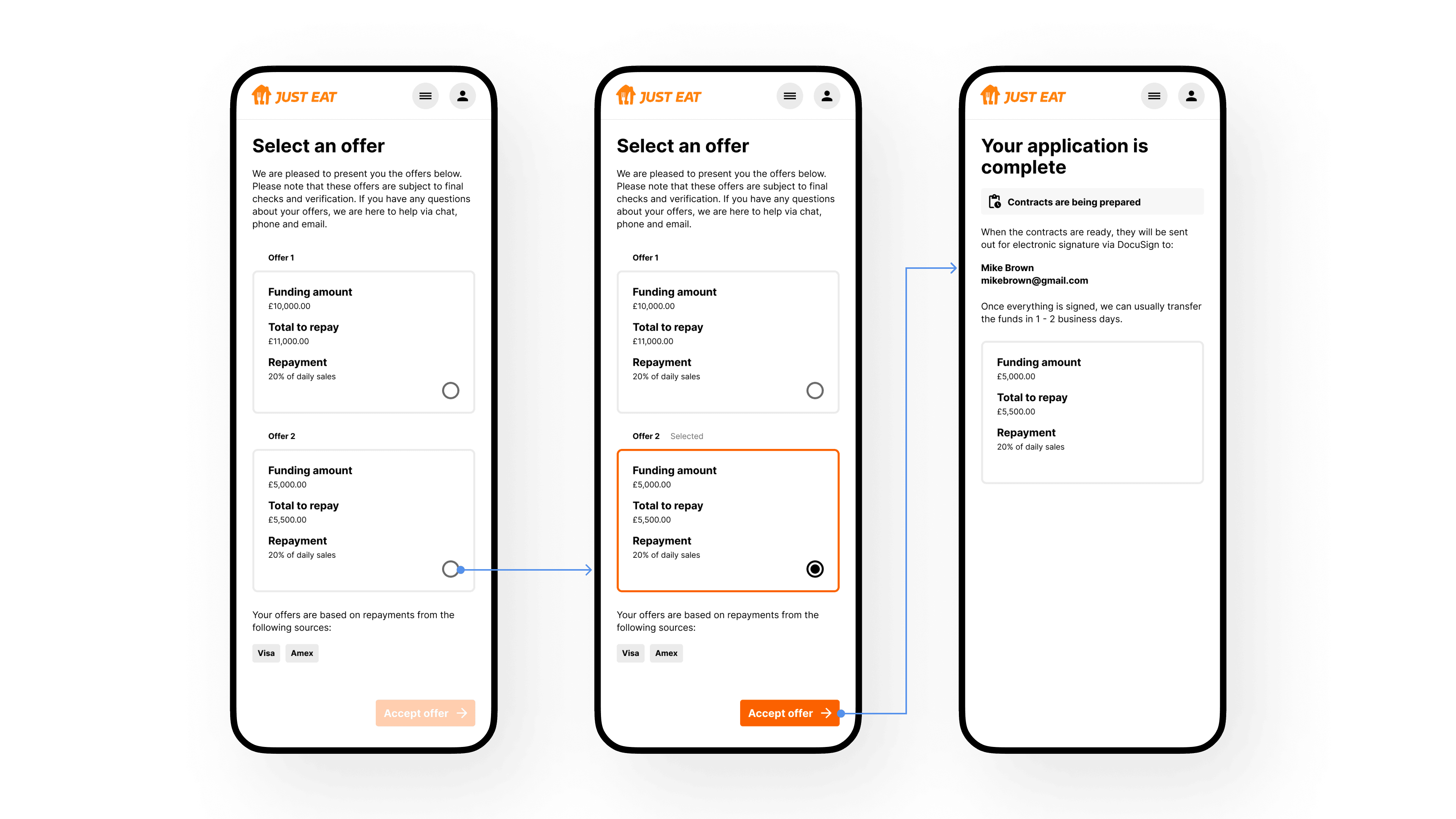
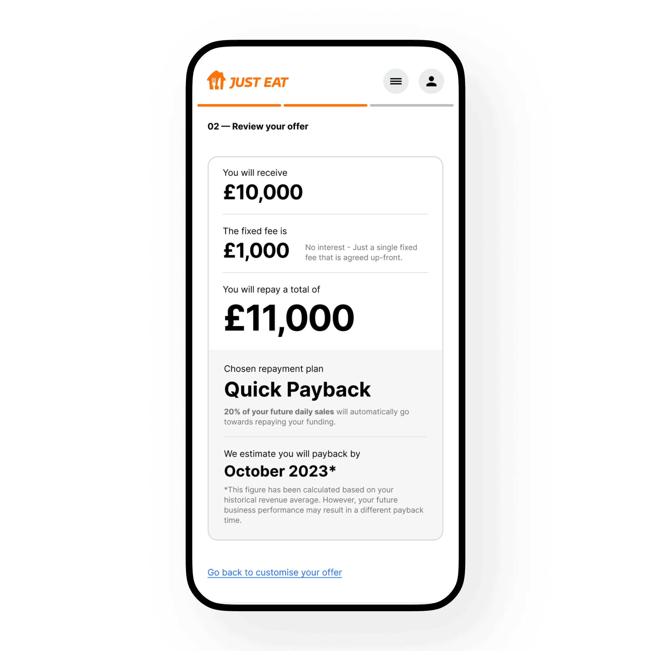
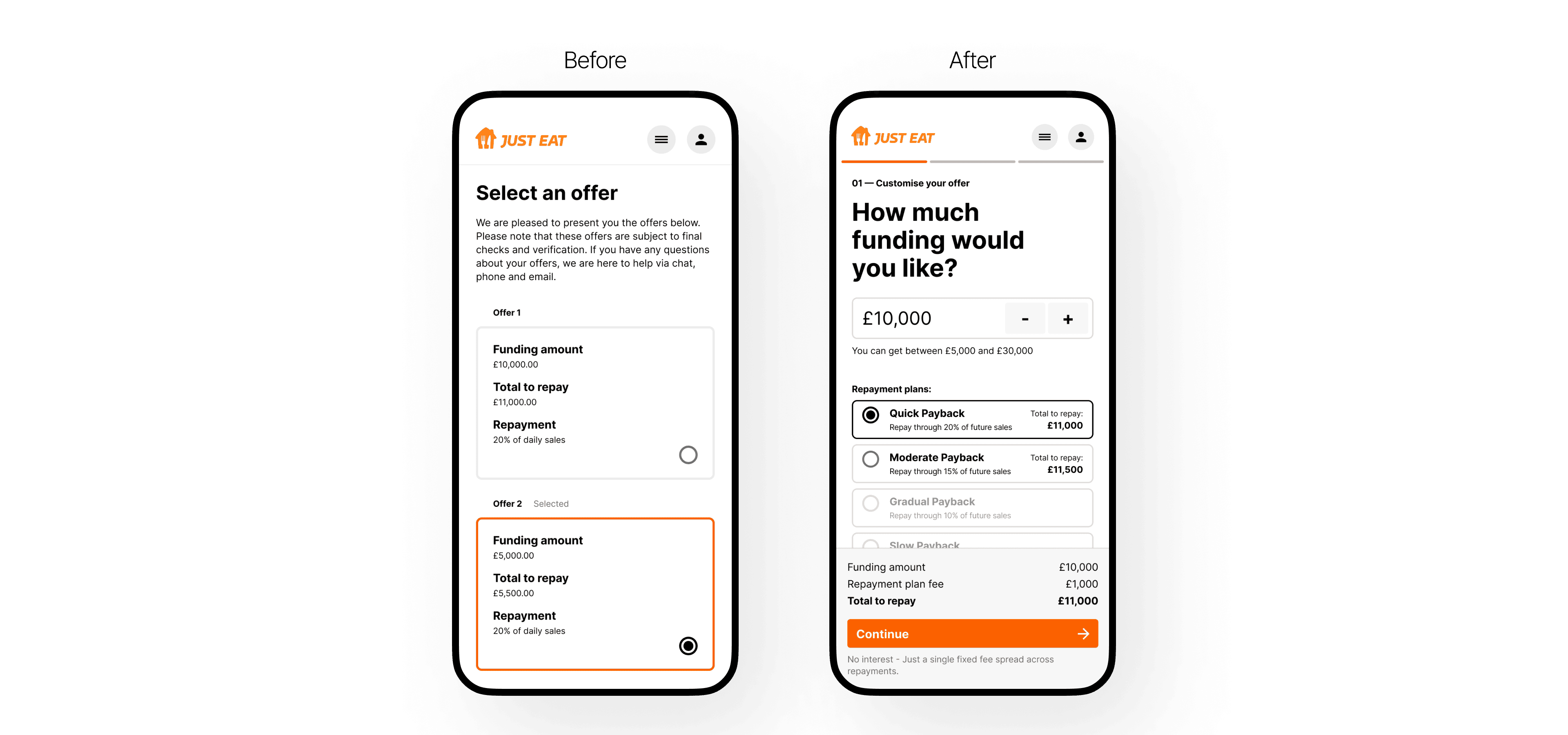
Familiar and reassuring
We completely re-architected the user journey using a traditional "checkout" pattern
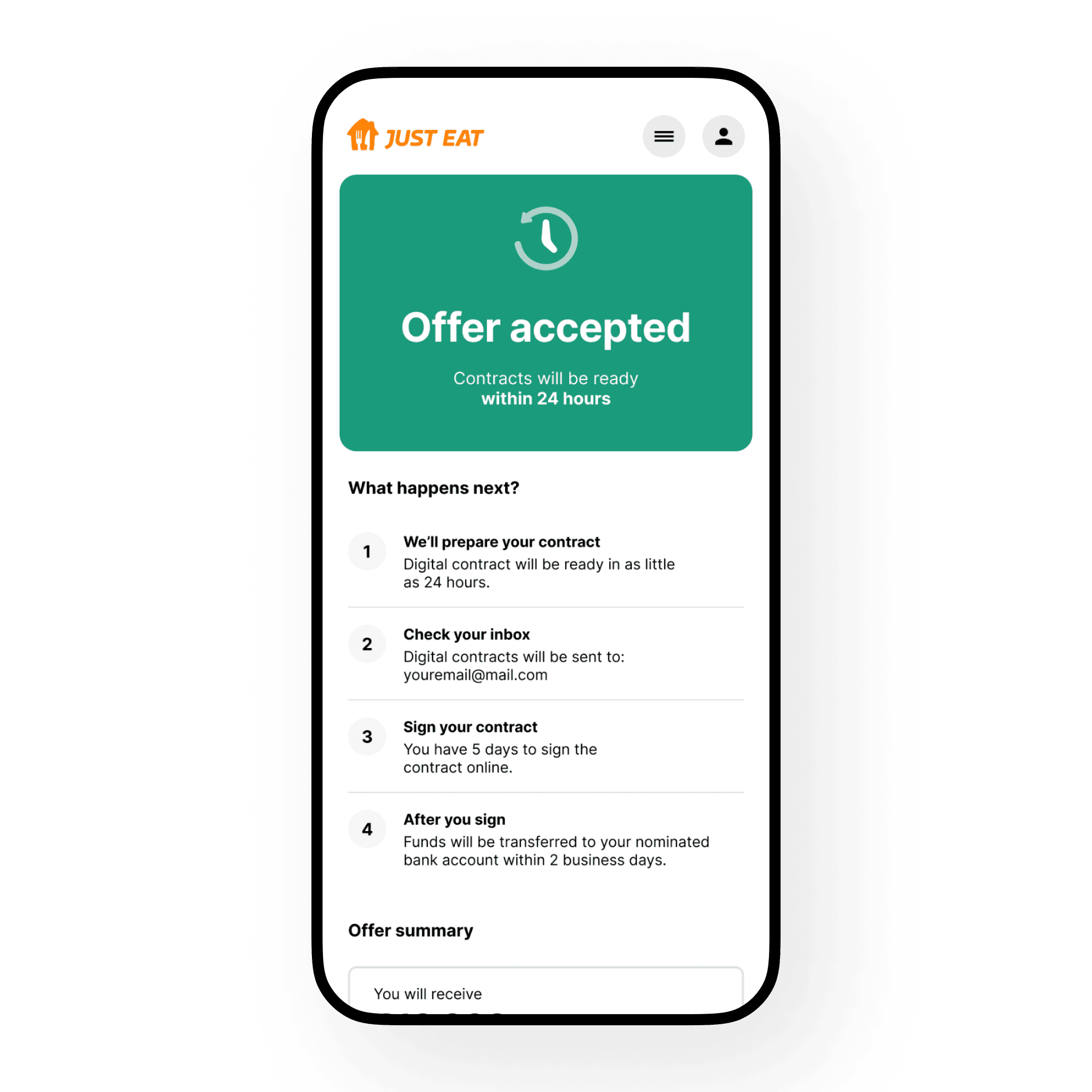
Since selecting an offer in our customer experience is akin to purchasing something expensive, we implemented a familiar "checkout" process. This included a cart, a review screen before confirmation, and a clear thank-you page with the next steps.
In testing, we found that this new "checkout" pattern improved customer orientation and engagement. In comparison to the original experience, the new one appeared to provide customers with all the essential information needed to make informed decisions.
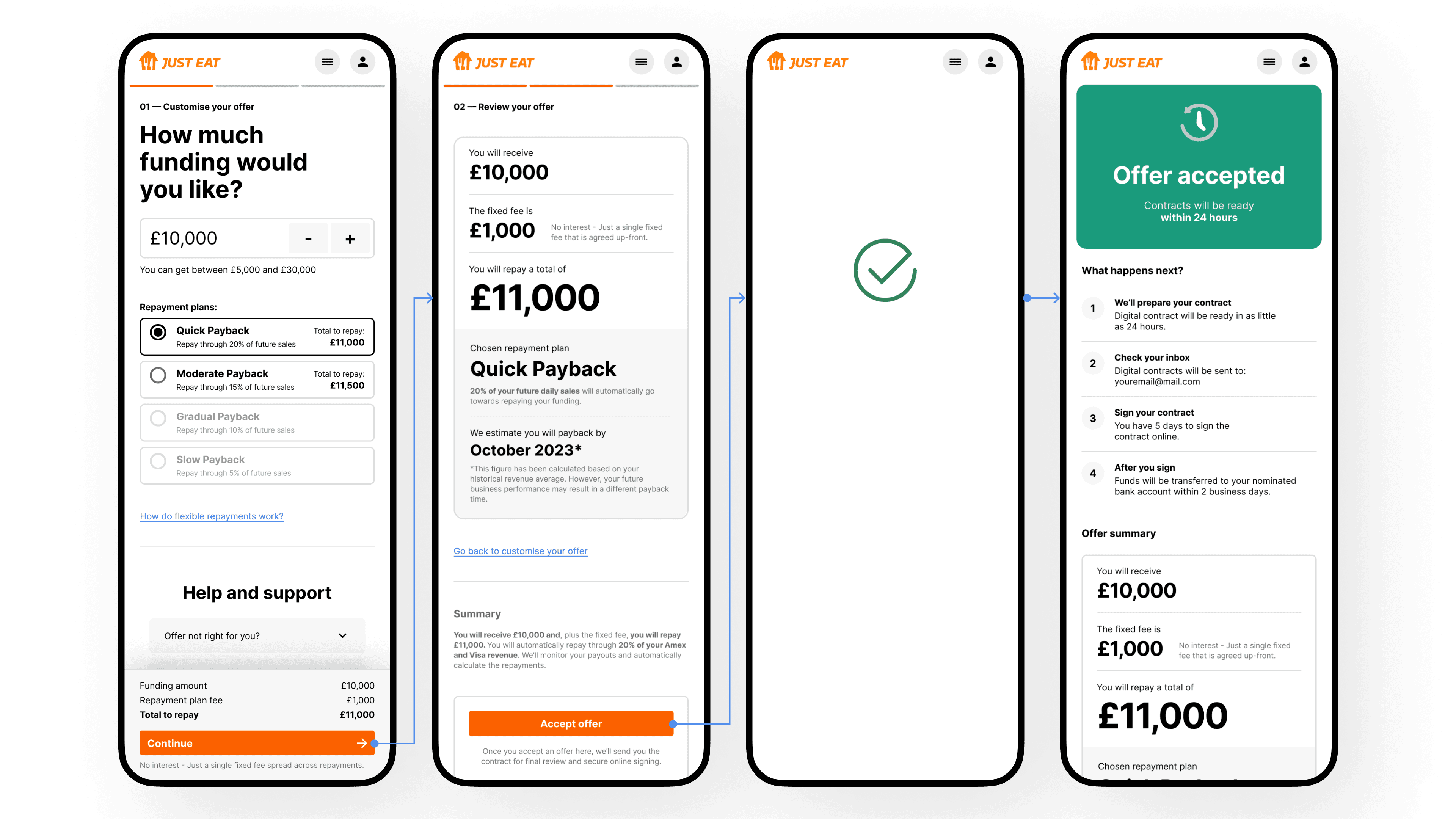
We noticed that customers frequently navigated between the customization and review screens. To address this, we made design adjustments in subsequent iterations to minimise the need for back-and-forth navigation.
These improvements helped create a more seamless and transparent experience, fostering greater trust and confidence among our customers.
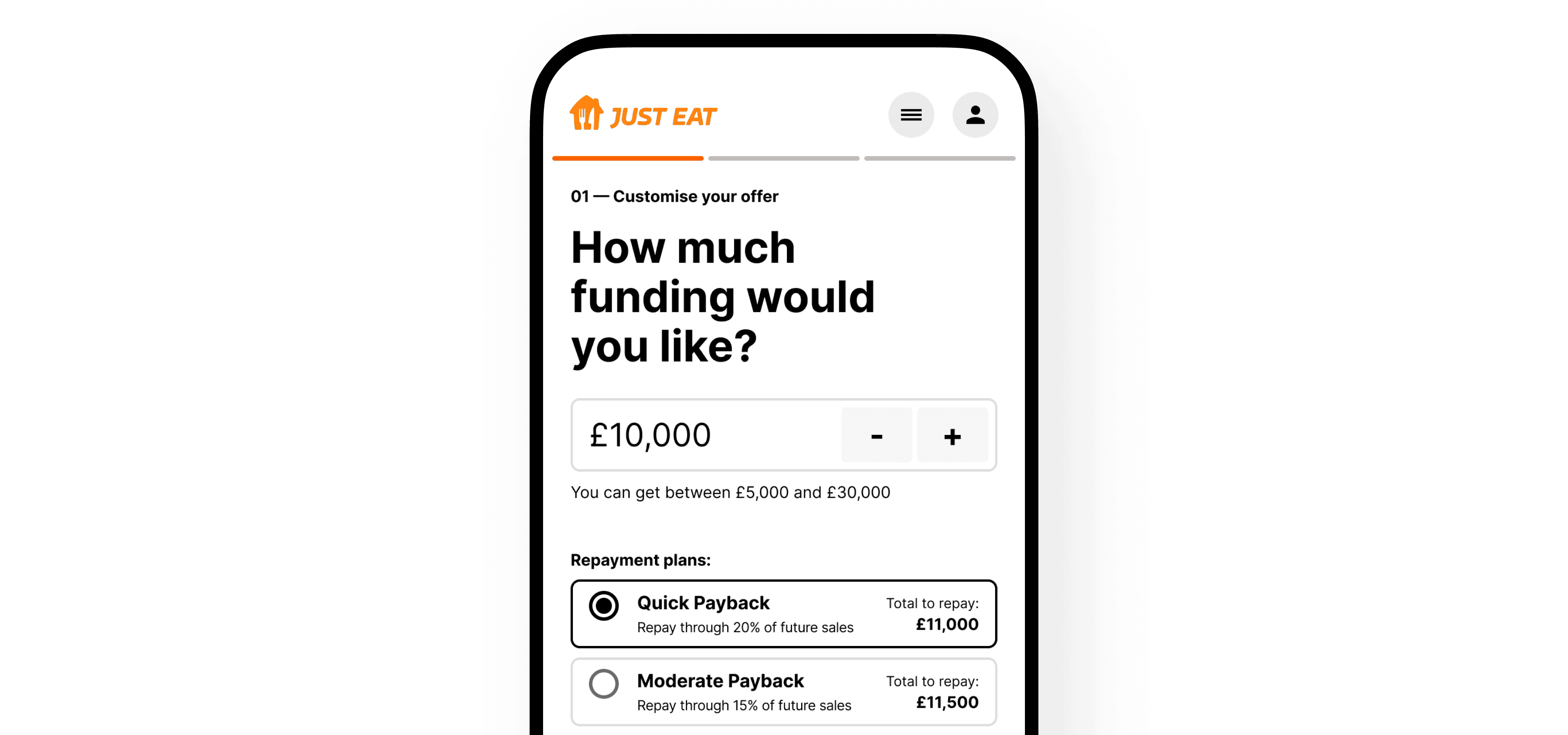
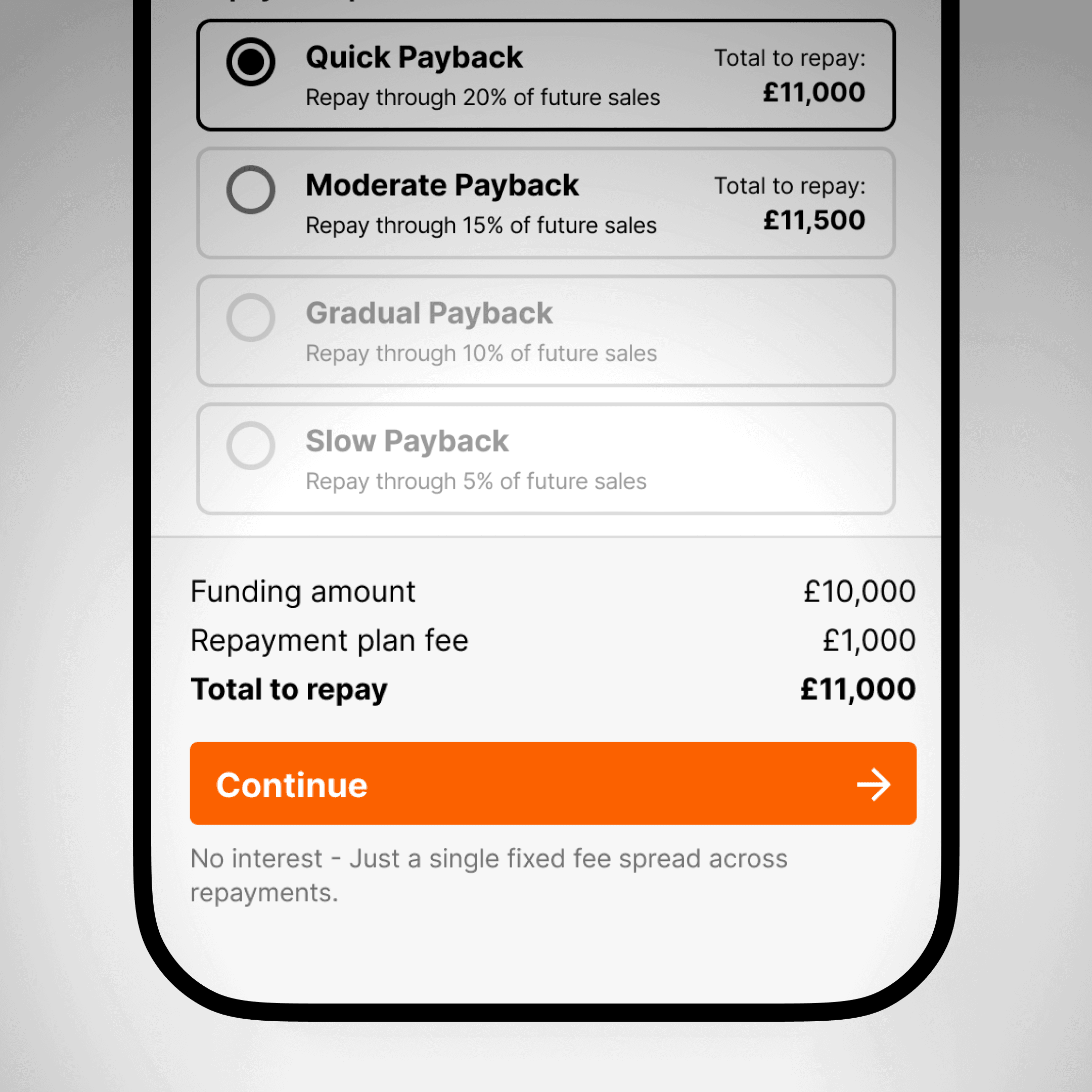
Customisation Interaction
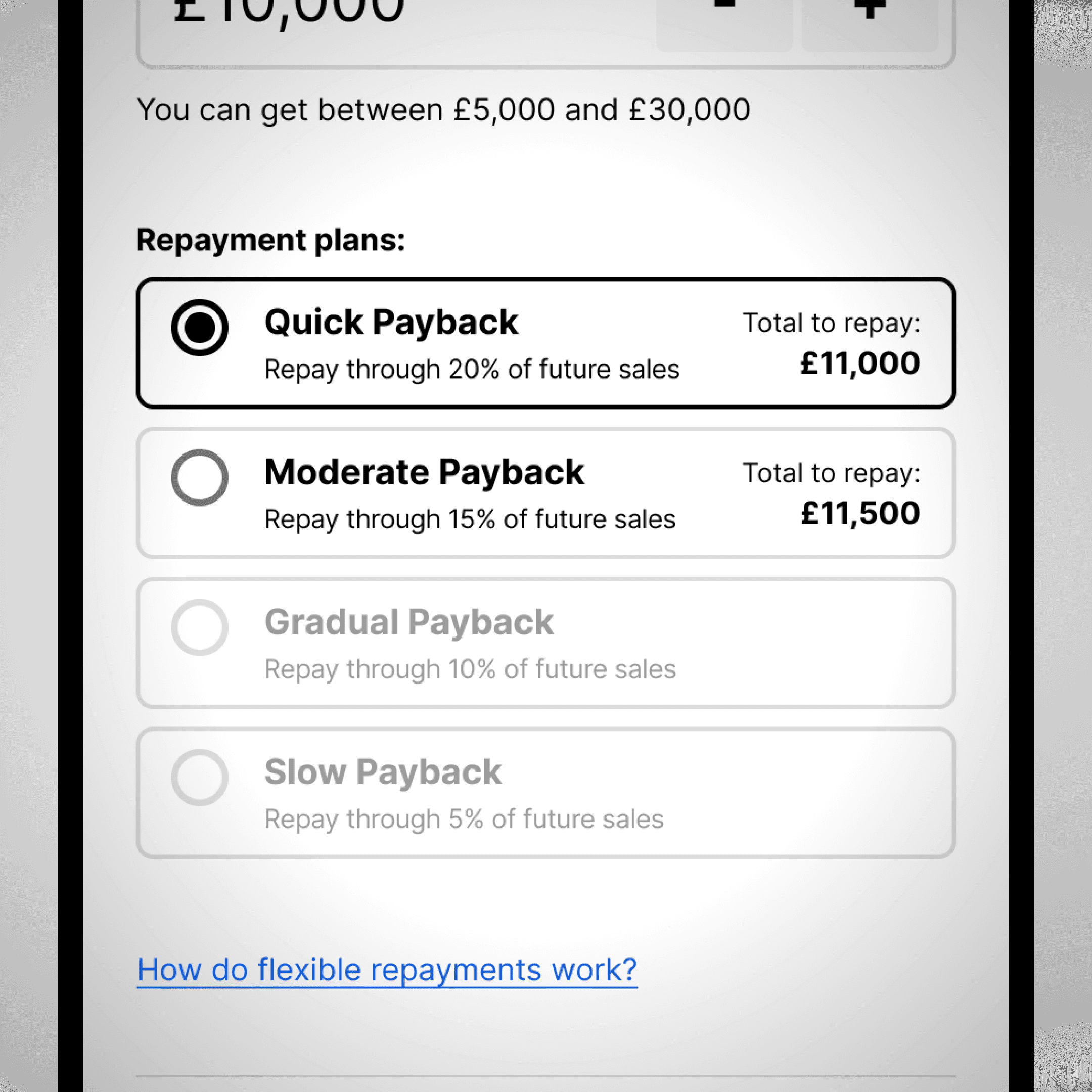
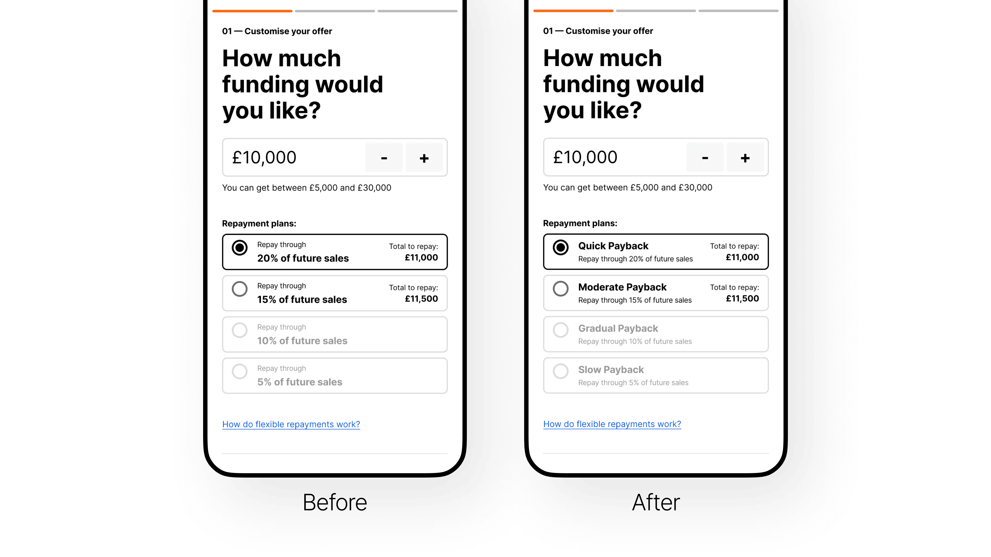
The new numerator component was intuitively discovered and used by all participants
The ability to easily adjust the amount needed and compare different repayment plans provides greater control and flexibility in customer’s repayment strategies.
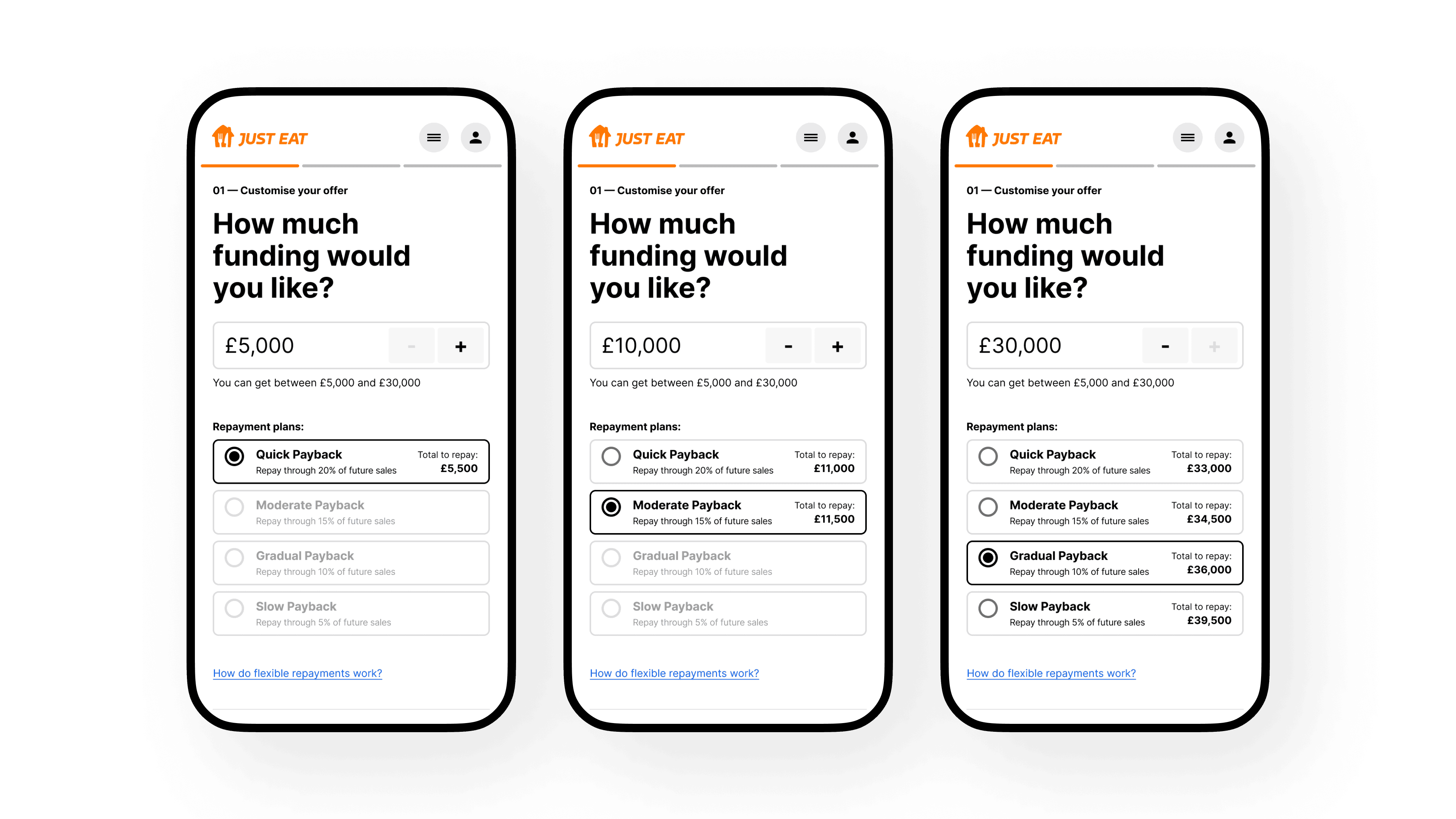
To reach this point, we tested numerous combinations. The main challenge was to ensure everything remained visible: the numerator, the varying repayment plans based on the selected amount, and a breakdown of key figures.
User-Friendly Taxonomy
A recurring issue was customers confusing the repayment percentage with the interest rate
Typically, loan percentages are perceived as interest rates, whereas repayments are fixed amounts. YouLend's revenue-based repayment system uses a percentage to represent the proportion of income allocated for automatic repayments, along with a fixed fee, which led to confusion.
This subtle issue seemed difficult to resolve. We addressed it by rebranding our repayment plans with more intuitive labels. Instead of using percentages, we introduced repayment speed labels. This change proved to be much more user-friendly and effectively reduced confusion, as fewer participants mistook repayment percentages for interest rates.
Deeper Understanding
Most participants grasped the main concept of YouLend, but some critical aspects, such as shortfall scenarios, one-off repayments, and the flow of funds, may need more visibility.
Clarity Around Fees
Despite several iterations, we observed that the fees associated with the service might still require further clarification. Since we couldn’t fully address this during our sprints, additional research was needed to determine the most effective way to communicate this information.
Customers could navigate the borrowing process with greater confidence and choose a plan that best meets their needs. Overall, this enhanced experience empowered customers to make more informed financial decisions and fostered a more positive user experience.
Conclusions
Further analysis revealed that the no-skimming approach at landing was negatively impacting our conversion numbers
When this factor was considered, the negative gap in our conversion rate was significantly reduced.
This project provided an excellent opportunity to make substantial improvements to many design aspects of this segment of the experience. As noted in the overall achievements at YouLend, we observed a general uplift in conversions. Although measuring the precise impact of this initiative was challenging, we believe that the design and UX improvements were among the most influential factors.
Saved 1.2 FTE in Sales
We also estimate that enabling customers to autonomously adjust their offers resulted in a savings of 1.2 full-time equivalents (FTE) in the Sales department.