New Financing Line for Amazon sellers

In April 2023, we partnered with Amazon to transform seller financing. By August 2023, we launched a new Financing Line, funding £1.8M within 6 weeks.

The information provided in this case study represents my own views and may not necessarily represent the opinions of Amazon and YouLend.

Preview of several Amazon Lending user interfaces.

Project brief

A new financial product to support Amazon sellers and help them grow

Amazon shortlisted several companies, and I teamed up with YouLend's CCO Jakob Pethick and Head of Commercial Andy Quach to complete the RFP. Our goal was to present a compelling prototype showcasing our proposal.

With great anticipation, we were delighted when YouLend won the pitch and was selected for an exclusive partnership with Amazon.

Client

Amazon

Project timeline

Apr 23 — Aug 23

My Role

Lead Product Designer

My Contribution

Product Strategy, User Research, User Testing, Information architecture, User Flows, Visual Design, Interaction Design, Prototypes, Design specifications

Contributors

CCO, Head of Commercial, Product & Scrums, Legal team

Platform

Web, Angular

Challenges

The main challenge was adapting our traditional cash advance into a Line of Credit tailored for Amazon sellers

Amazon's research revealed that their customers were more likely to need a product that featured line of credit benefits, allowing access to funds as needed.

The biggest challenge was to create a brand-new product with these characteristics specifically for Amazon sellers, by adapting our existing traditional cash advance product into a Line of Credit (LoC) product, which we named the Flexible Financing Line.

In Amazon's survey, 83% of respondents favored a Line of Credit product as the most suitable solution, significantly surpassing other proposed options. Meanwhile, 78% of eBay respondents expressed interest in a Line of Credit solution, with 76% preferring a financial product that enables on-demand access to funds.

In Amazon's survey, 83% of respondents favored a Line of Credit product as the most suitable solution, significantly surpassing other proposed options. Meanwhile, we launched our own survey targeting YouLend's eCommerce merchants, who share similar characteristics with Amazon sellers. The results showed that 78% of eBay respondents were interested in a Line of Credit solution, with 76% preferring a financial product that offers on-demand access to funds.

In Amazon's survey, 83% of respondents favored a Line of Credit product as the most suitable solution, significantly surpassing other proposed options. Meanwhile, we launched our own survey targeting YouLend's eCommerce merchants, who share similar characteristics with Amazon sellers. The results showed that 78% of eBay respondents were interested in a Line of Credit solution, with 76% preferring a financial product that offers on-demand access to funds.

Quotes from testers. "In our sector bulk buying pre season is a must and these sort of facilities take the pressure off especially if it avoids using the cash flow."

Quotes from testers.

Quotes from testers.

Another significant challenge
was the tight timeline

We needed to develop and test this new product quickly. We started working on the new product in April 2023 and aimed to be ready for launch by July 2023.

This required us to revisit the entire product design and ensure it was thoroughly tested with real users before launch.

Approach

We divided the project into two phases

The first phase focused on the account management aspect of the new product, addressing the daily tasks and needs an Amazon seller would have when using this product.

We planned to address the application process later. Our objective was to quickly assemble a testable experience to allow for multiple iterations before the launch, knowing our reputation with Amazon was on the line.
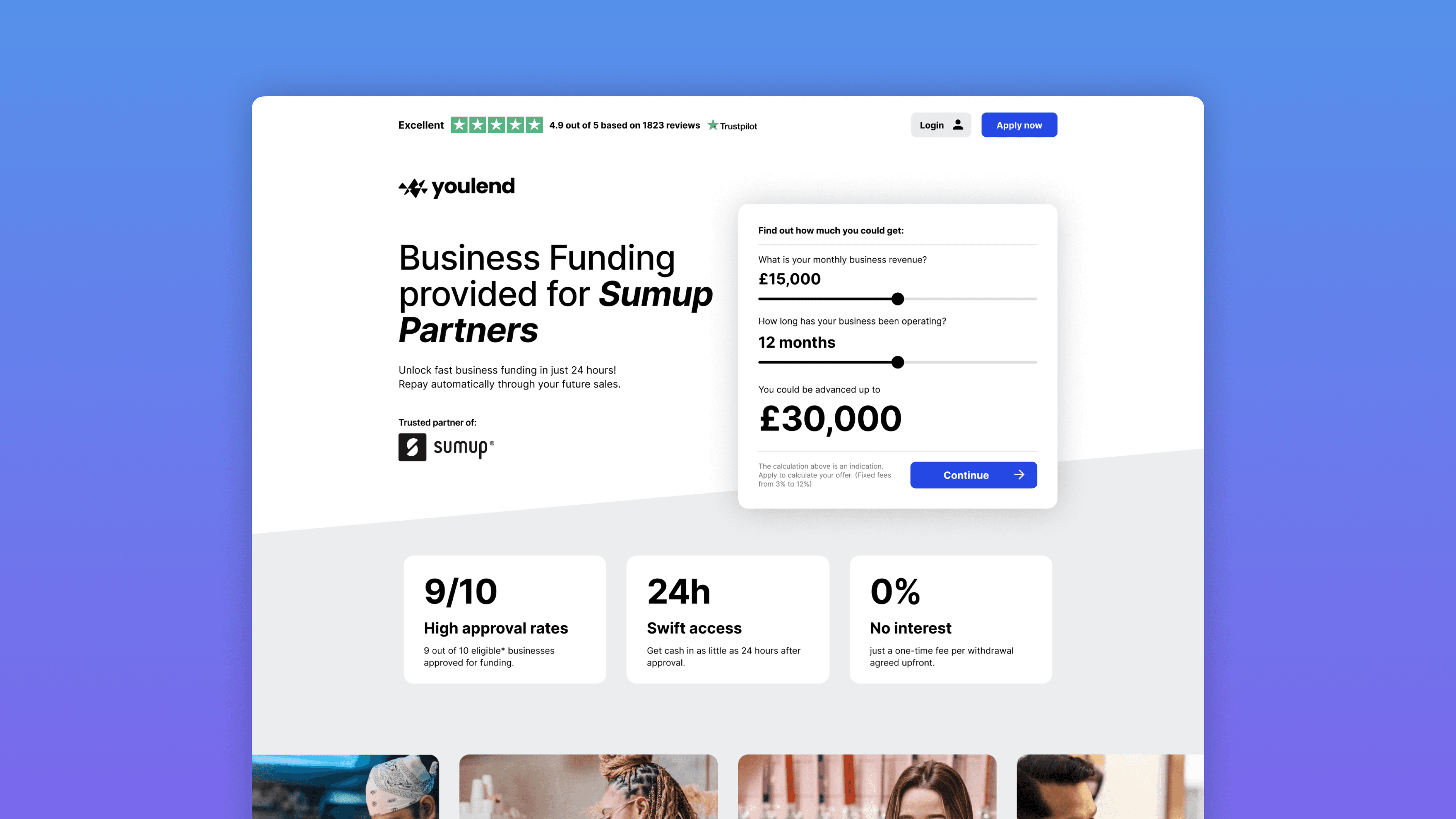
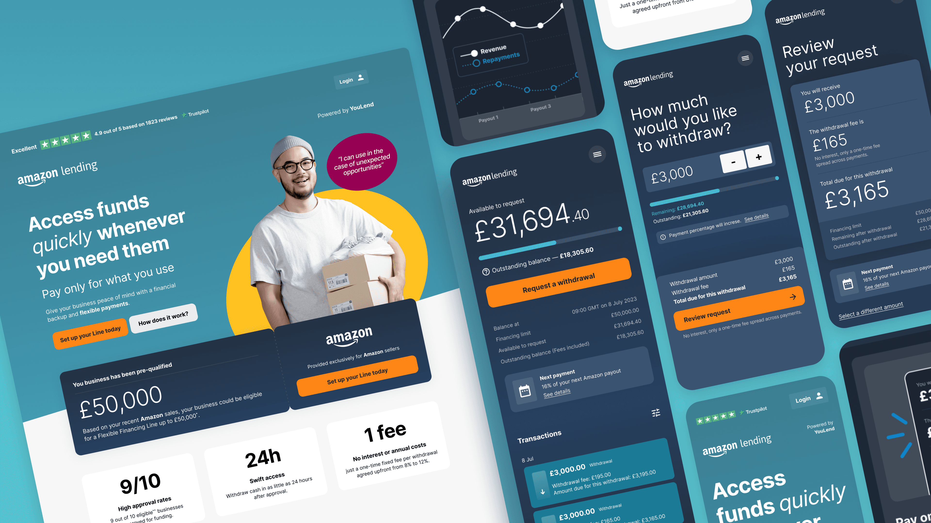
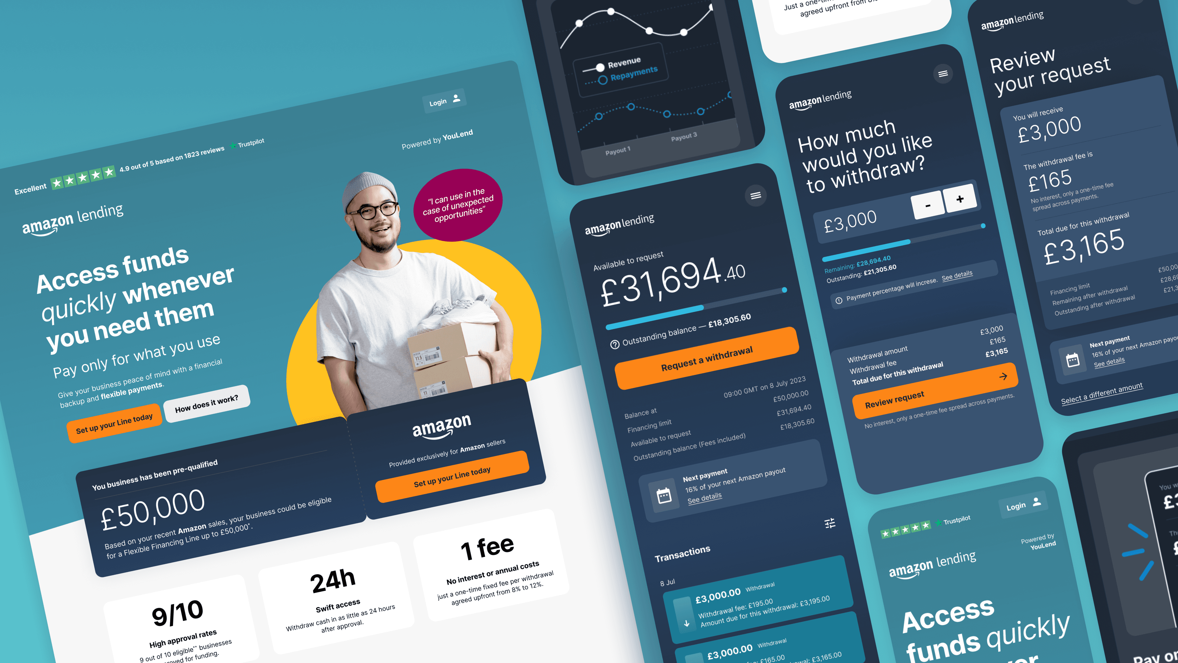
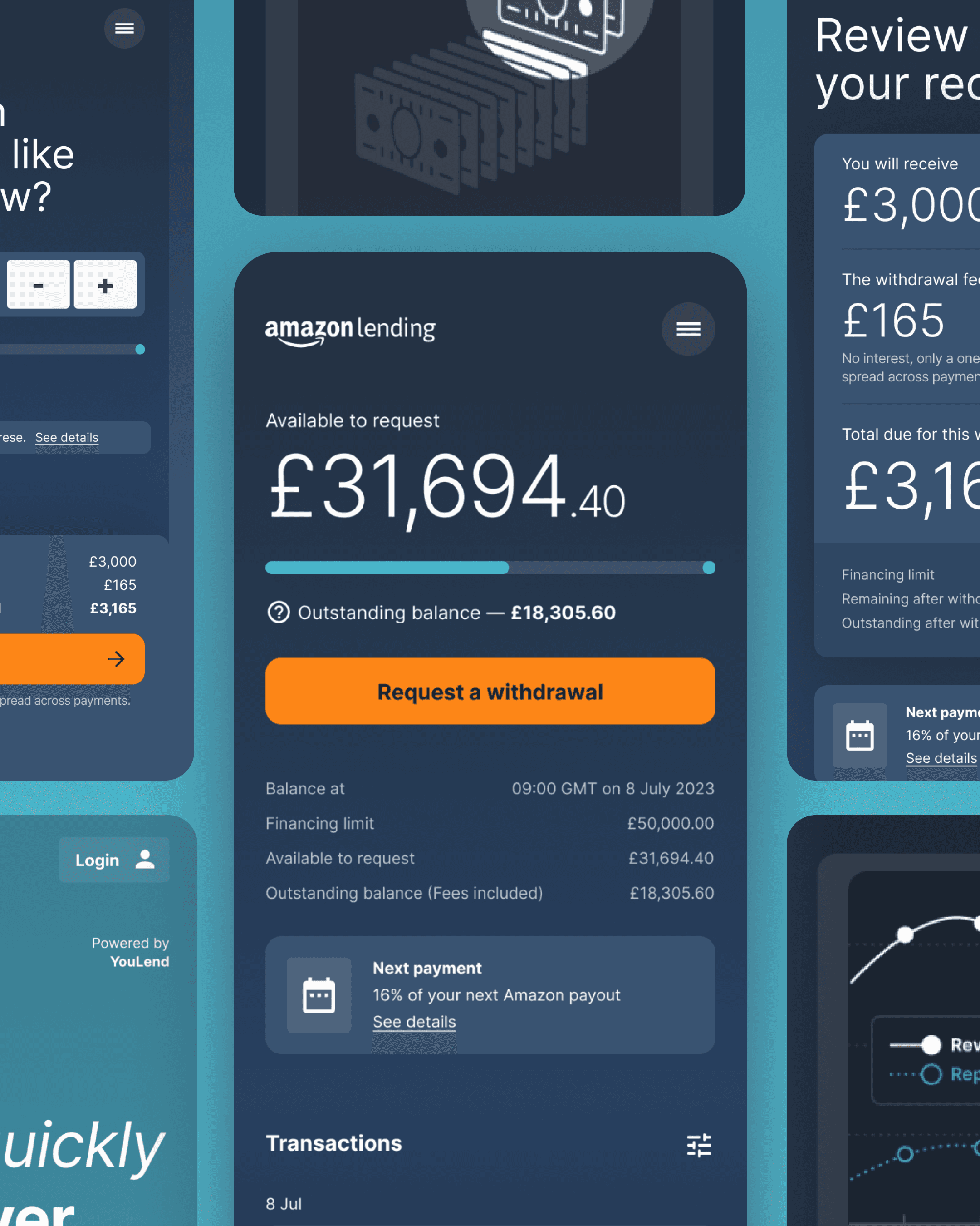
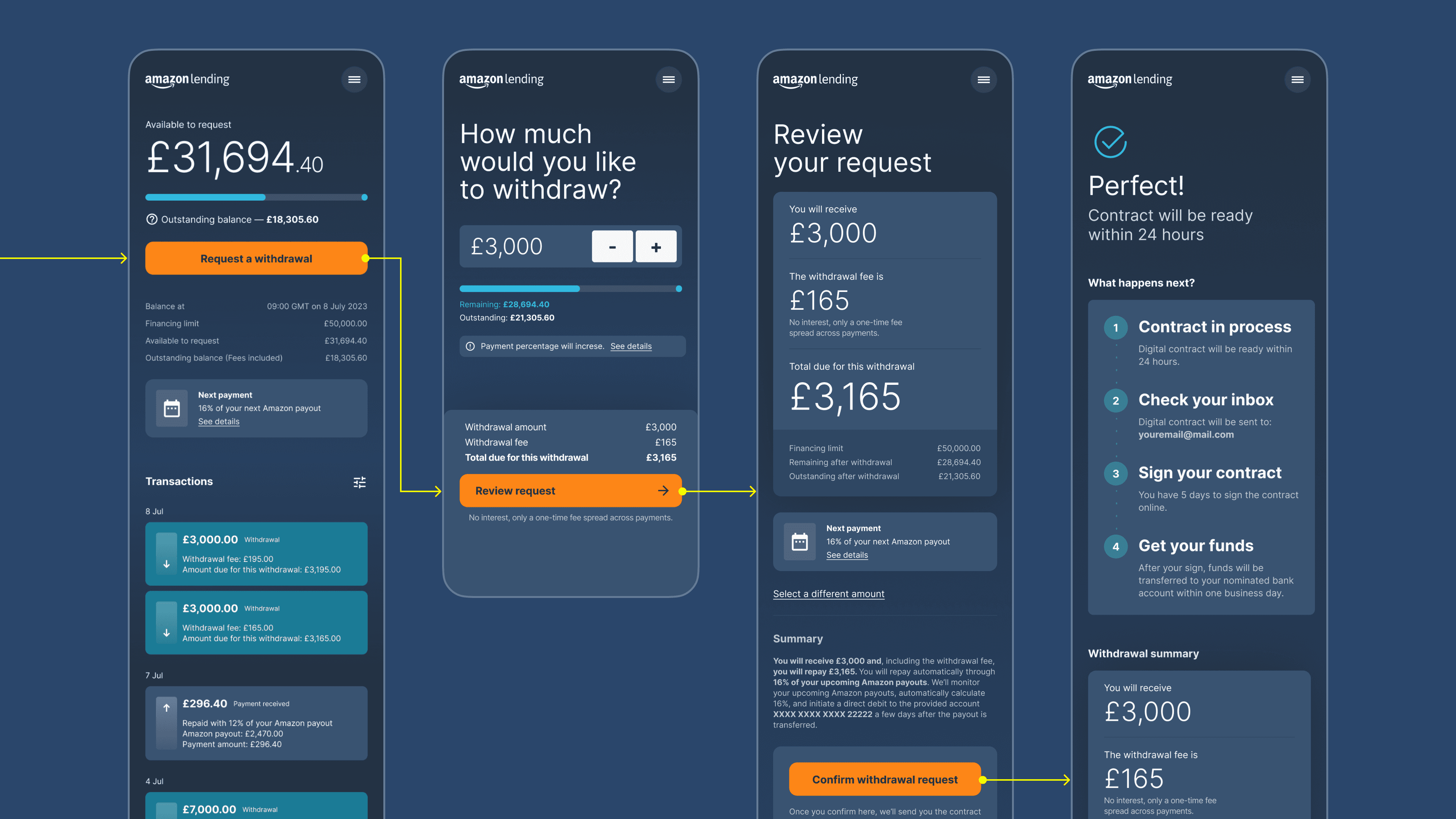
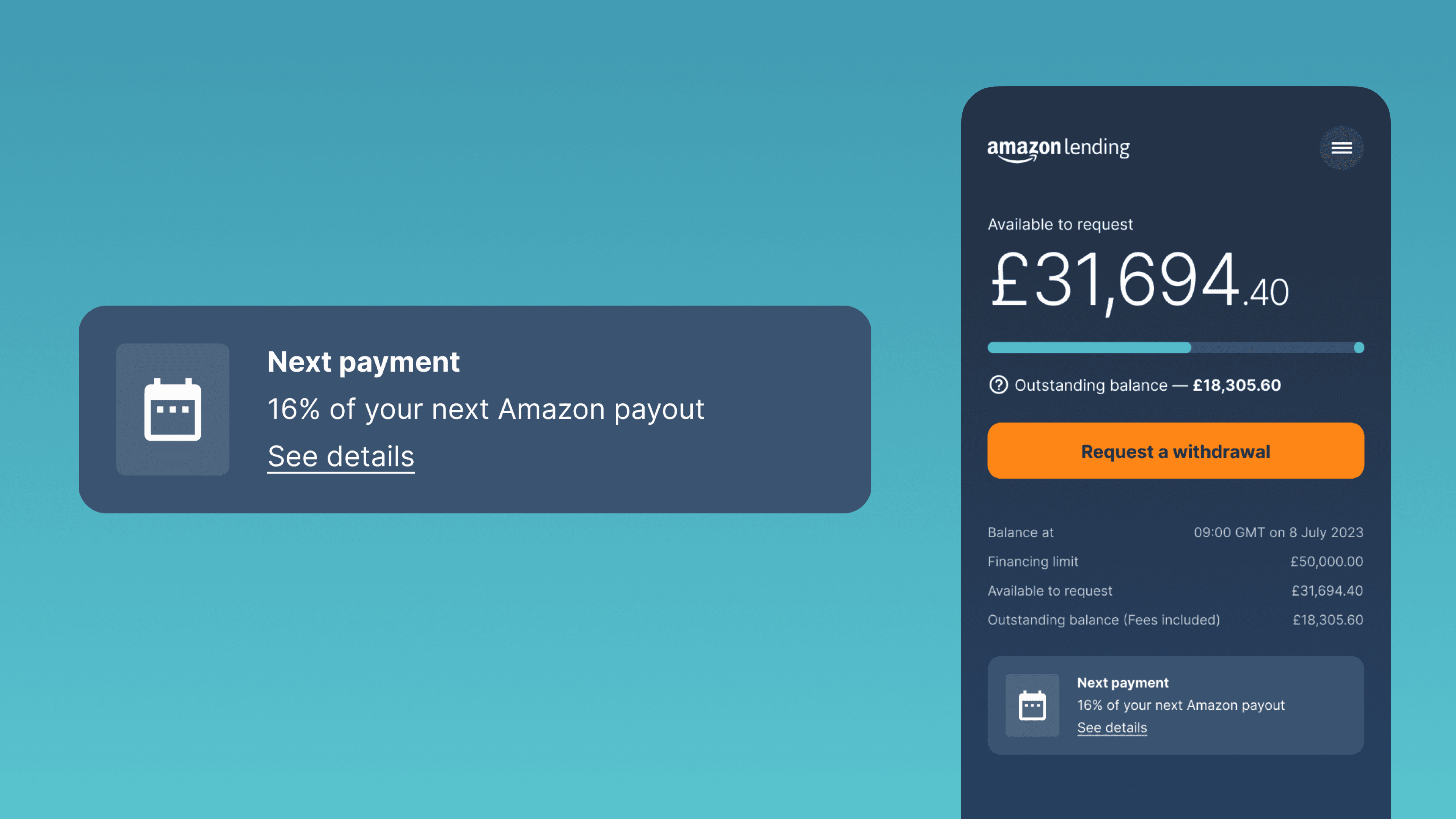
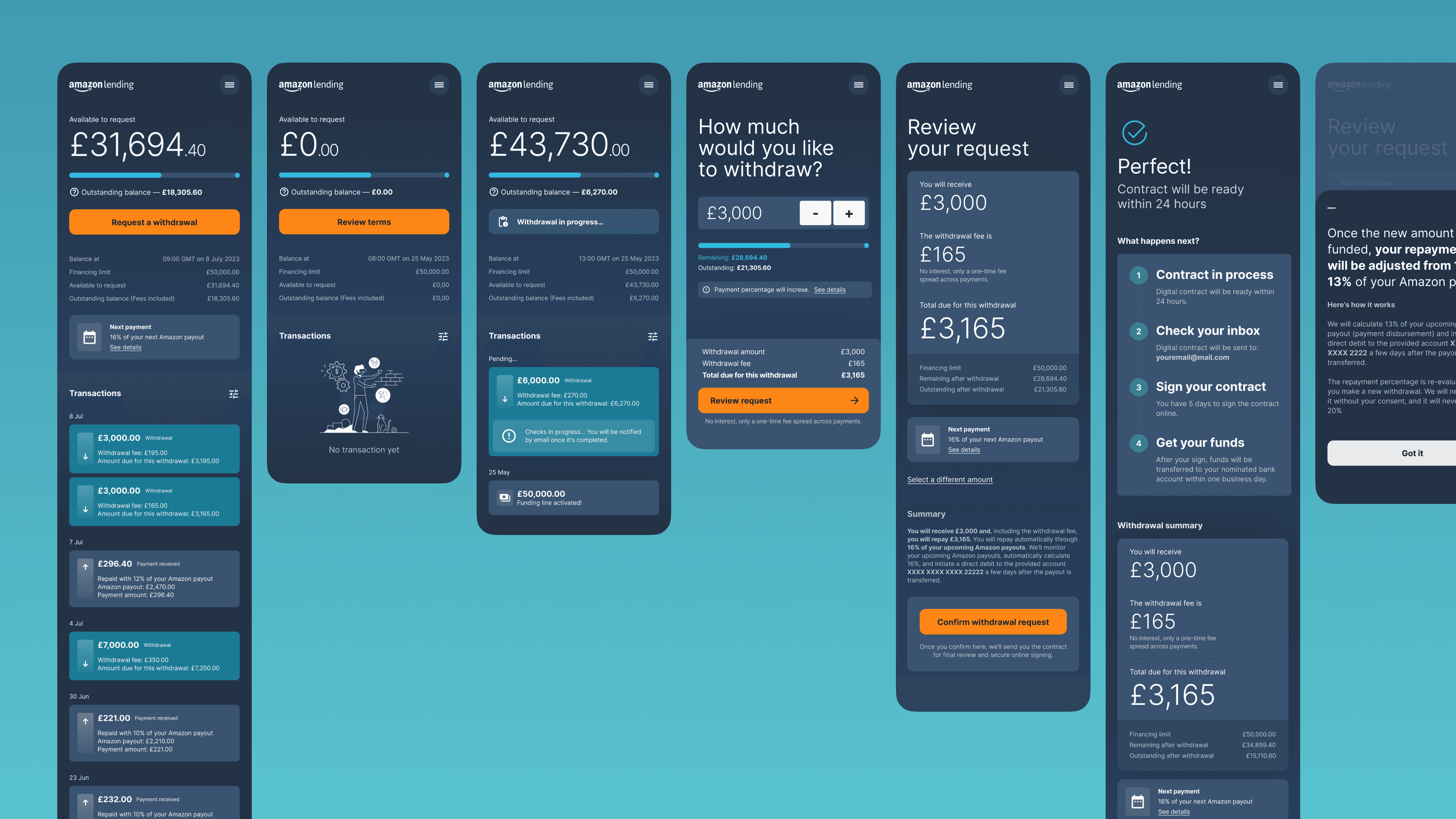
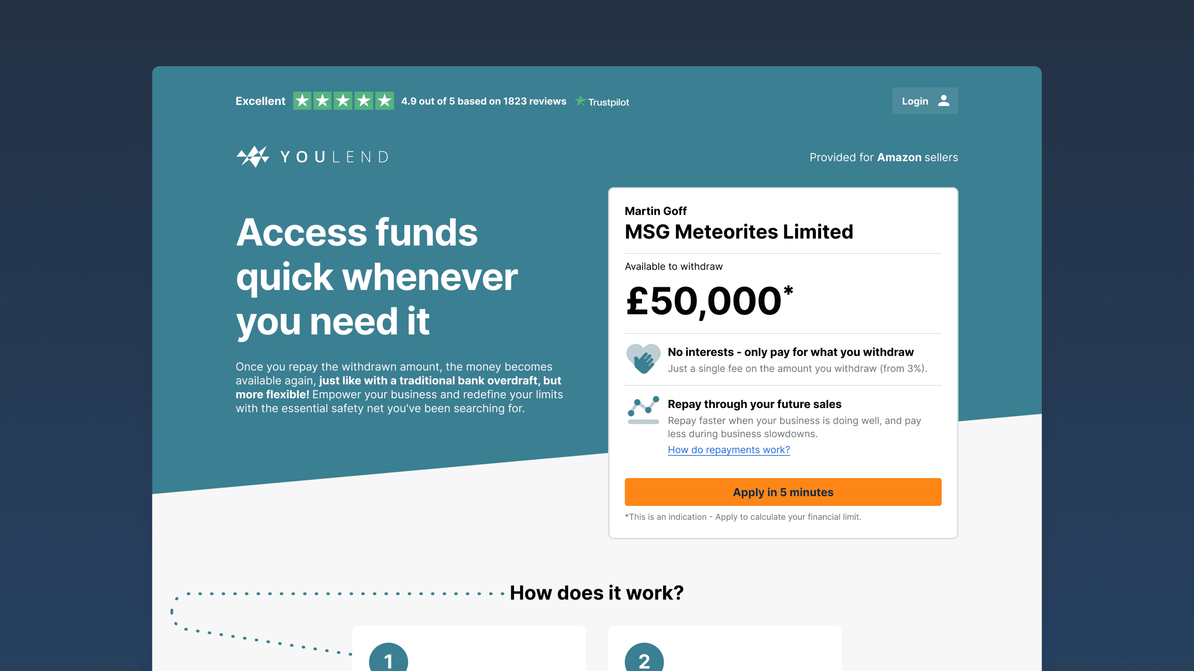
Phase — 01

Account Management

Based on our research, we identified three main user needs when managing an LoC product

Phase — 01

Account Management

Based on our research, we identified three main user needs when managing an LoC product

1

Check funds availability

2

Make withdrawals

3

Track repayments

1

Check funds availability

2

Make withdrawals

3

Track repayments

1

Check funds availability

2

Make withdrawals

3

Track repayments

1

Check funds availability

2

Make withdrawals

3

Track repayments

The Dashboard

How can we design a product that instantly meets user needs?

We highlighted the outstanding balance and total available funds in a visual yet simple way, placing this information prominently at the top of the dashboard.

The Financing Line dashboard.

The Financing Line dashboard.

We made the "Make a Withdrawal" button the primary action, placing it just below the available funds block.

Below the withdrawal button, we included a table summarising essential numbers needed by the seller, ensuring transparency even if some information seemed redundant.
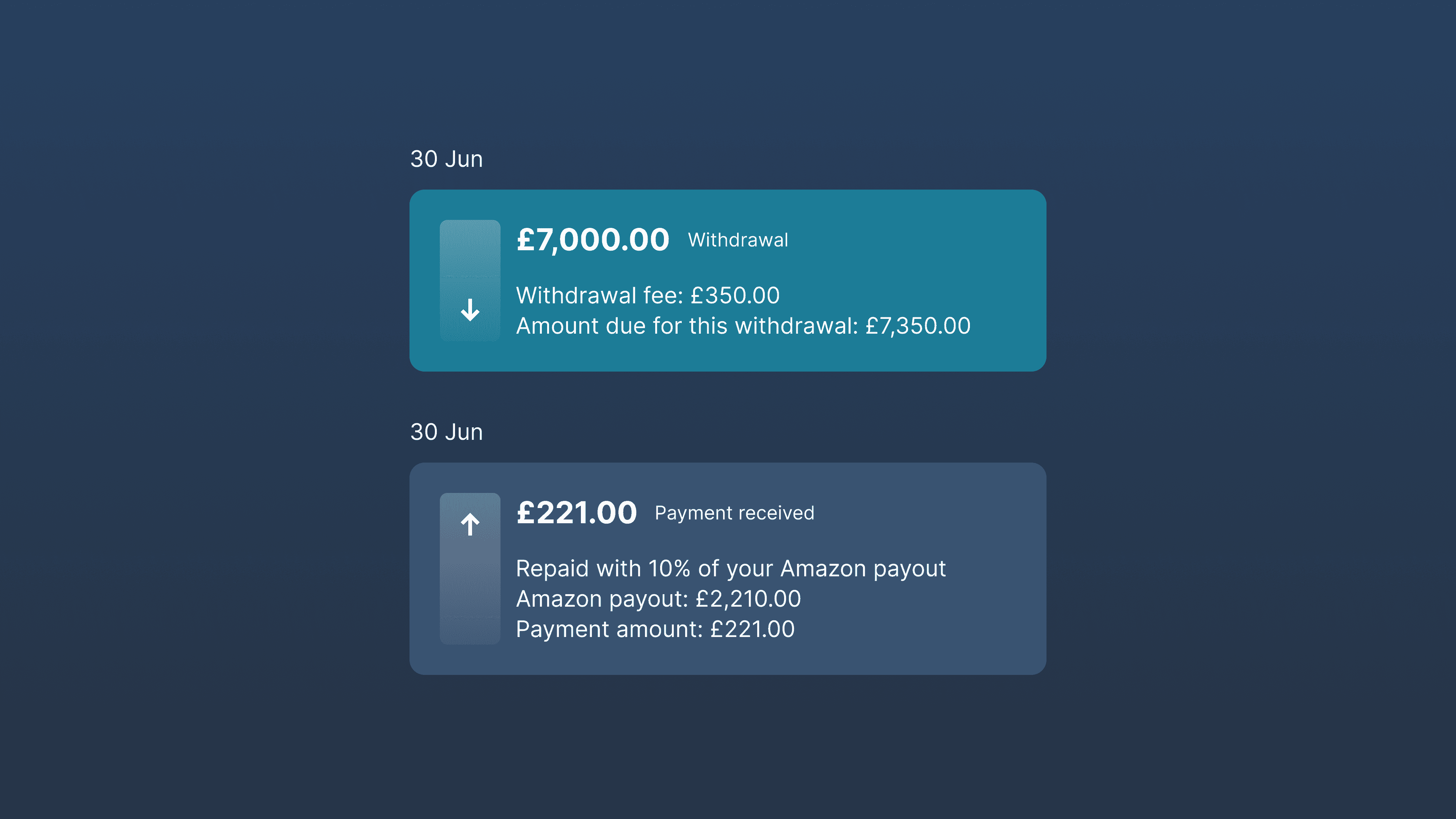
Transaction history

We designed a transaction log that included all financial transactions such as withdrawals and repayments

This element was crucial for transparency and helped customers feel in control.
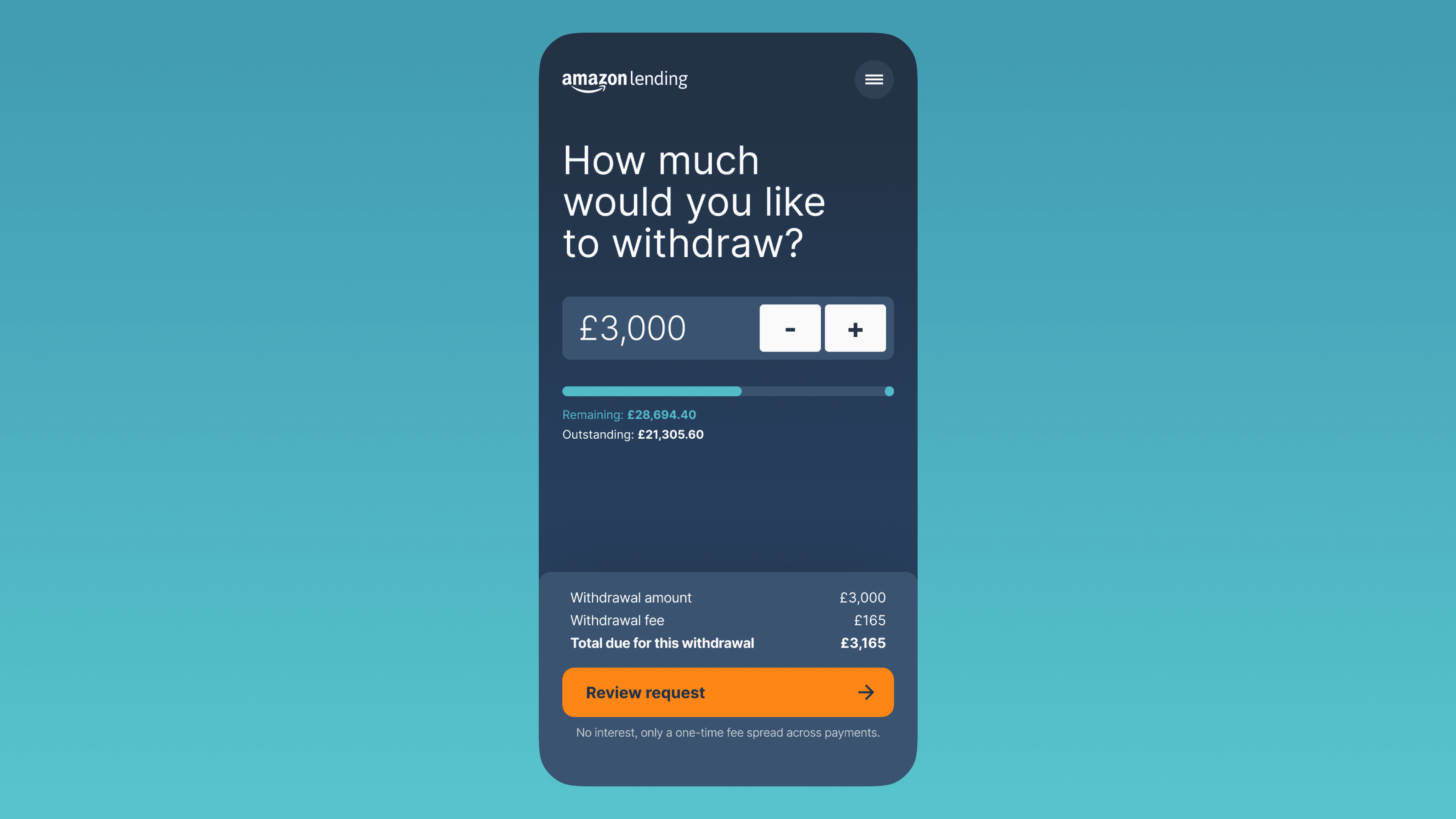
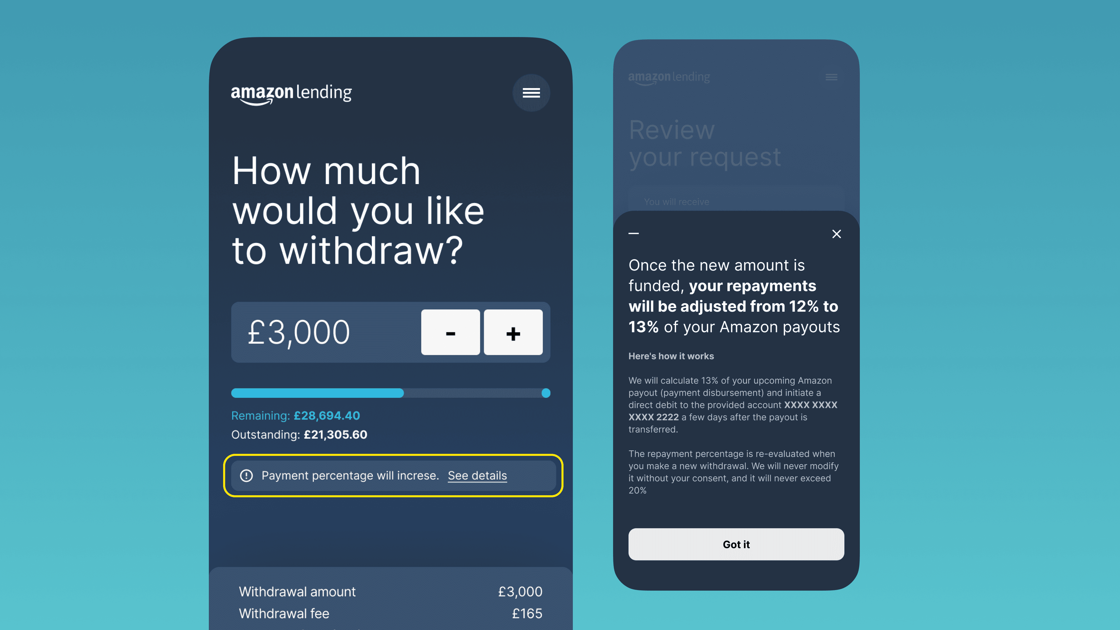
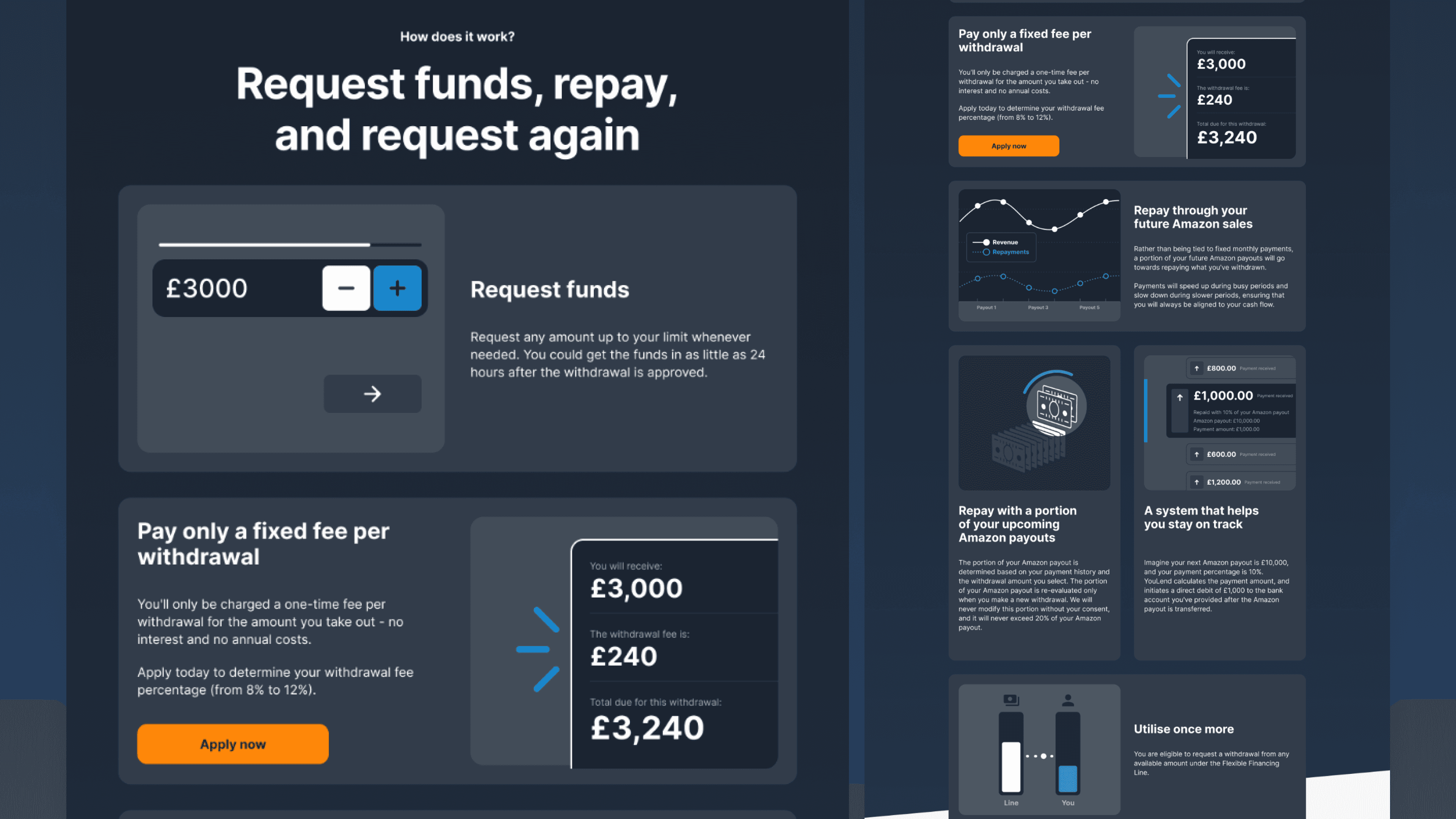
Withdrawal Flow

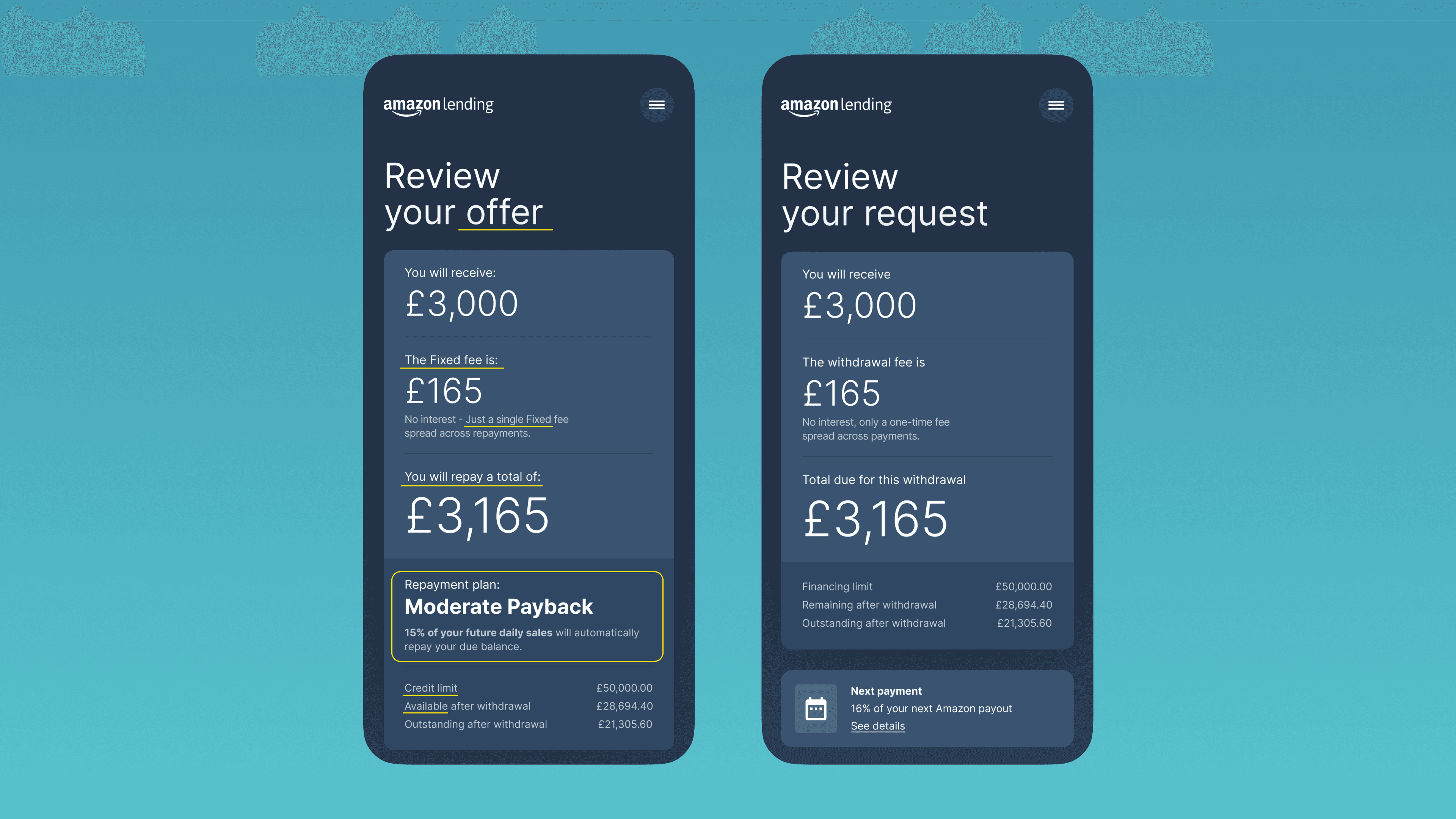
We leveraged the same user experience we had recently launched for the traditional cash advance product for selecting the funding amount

Comparing the original user interface used as a starting point with an early version of the withdrawal experience for Amazon.

On the left is the original experience, while on the right is an early version of the Amazon Financing Line.

On the left is the original experience, while on the right is an early version of the Amazon Financing Line.

This experience, which used a checkout pattern, had performed well in previous tests.

However, including repayment plans for Amazon's Flexible Financing Line proved too complex and would have delayed the product's release. In agreement with Amazon, we standardised and simplified the repayment plans to have one plan for all users.

Image showing the final version of the withdrawal experience.

The final version of the withdrawal experience.

The final version of the withdrawal experience.

The withdrawal user flow starts with a request from the dashboard, opening a screen with a numerator to select the withdrawal amount. This is followed by a review screen, and the flow is completed with a confirmation screen.

Withdrawal is prominently available in the dashboard. The numerator proved to be the best solution for selecting the desired amount on both mobile and desktop. An essential review and confirm screen completed the checkout sequence.

Withdrawal is prominently available in the dashboard. The numerator proved to be the best solution for selecting the desired amount on both mobile and desktop. An essential review and confirm screen completed the checkout sequence.

Usability Testing

Our primary focus was on the dashboard experience, specifically assessing users' understanding with minimal information provided

We conducted unmoderated usability tests using a Figma prototype on UserBrain. Participants were tasked with completing the application process and making withdrawals, recording their experiences through screen recordings. They provided feedback on various aspects of their experience, including likes and areas for improvement.

To ensure an iterative approach, we divided the test into segments with two participants per iteration. After each test, we analysed the results and made adjustments to enhance the experience for subsequent sessions.

The UX research revealed no significant usability issues

Participants appreciated the easy navigation and user-friendly experience.

  • 😌

    "...Well, it was very clear laid out very clearly and simply no clutter on the pages. It was instant..."

    Nikola M.

  • 🙂

    "...Yeah, it was easy to use. I thought, yeah, it was it was all quite straightforward, and I can see what's happening..."

    Julie W.

  • 😊

    "...Seem quite straightforward. The tasks I've been asked to do were easy and obvious. If anyone's used a similar sort of app, they should take to this experience quite quite easily..."

    Keith S.

Quotes from unmoderated usability test.

Quotes from unmoderated usability test.

Better taxonomy

However, there were areas of confusion. We refined the terminology to ensure consistency, clarity, and meaningfulness. For example:

  • "Fixed fee" became "Withdrawal fee"

  • "Total to repay" became "Total due for this withdrawal"

  • "Repayment plan" became "Next repayment"

  • "% of your future daily sales" became "% of your next Amazon payout"

Review screen displaying a comparison of the original and improved copy

Review screen displaying a comparison of the original and improved copy.

Review screen displaying a comparison of the original and improved copy.

Improving the Transaction History

One particular confusion arose when participants mistakenly associated "Available credit" with total Amazon revenue

Transaction components.

Original design.

The signup screen was what customers saw when they landed on YouLend's online application.

Original design.

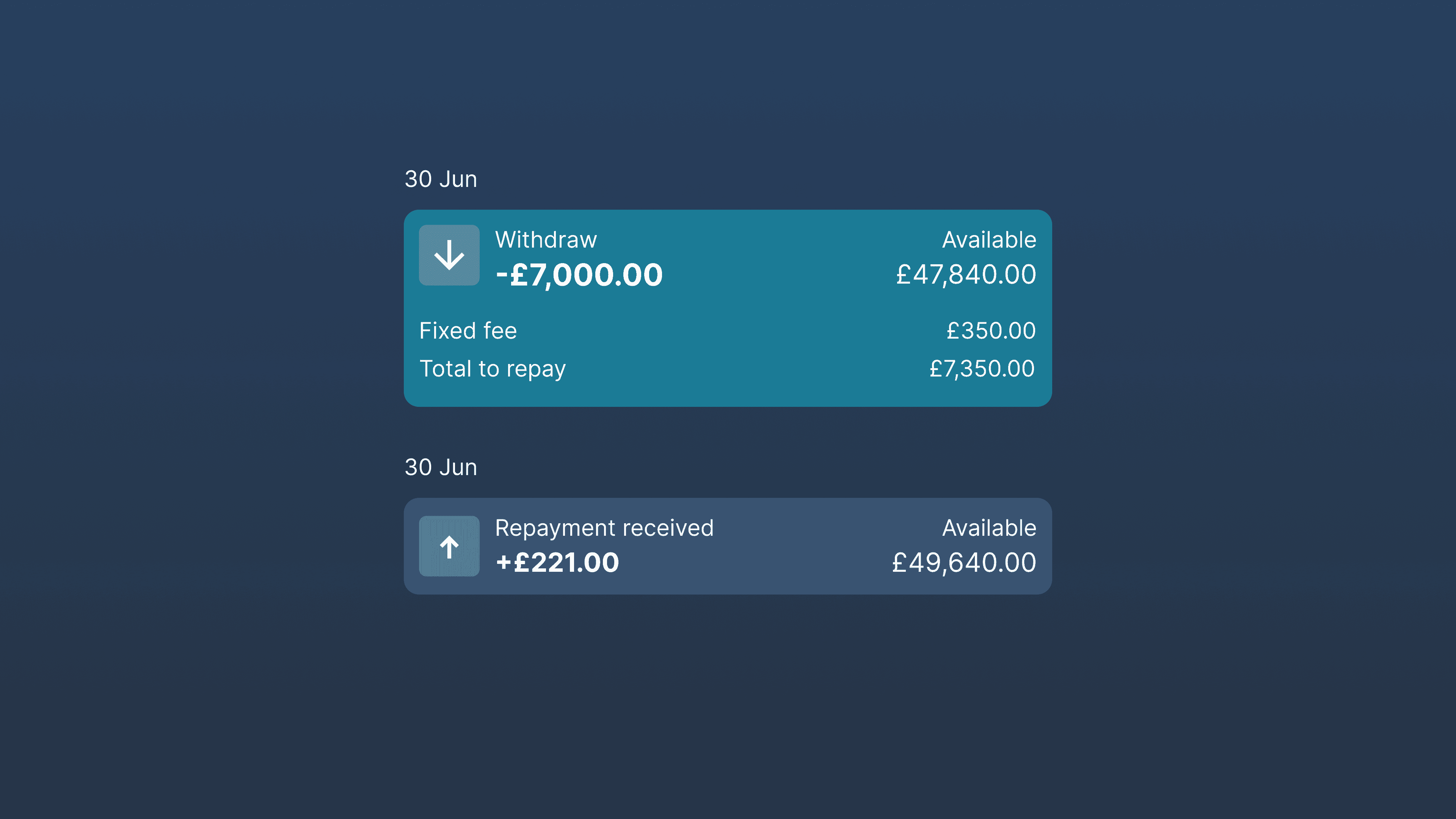
To address this, we decided to exclude the available credit amount from transaction records, as it was unnecessary. We also introduced the repayment rate for each repayment in the transaction history to improve understanding of the repayment process.

Improved transaction components.

Improved transactions.

The signup screen was what customers saw when they landed on YouLend's online application.

Improved transactions.

Next Repayment Component

Users expected to access "next repayment" information

  • 🙄

    “...I think there will it it should be beneficial if on the main page you can just specify how much repayment is due. Minimum repayment is due at what date. So that will be very important as well....”

    Haider K.

  • 🤔

    “...Which information available on this website is the most important, well, for me, it's the outstanding balance. But second to that is actually the next repayment. And it'd be really useful if it actually said when that was due and how much that is. I don't know if that's possible....”

    Keith S.

Providing details about upcoming repayments enables customers to plan ahead. Although we couldn't provide precise numbers or dates due to varying repayment terms, we introduced an element that resembled "next repayment" information. This approach improved general comprehension and gave users a greater sense of control.

next repayment component highlighted.

Next repayment component is available in the dashboard and in the confirmation screen.

Next repayment component is available in the dashboard and in the confirmation screen.

Fluctuating Rates and Fees

Participants expressed confusion when the repayment rate changed unexpectedly

  • 🤨

    “...Well, if the rates went up back, you know, up and down like that or up, mainly, I don't think I would. I don't think I would bother. I'd give it a try and that would be it....”

    Faren G.

  • 🤨

    “...Well, if the rates went up back, you know, up and down like that or up, mainly, I don't think I would. I don't think I would bother. I'd give it a try and that would be it....”

    Faren G.

The repayment rate and fees were variable, based on a complex algorithm considering the amount withdrawn so far, the amount selected for the current withdrawal, and the amount repaid so far.

To address this, we made these changes explicit on the review screen and in the withdrawal selector, using appropriate indicators, dialog boxes, and info messages. This reduced frustration and scepticism significantly.

On the withdrawal screen, a notification will appear below the numerator if the selected amount implies a higher repayment rate. A dialog box will automatically appear in the review screen when the repayment rate will be changed.

On the withdrawal screen, a notification will appear below the numerator if the selected amount implies a higher repayment rate. A dialog box will automatically appear in the review screen when the repayment rate will be changed.

On the withdrawal screen, a notification will appear below the numerator if the selected amount implies a higher repayment rate. A dialog box will automatically appear in the review screen when the repayment rate will be changed.

Further Testing

Through several cycles of design, test, evaluate, and repeat, we refined the account management experience

Over time, we noticed fewer major issues. However, transparency around fees and how they were calculated still had room for improvement.

Comparing the original user interface used as a starting point with an early version of the withdrawal experience for Amazon.

Withdrawal process user flow.

Withdrawal process user flow.

Some of the UI created for the account management.

Some of the UI created for the account management.

Some of the UI created for the account management.

Phase — 02

Landing Experience

Leads came from Amazon Seller Central, where the Flexible Financing Line was advertised, and from Amazon's marketing campaigns

Phase — 02

Landing Experience

Leads came from Amazon Seller Central, where the Flexible Financing Line was advertised, and from Amazon's marketing campaigns

Preview of the landing page showing the header and the hero sectin.

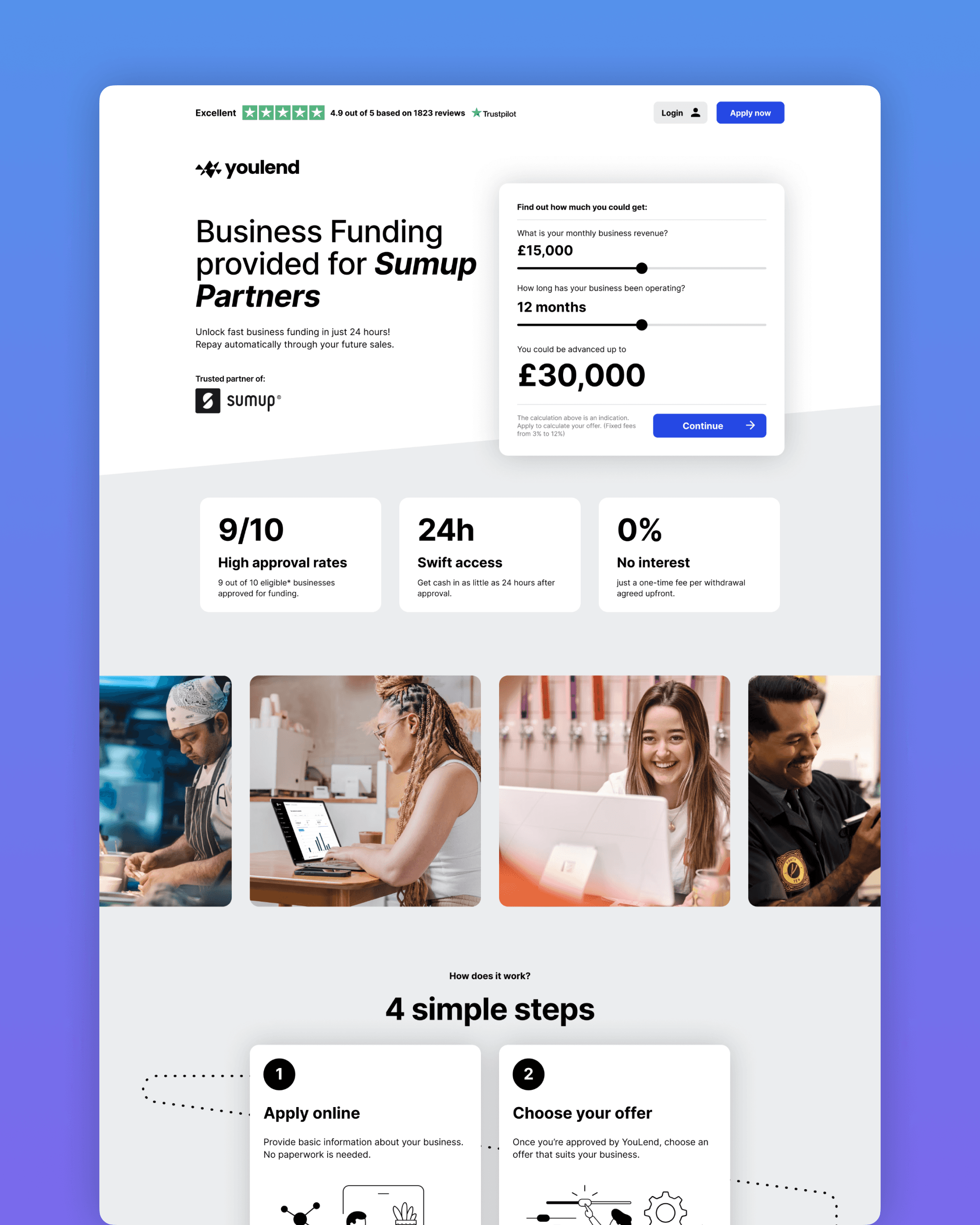
The information provided by Amazon at that stage was insufficient to answer all customer questions. To optimize sign-ups and marketing efforts, we needed to include all essential information on a landing page between lead generation and the application process.

Showing how little information was included in the Amazon acquisition journey.

Little information was included in the Amazon acquisition journey.

Little information was included in the Amazon acquisition journey.

The messaging

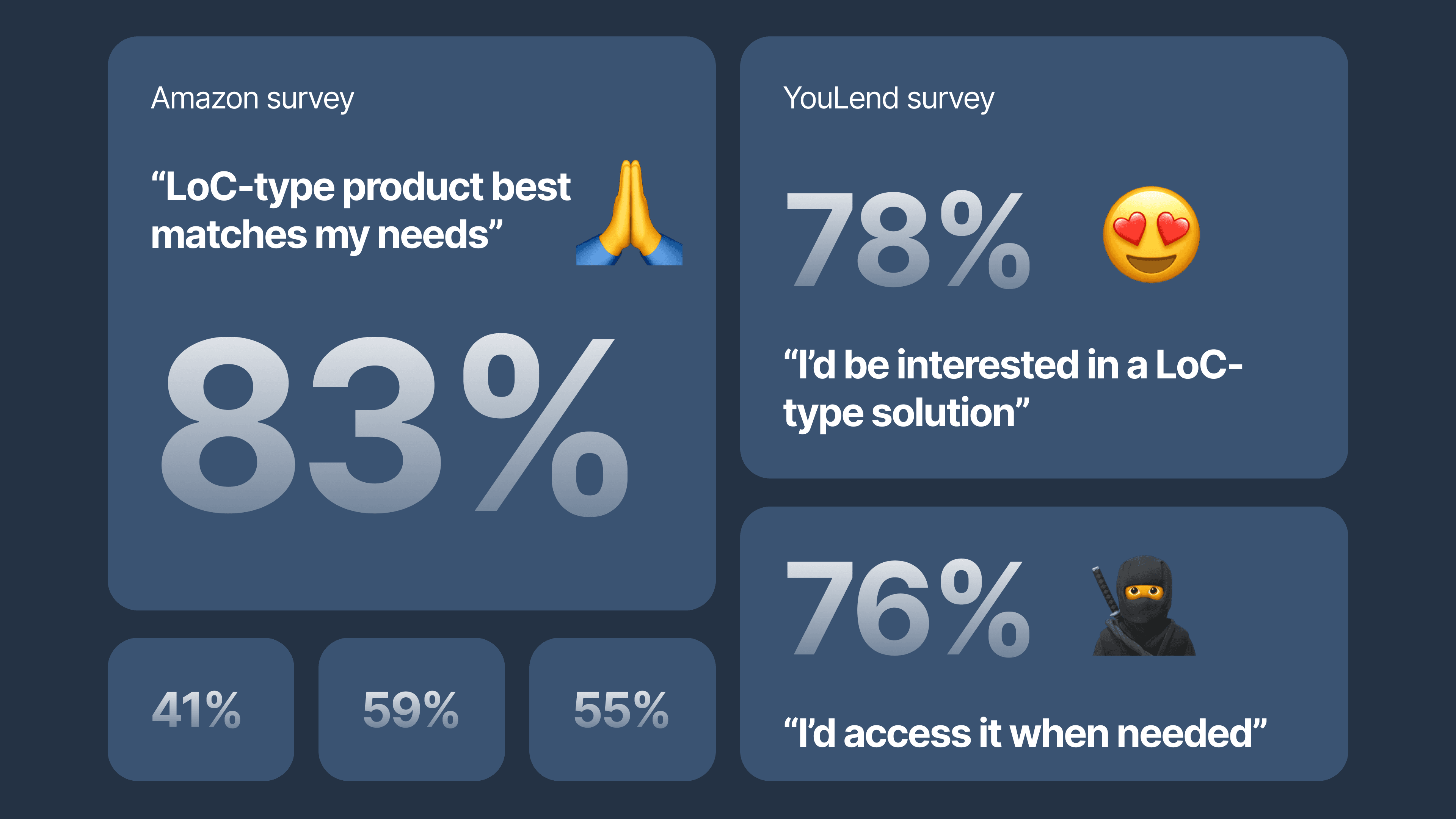
Our research and surveys confirmed that a LoC product matched Amazon sellers' needs

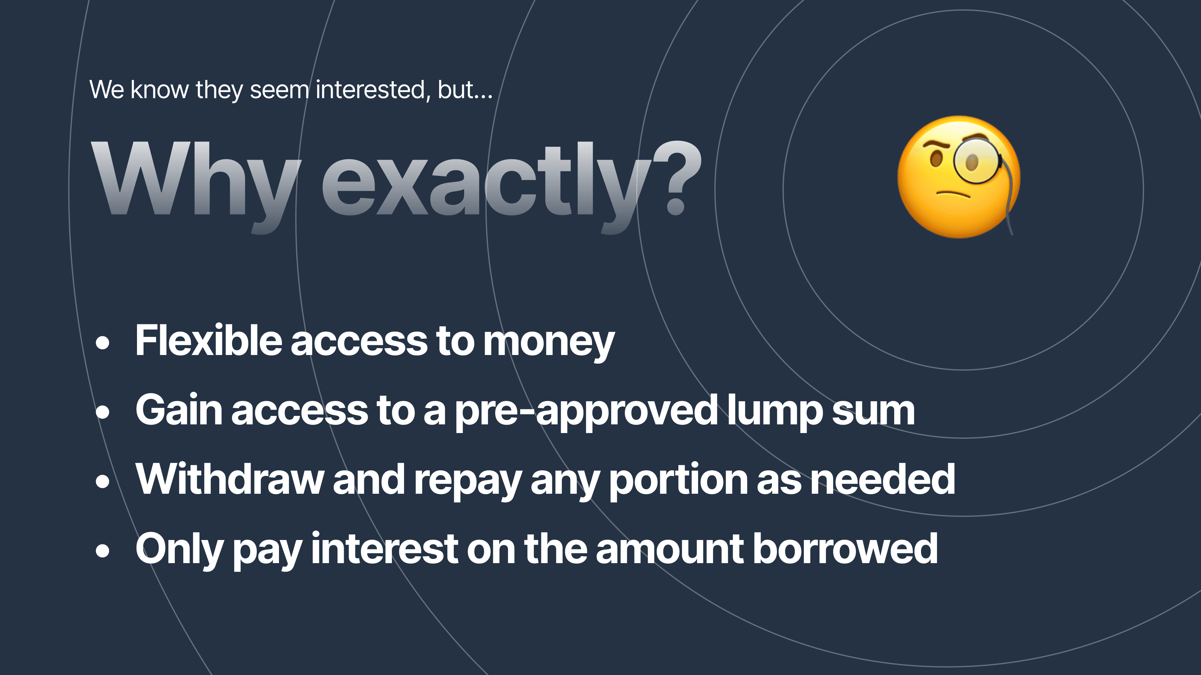
The main benefits of a LoC product for ecommerce sellers include:

  • Flexible access to money

  • Access to a pre-approved lump sum

  • Ability to withdraw and repay any portion as needed

  • Paying interest only on the amount borrowed

Product strategy slide highlighting the core values of a Line of Credit (LoC) product, which are the same written in the paragraph above.

Product strategy slide highlighting the core values of a Line of Credit (LoC) product.

Product strategy slide highlighting the core values of a Line of Credit (LoC) product.

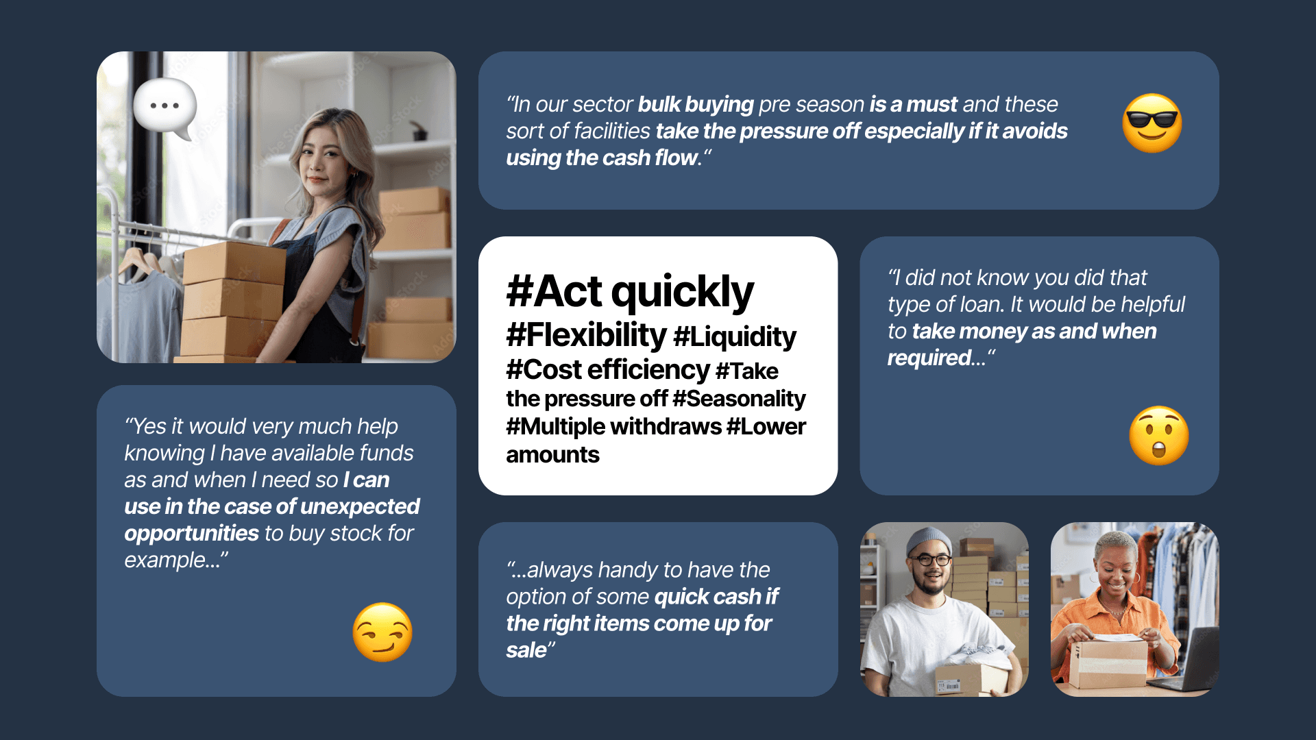
But we took into consideration another aspect. the LoC it's not just about practical benefits – we believe the LoC solution has a positive impact on how people feel too.

It's like a safety net that makes businesses feel better and more confident, knowing they have something to fall back on. This helps them alleviate concerns and operate with increased confidence.

We brainstormed for a headline that fit well into the journey

Despite having a few good options, we needed something more direct

Initial versions of the landing page headline. Example 1:"A game chnager for business like yours", Example 2:"Are overdrafts crippling you financially?", Example 3:"Pioneering a new era for businesses like yours", Example 4:"A better way to manage business", Example 5:"Experience worry-free finance with YouLend today" and Example 6:Empower your business and redefine your limits".

Initial versions of the landing page headline.

Initial versions of the landing page headline.

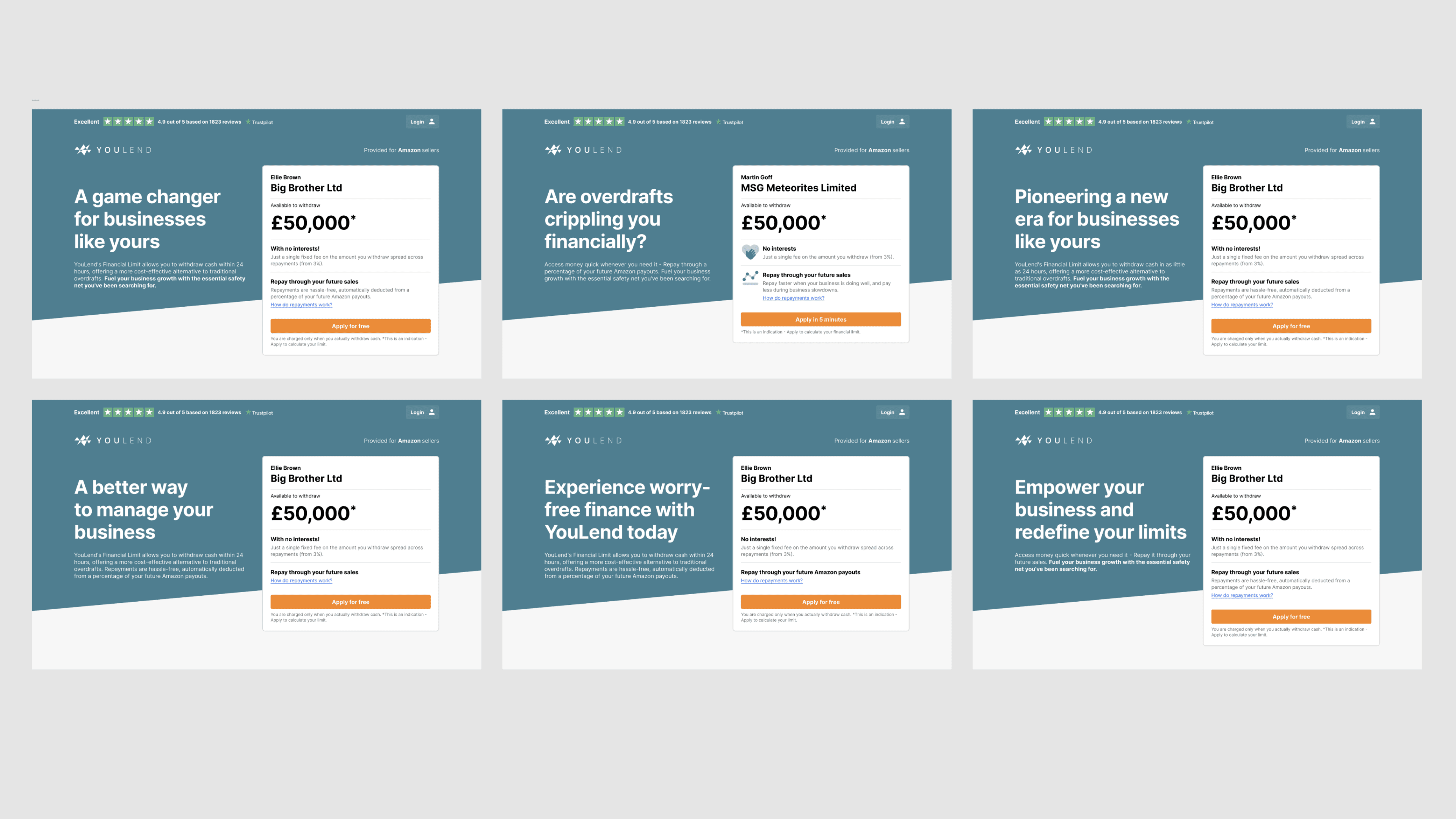
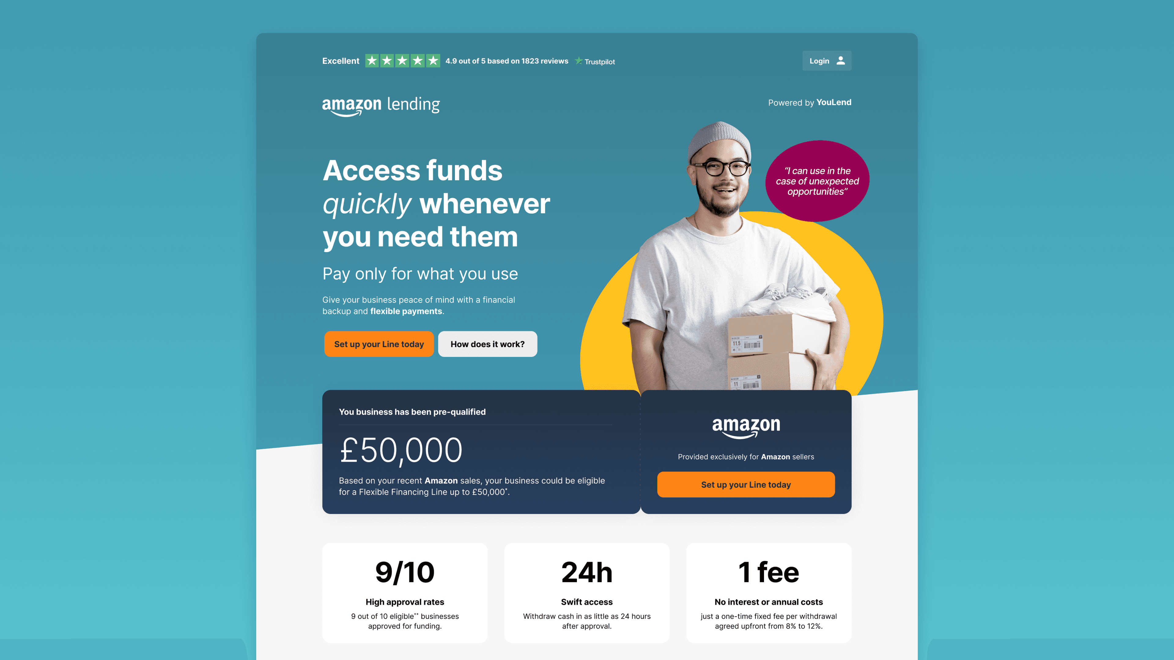
Our final main message was: "Access funds quickly whenever you need them." We complemented this with: "Pay only for what you use. Give your business peace of mind with financial backup and flexible payments."
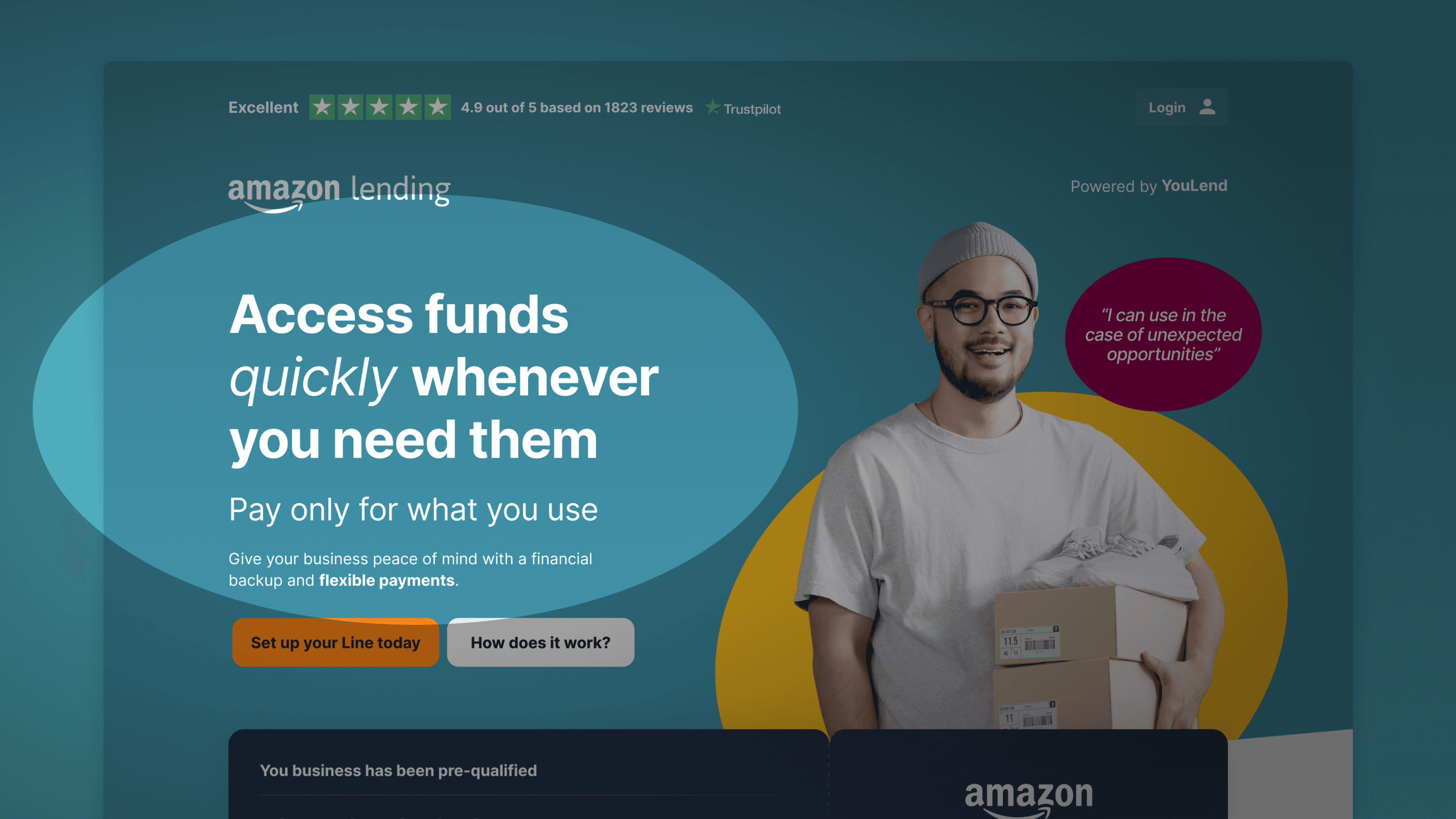
Image showing the Financing Line dashboard user interface.

Final headline and body copy.

Final headline and body copy.

The Hero Block

We realised the hero block was too crowded with information

Initially, we tried to reuse what we had designed for YouLend's Cash Advance product. However, after the first round of tests, we realised the hero block was too crowded with information.

Early version of the hero block demonstrating how much information was packed into a limited space.

Early version of the hero block.

Early version of the hero block.

We did an impression test by showing the hero for a limited time, followed by questions recalling what participants had seen. Testers could remember bits of info but were cognitively overwhelmed.

Screenshot from Maze showing 63% of testers not recalling the displayed product.

63% of testers didn't remember what the product was.

63% of testers didn't remember what the product was.

We reorganised the information architecture, added more white space around key elements, and implemented clearer divisions between different concepts

Image showing the final hero block with a smiling Amazon seller.

Including images of sellers similar to our users helps create a sense of familiarity and trust, making the landing page more approachable.

Including images of sellers similar to our users helps create a sense of familiarity and trust, making the landing page more approachable.

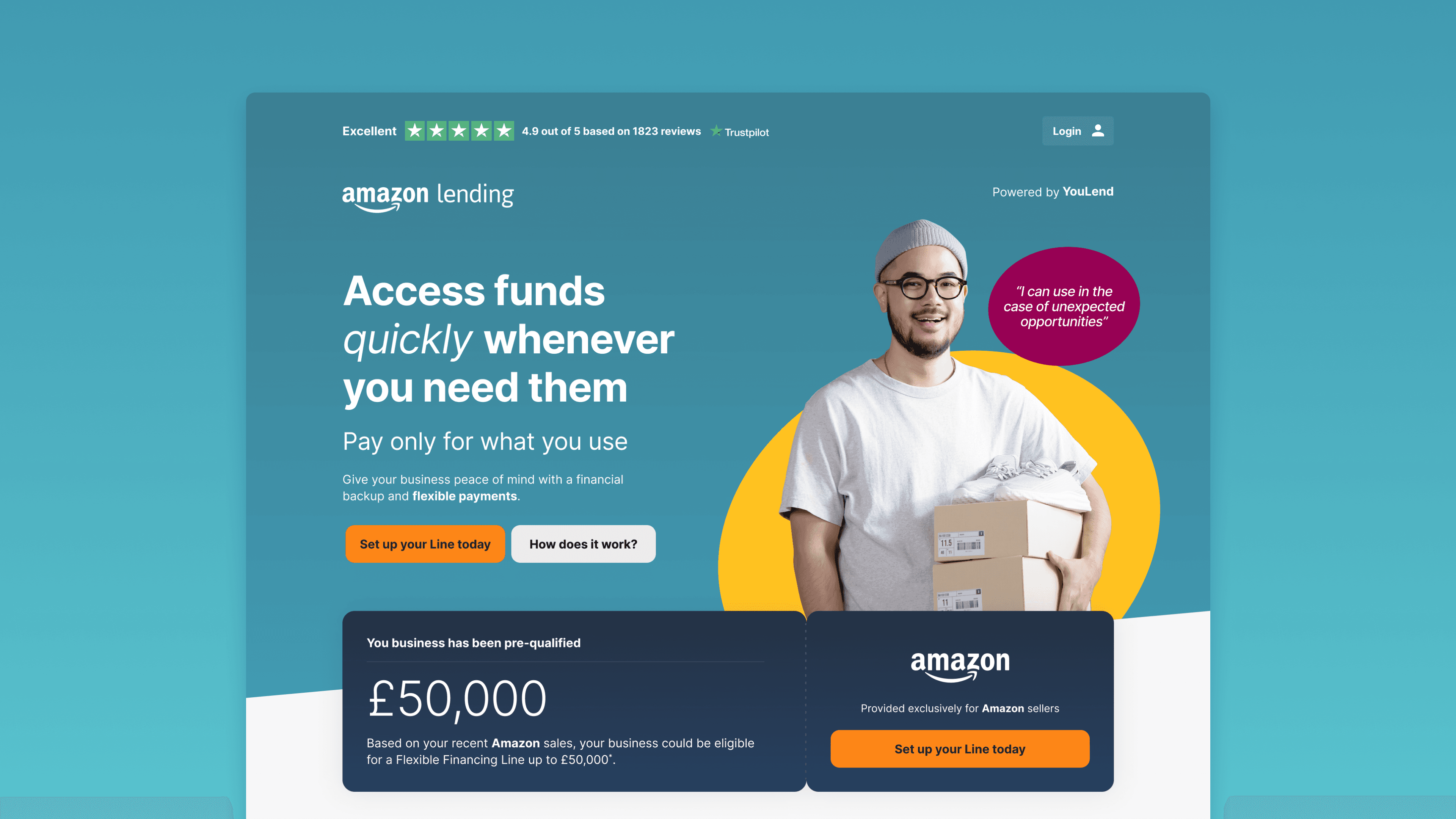
This intervention helped participants readily grasp the value proposition. We included core messaging in the hero section and an animation showcasing various ecommerce personas using the Amazon line of credit. Real quotes from testers proved effective, as customers tend to empathise with stories.

Unique Selling Points

Below the fold, we added the three main benefits valued by our ecommerce customers, followed by a conversational paragraph addressing recurring questions and doubts from our interviews and tests.

The landing page highlighted the three main unique selling points graphically displayed as blocks. Additionally, a section describing other important product details featured a picture of an e-commerce seller happily packing orders.

The three main benefits were a high approval rate, quick access to funds, and the simplicity of a single fixed fee.

The three main benefits were a high approval rate, quick access to funds, and the simplicity of a single fixed fee.

Improving Inclusivity and Comprehension

Explaining the Amazon Flexible Financing Line clearly to a diverse audience was challenging

Despite numerous copy revisions, the less savvy segment still experienced confusion.

We introduced complex concepts in a friendly and visual manner, breaking them into smaller bits with animated infographics. We iterated on the copy, design, and infographics until comprehension was as inclusive as possible.

Image displaying the 'How It Works' section of the landing page, divided into six parts. The first part explains how to request funds, the second details how the fees work, the third, fourth, and fifth provide in-depth explanations of revenue-based repayments with practical examples, and the sixth section covers how a revolving facility operates.

An extensive part of the landing page was dedicated to explaining how the product works.

An extensive part of the landing page was dedicated to explaining how the product works.

Trust and FAQ

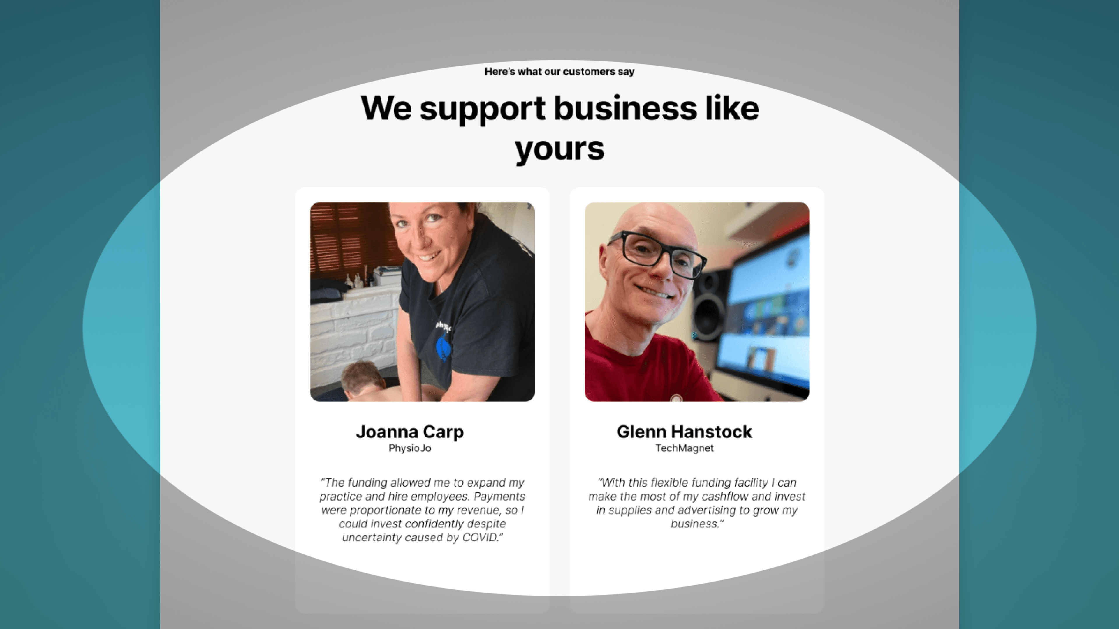
We included elements to build trust, such as Trustpilot badges, testimonials, and a FAQ section for additional information Amazon sellers might need.

Image shows the testimonial section of the landing page featuring two positive stories.

Testimonials section.

Testimonials section.

Phase — 02

Application Process

Applicants needed to log in to both our website and Amazon Seller Central to review and accept the terms, and sign the direct debit mandate, creating three friction points and generating frustration

Phase — 02

Application Process

Applicants needed to log in to both our website and Amazon Seller Central to review and accept the terms, and sign the direct debit mandate, creating three friction points and generating frustration

Image comparing the original with the improved user journey, the imporved user journey

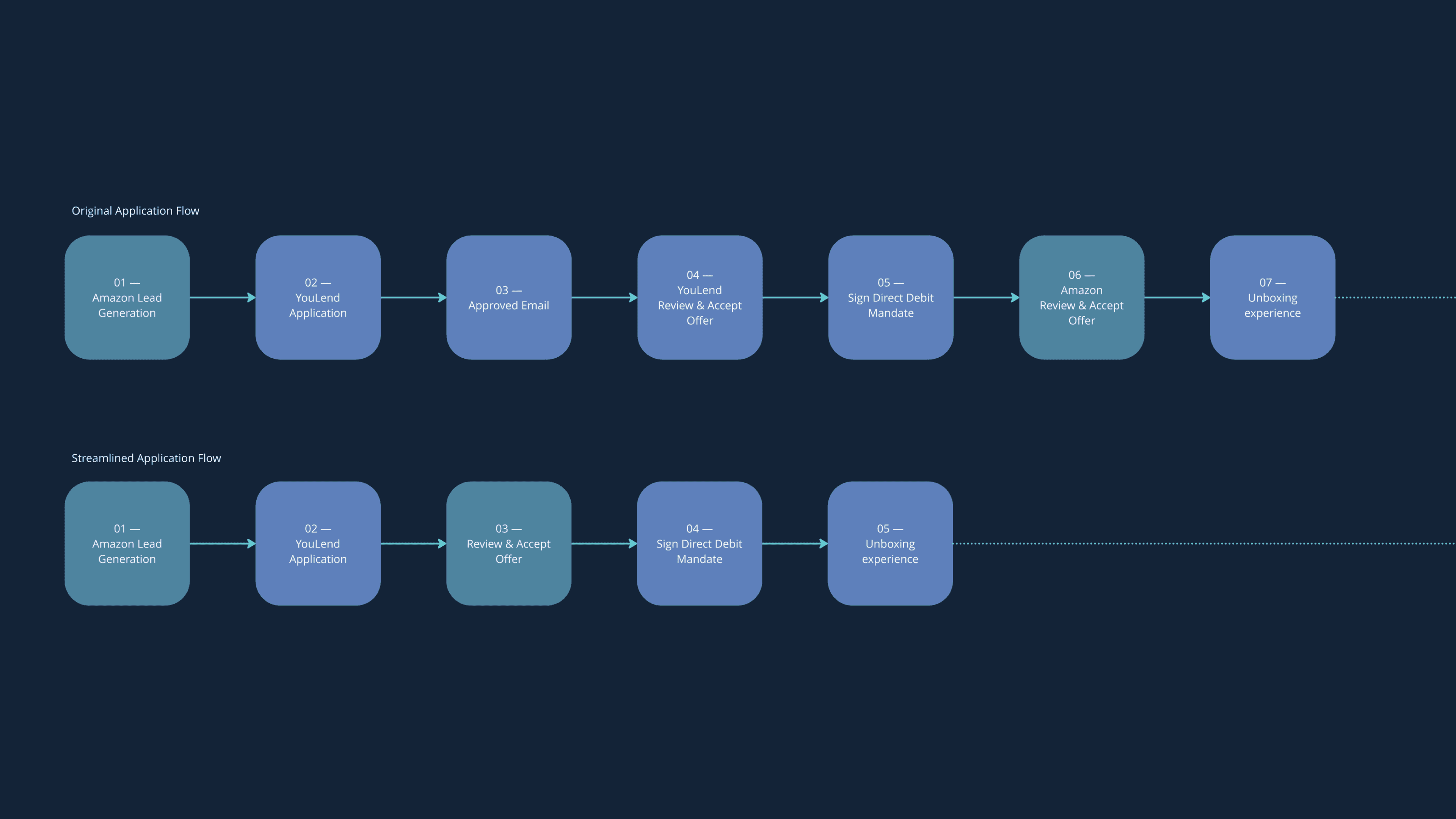
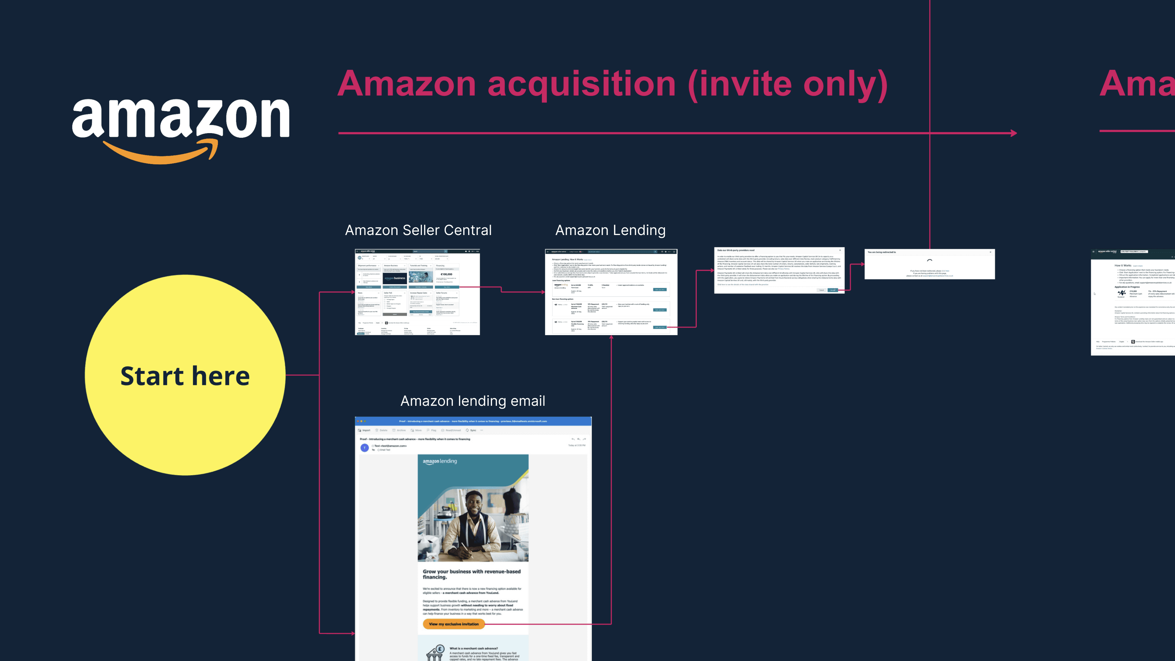
The application journey for the Amazon financial line was similar to YouLend's Cash Advance process, with small adaptations

Customers submitted an application, received an approval email, reviewed the offer, accepted the terms, and signed a contract. However, Amazon's requirements complicated the experience.

Showing the friction points in the original user journey.

The original user journey.

The original user journey.

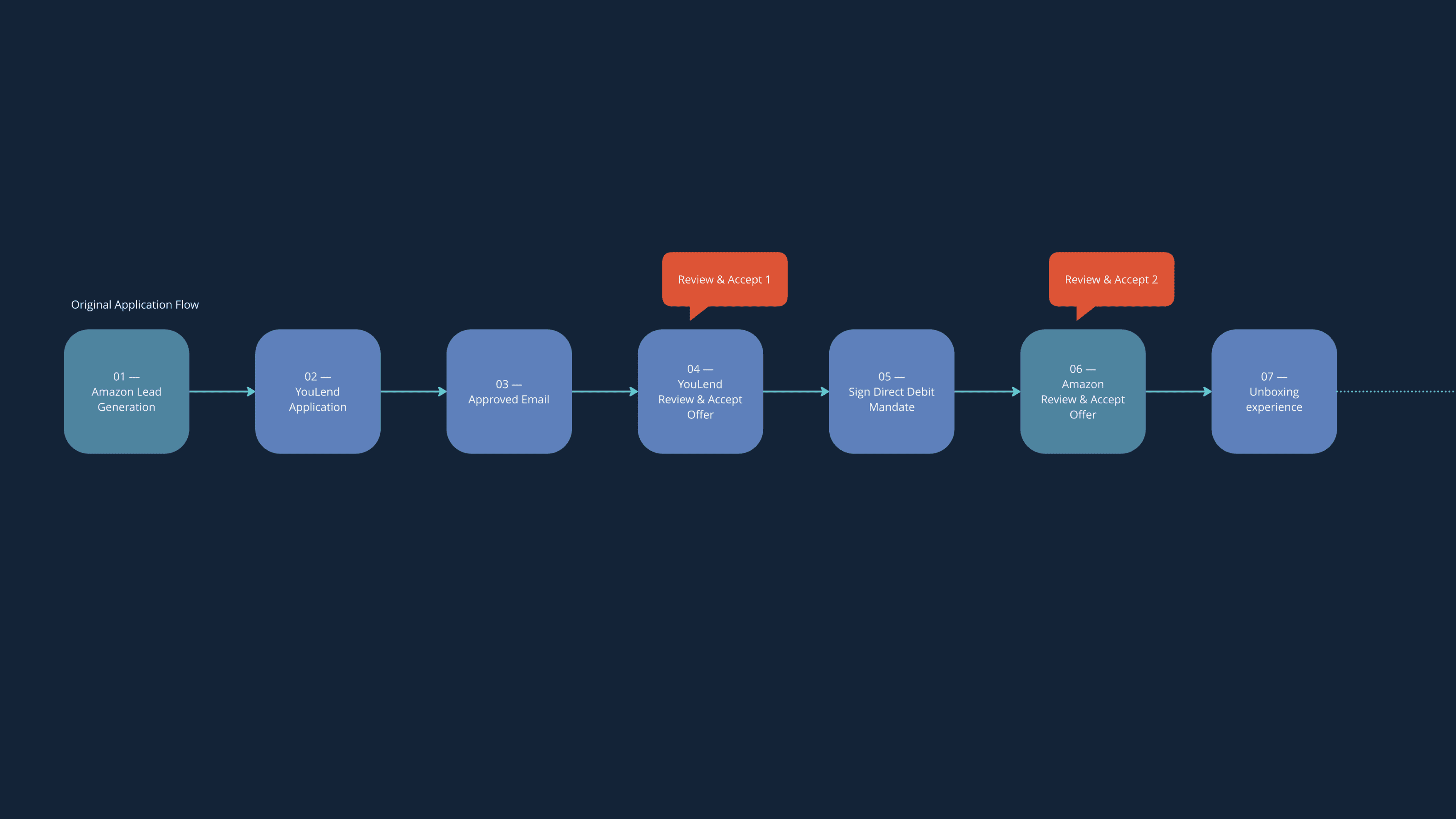
From a customer's perspective, accepting the terms twice was unnecessary and strange. Many testers were confused by the experience, causing them to lose trust.

Streamlining the Application Process

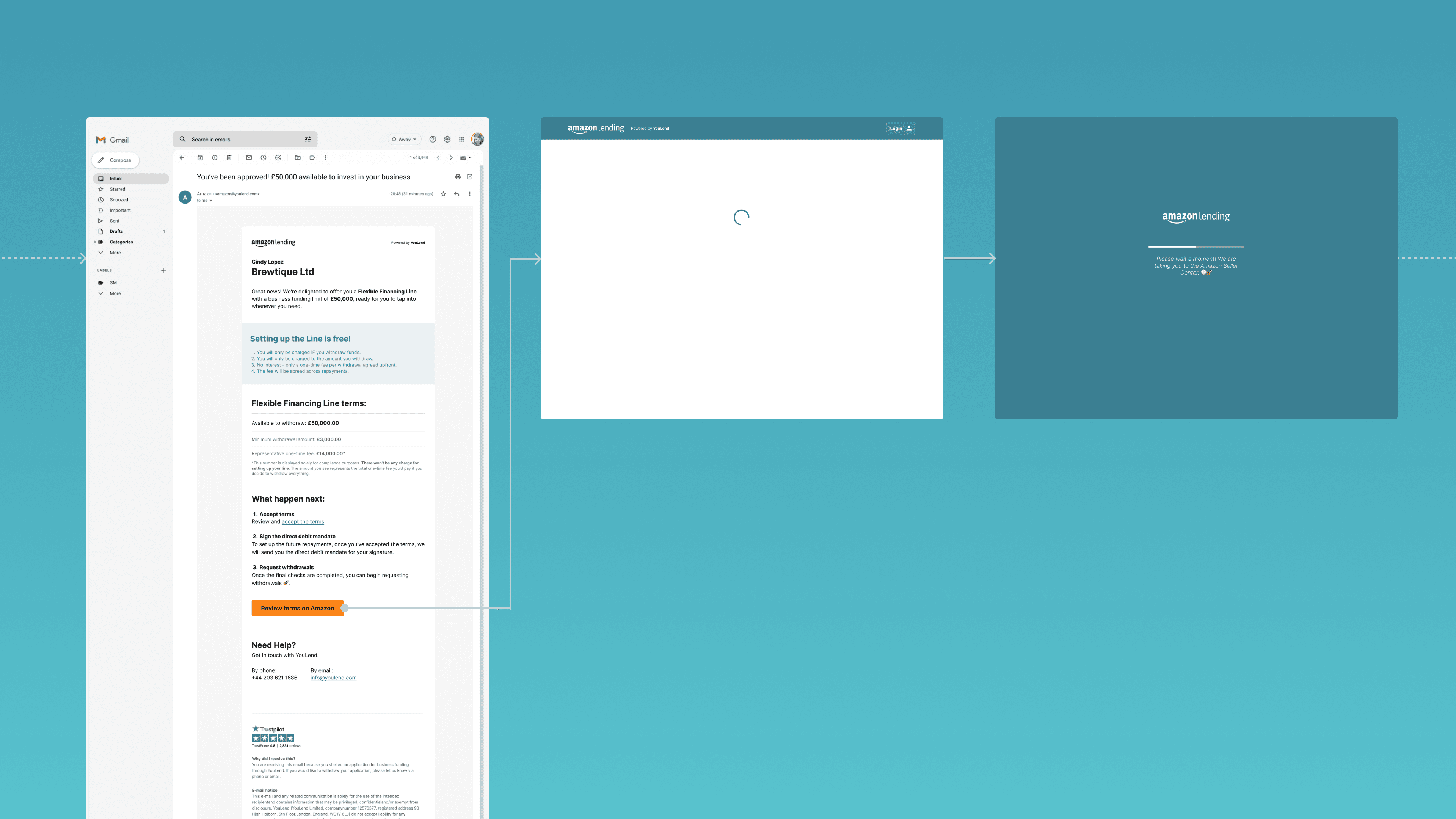
We streamlined the process by sending an email with all the offer details, allowing customers to accept terms without logging in

Instead of forcing customers to sign in to our platform to accept the terms, we modified the email to include all the offer details directly.

We created a call to action "Accept terms on Amazon" which directed customers to a YouLend url that was processing their acceptance automatically using Url variables, update their application status, and then redirect them to Amazon to log in and accept the terms there.

Showing the screens involved in the redirecting process.

Email and redirecting "smart" process.

Email and redirecting "smart" process.

This cut one whole friction point, making it seem like customers only needed to review and accept terms once

Refinement and Testing

We ran several iterations of design, test, evaluate, and repeat using unmoderated usability tests on Maze and UserBrain

The streamlined application process showed a higher completion rate and positive indicators in qualitative observations.

However, many aspects still had room for improvements. For instance, the copy in the “accept and review” email could have been clearer, as a small minority didn't realise the process wasn't finished yet.

Additionally, some participants mistakenly associated Amazon's presence with limited fund usage, which wasn't the case.

Impact

£1.8M funded in the first 6 weeks

Regrettably, we couldn't launch the new product by July as planned, and the launch was delayed by a month.

However, the initial results were very promising. Within the first six weeks, we funded £1.8M, and in just the first two weeks, we generated over 1000 leads.

The design work played a significant role in this initial success, but these impressive results were due to a combination of factors. Amazon's extensive marketing efforts and the dedicated work of YouLend's operations and production teams were crucial in achieving these milestones.

Explore other projects

Amazon. New Financing Line for Amazon sellers. Founder designer 0 to launch of brand new Financing Line for Amazon sellers. Led product strategy, user research, design and test.
YouLend. Simplifying Business Funding Applications. Led redesign of the business funding application experience. Reduced FTE, Improved conversions and recovered lost traffic.
Waitrose. Elevating the digital interface of one of the UK's most iconic grocery brands. I led the UI motion for a variety of initiatives, improved the design system, and enhanced the usability of the 'Add To Trolley' experience.
Paradym. Bringing the Paradym App to Life. I led the UX and art direction for the initial release of the product.
Goodfit
Weedeo

Let’s build the next big thing!

© 2025 Gio Cassano